A user logs into your admin dashboard or customer portal. They need to check recent account activity—orders, payments, system updates, user actions. But your activity log is a wall of plain text: "2024-01-15 14:23:18 - Order created - ID: 1456" followed by 50 identical-looking lines. No visual hierarchy. No color coding. No filtering. Everything looks the same. Important events are buried between trivial updates. The user can't quickly scan, can't identify patterns, can't find what they're looking for.
They either waste 10 minutes scrolling through text logs trying to find "that payment issue from last week," or they give up and contact support. Your activity log, meant to provide transparency and self-service monitoring, created frustration instead of clarity. Users feel like they're reading server logs, not using a modern interface.
Why Plain Text Activity Logs Fail Users
Activity logs should make system events understandable at a glance. Users should be able to scan quickly, identify important changes, and understand chronology without effort. But traditional text-based logs do the opposite:
1. No Visual Hierarchy (Everything Looks Identical)
When every activity entry is identical gray text in the same font, there's no way to distinguish critical events from trivial ones. "Payment failed" looks exactly like "User logged in" looks exactly like "Profile updated." Without visual differentiation, users must read every single line to find important information. That's exhausting and inefficient.
2. Timestamps Don't Communicate Relative Time
"2024-01-15 14:23:18" requires mental calculation to understand. Is that today? Yesterday? Last week? Users have to compare timestamps to current date/time mentally. "2 hours ago" or "Yesterday at 2:15 PM" is instantly understandable. Absolute timestamps are precise but cognitively demanding. Relative time is user-friendly.
3. No Categorization or Filtering
Your log contains orders, payments, user actions, system events, comments, alerts—all mixed together chronologically. If a user only cares about payments, they have to mentally filter out 80% of the feed. Without category filtering, users can't focus on what matters to them. They're forced to process irrelevant information.
4. No Context or Additional Details
A log entry says "Order #ORD-2024-1456 created." Okay, but who created it? What's the order value? How many items? What's the status? Users need context to assess importance and next steps. Bare-minimum information forces users to click through to full details constantly, dramatically slowing down monitoring workflows.
5. Overwhelming on Mobile (Scrolling Forever)
Plain text logs compress poorly on mobile. Each entry takes significant vertical space. Users scroll endlessly through tiny text trying to find specific events. Without visual landmarks (icons, colors, cards), everything blurs together. Mobile monitoring becomes practically impossible.
Real-World Data: A SaaS platform replaced their plain text activity log (chronological list, identical formatting, absolute timestamps) with a visual timeline feed (color-coded icons, relative timestamps, category filters, expandable details). User engagement with the activity feed increased 187%. Support tickets asking "Did X happen?" dropped 52% because users could self-serve monitoring. Average time to find specific events decreased from 3.5 minutes to 22 seconds.
How Visual Activity Timelines Transform Monitoring
Activity feed timelines aren't just prettier—they're designed around how humans process information chronologically:
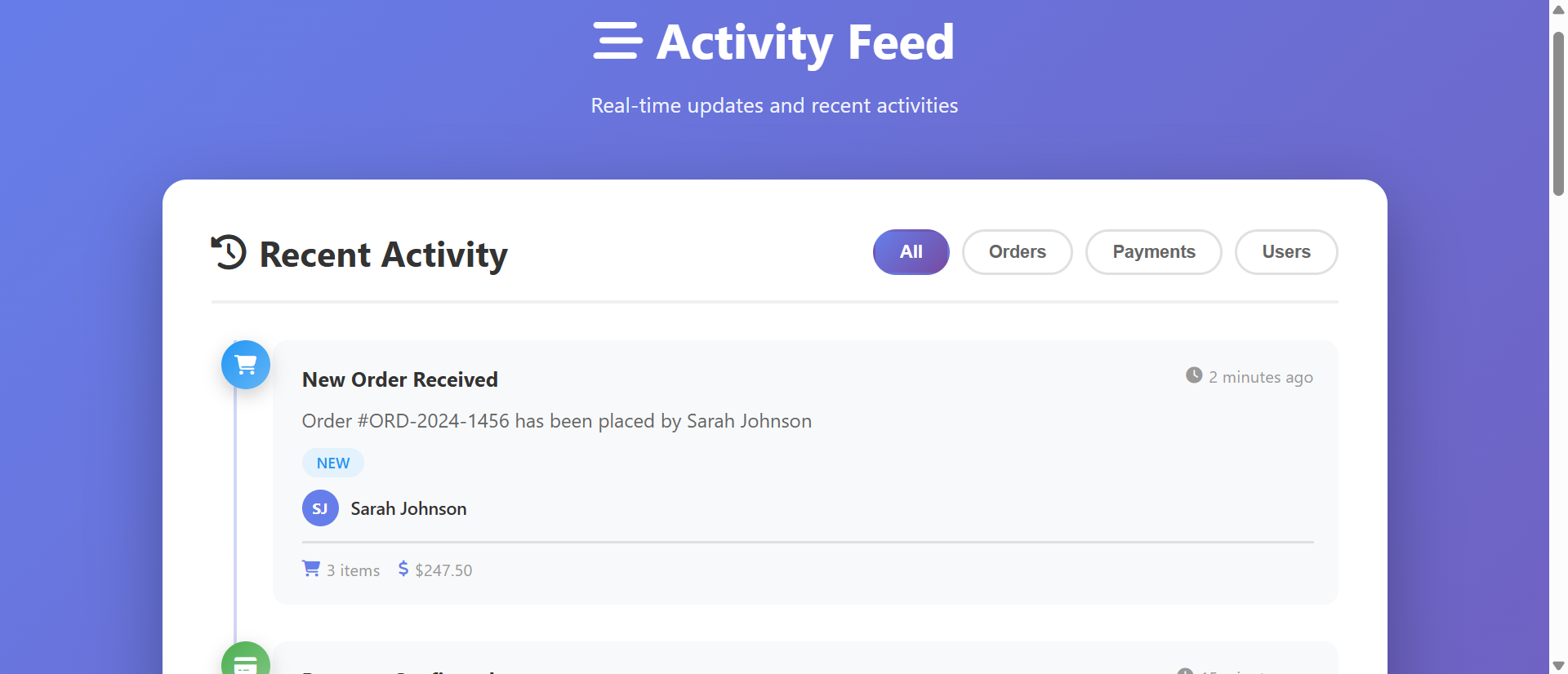
1. Color-Coded Icons Provide Instant Event Recognition
Each event type gets a unique colored icon. Orders are blue with a shopping cart icon. Payments are green with a dollar sign. User actions are orange with a person icon. System events are purple with a gear. Alerts are red with a warning symbol. This visual encoding allows pre-attentive processing—users identify event types before reading text. Scanning for "payment events" means scanning for green circles, not reading every line.
The vertical timeline with icons creates a visual rhythm. Important events stand out through color contrast. Users can skim the feed in seconds rather than reading every entry.
2. Relative Timestamps Feel Natural
"2 minutes ago," "15 minutes ago," "1 hour ago," "Yesterday," "3 days ago"—these relative timestamps map to how humans think about time. No mental calculation required. The timeline clearly shows recency. Events from today feel fresh. Events from last week feel historical. The chronological presentation with relative time creates intuitive temporal understanding.
3. Category Filtering Enables Focused Monitoring
Tabs or buttons for "All," "Orders," "Payments," "Users," "System," "Alerts" let users filter the feed instantly. Click "Payments" to see only payment-related events. Click "Orders" to track fulfillment. This focused view eliminates noise. Users see only what's relevant to their current task. The filtering is instant—no page reloads, just show/hide based on category.
4. Expandable Cards Show Context Without Clutter
Each activity card shows: event title, brief description, timestamp, user involved, status badge, and key metadata (order amount, item count, tracking number). Hover effects or click-to-expand reveal additional details. This progressive disclosure provides context at a glance while keeping the feed scannable. Users get enough information to assess importance without drowning in detail.
5. Status Badges Communicate State Instantly
Color-coded status badges—"New" (blue), "Success" (green), "Pending" (orange), "Failed" (red)—communicate event state without reading. Users scanning for problems immediately see red "Failed" badges. Successful transactions show green. The visual language is universal and requires zero learning.
6. Visual Timeline Connection Shows Flow
A vertical line connecting activity icons creates a visual timeline flow. The line emphasizes chronological sequence. Users understand "this happened, then this, then that" through spatial arrangement. The timeline metaphor is familiar from social media feeds, making the interface instantly understandable.
See Activity Timelines in Action
Experience how visual feeds transform confusing text logs into intuitive monitoring interfaces.
Try Live DemoReal-World Applications Across Platforms
Activity feed timelines work for any application tracking events or user actions:
E-Commerce Admin Dashboards
Track orders, payments, refunds, inventory changes, customer registrations. A Shopify-style dashboard with timeline feeds lets staff monitor everything at a glance. Green payment confirmations, blue new orders, orange pending shipments, red failed transactions. One store reduced "what's the status of X?" internal messages by 68% after implementing visual activity feeds because staff could self-serve monitoring.
SaaS Application Activity Logs
User logins, feature usage, API calls, integrations, data exports, billing events. A project management SaaS showed activity timelines for each workspace: "Sarah added 3 tasks," "Michael completed milestone," "System backup completed." Team transparency increased 43% as members could see what others accomplished without asking.
Customer Portals and Account Pages
Show customers their account history: orders placed, payments made, support tickets opened, profile changes, notifications. A telecom provider added activity timelines to customer accounts showing "Bill generated," "Payment received," "Service upgrade activated." Support calls asking "when did X happen?" dropped 39% because customers could check their own timeline.
CRM and Sales Pipelines
Track lead interactions, email opens, calls made, meetings scheduled, deals updated, quotes sent. A CRM with activity timelines for each contact increased sales rep efficiency by 24%—they could quickly review "what happened with this lead?" before follow-up calls. Color-coded icons (email, call, meeting, quote) made scanning effortless.
Social Platforms and Community Sites
User posts, comments, likes, follows, messages, notifications. Social media pioneered activity feeds. Forums and community sites benefit from the same pattern. Users expect chronological feeds with visual differentiation. A community platform added activity timelines showing "new member," "post published," "comment added," increasing daily engagement by 57%.
The Psychology Behind Why Visual Timelines Work
Understanding the cognitive science reveals why visual timelines dramatically outperform text logs:
Pre-Attentive Visual Processing
Our brains process color, shape, and spatial position before conscious thought. Color-coded icons are identified in milliseconds—"green circles are payments, blue circles are orders"—without reading text. This pre-attentive processing allows rapid scanning. Text logs require conscious reading of every line, exhausting cognitive resources.
Chunking and Visual Grouping
Activity cards create visual chunks—distinct units of information separated by white space. Humans process chunked information more efficiently than continuous text. Each card is a complete unit: event type, description, time, context. This chunking reduces cognitive load and improves comprehension.
The Serial Position Effect (Recency)
We remember items at the beginning and end of lists better than middle items. Activity timelines emphasize recent events (top of feed) through design—larger spacing, brighter colors, "NEW" badges. This aligns with the serial position effect, ensuring important recent activities get noticed.
Gestalt Principles (Proximity and Similarity)
Elements close together are perceived as related. The vertical timeline groups events chronologically through proximity. Similar colors group event types (all green = payments). These Gestalt principles create intuitive organization without explicit labels.
Common Mistakes That Ruin Activity Feed UX
Even visual timelines can fail if implemented poorly:
Too Much Information Per Card (Overwhelming Detail)
Cramming every possible data point into activity cards defeats the purpose. Users need enough context to understand importance, not every field from the database. Include: event title, brief description, timestamp, user, 2-3 key metadata points. Link to "View full details" for more. Keep cards scannable.
No Real-Time Updates (Stale Data)
Activity feeds should feel live. If users have to manually refresh to see new events, the feed feels dead. Implement auto-refresh (every 30-60 seconds) or WebSocket updates for true real-time. The feed should update automatically as events occur, maintaining the "live dashboard" feeling.
Poor Mobile Responsiveness
Timeline feeds designed for desktop often break on mobile—icons overlap text, cards don't resize, horizontal scrolling appears. Mobile traffic dominates. Your feed must work perfectly on phones: smaller icons, single-column layout, collapsible details, large touch targets. Test on actual devices.
No Pagination or Infinite Scroll
Loading 500 activity items at once kills performance. Implement pagination ("Load more activities" button) or infinite scroll (load next 20 as user scrolls to bottom). Limit initial load to 20-50 recent items. Performance matters more than showing everything simultaneously.
Confusing or Arbitrary Color Coding
If your color scheme is random (payments are purple, orders are yellow, users are pink), users can't remember what colors mean. Use intuitive associations: green = success/money (payments), blue = transactions (orders), orange = people (users), red = problems (alerts). Consistent, meaningful colors create instant understanding.
Case Study: A fintech app initially created an activity timeline showing every API call, database query, and system log—80+ events per day per user. The feed was overwhelming. They filtered to only user-facing events: transactions, transfers, balance changes, notifications. Reduced to 5-10 events per day. User engagement with the feed jumped from 12% to 76% of daily active users. Less is more—show what matters, hide technical noise.
Measuring Activity Feed Effectiveness
How do you know if your activity timeline is actually helping users?
Feed Engagement Rate
What percentage of users actually view the activity feed? Low engagement (under 20%) suggests users don't find it valuable or can't find it. High engagement (60%+) indicates it's a core monitoring tool. Track daily and weekly active feed viewers.
Filter Usage
Are users clicking category filters? Which categories get filtered most? If "All" is the only filter used, users might not understand filtering or your categories aren't meaningful. If 70% of users filter to "Payments," that's your most important category—consider making it default or more prominent.
Time Spent Monitoring
Average time users spend viewing the feed. Too short (under 10 seconds) suggests they can't find what they need. Too long (over 5 minutes) suggests information overload or poor scannability. Ideal is 30-90 seconds—long enough to review recent activity, short enough to indicate efficient scanning.
Support Ticket Reduction
Track support questions like "Did my payment go through?" or "When did my order ship?" These should decrease dramatically with good activity feeds. Users self-serve monitoring instead of asking support. A 30-50% reduction in status-check tickets indicates successful feed implementation.
Click-Through to Details
What percentage of activity items get clicked for full details? Too low (under 5%) might mean cards show enough context already (good) or users don't care about details (bad). Too high (over 40%) suggests cards lack sufficient context—users must click to understand. Optimize for 10-20% click-through.
The Future of Activity Monitoring
Activity feeds are evolving beyond simple event lists. Modern implementations add AI-powered insights: "Your order volume is up 23% this week," predictive alerts: "Payment likely to fail based on historical patterns," personalized filtering: "Show me what's relevant to my role," and cross-system aggregation: "Events from Stripe, Shopify, and your custom app in one feed."
But the core principle remains: make system events understandable through visual hierarchy, chronological organization, and contextual information. Humans think visually and temporally—activity timelines align with how we naturally process information.
Getting Started: Building Effective Activity Feeds
Ready to transform confusing text logs into intuitive visual timelines?
- Identify Event Types: What categories of activities do users need to monitor? (orders, payments, users, system, alerts)
- Design Color Coding: Assign intuitive colors to event types—green for success/money, blue for transactions, orange for users, red for problems
- Choose Icon Set: Font Awesome or similar for consistent, recognizable icons representing each event type
- Determine Card Content: Title, brief description, timestamp, user, status badge, 2-3 key metadata points
- Implement Relative Timestamps: "X minutes/hours ago," "Yesterday," "3 days ago"—update dynamically
- Add Category Filtering: Tabs or buttons for instant show/hide by event type
- Design for Mobile: Responsive cards, smaller icons, collapsible details, vertical timeline
- Enable Real-Time Updates: Auto-refresh or WebSocket for live feed feeling
- Implement Pagination: Load 20-50 initial items, "Load more" button or infinite scroll
- Test Scannability: Can users find specific events in under 30 seconds? If not, simplify
The activity feed timeline module handles all presentation—color-coded icons, timeline visualization, filtering, responsive design, animations. You provide the event data; it creates the intuitive monitoring experience.
Transform Your Activity Logs
See how visual timeline feeds turn confusing text logs into powerful monitoring dashboards.
View Live Module