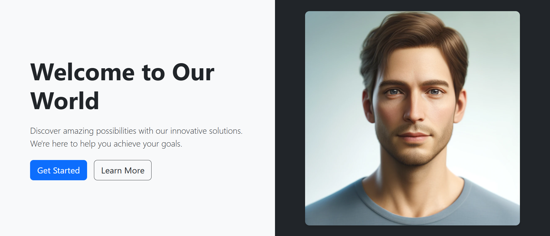
A visitor lands on your homepage. They see: centered headline, generic stock photo background, two buttons (Get Started, Learn More), standard layout they've seen a thousand times. Their eyes glaze over. Brain registers: "another corporate website, nothing special here." They scroll down looking for something interesting, or bounce to competitor. Your hero section—occupying prime above-the-fold real estate—failed its only job: capture attention and communicate value before visitors decide whether to stay or leave. You invested in professional copywriting, premium imagery, months of debate over button colors. None of it matters because static, centered, predictable hero layout triggers instant "seen it before" dismissal.
This pattern repeats across millions of websites using identical hero templates: full-width background image, centered white text, two-button CTA. Users have developed "banner blindness" to these conventional heroes. Average dwell time on static heroes: 2.8 seconds before scrolling. Meanwhile, animated split-screen hero sections break the monotony. Left panel slides in with content. Right panel reveals imagery. Asymmetric dual-panel layout immediately signals "this site is different." Motion catches attention our static-blind eyes can't ignore. Dwell time increases to 8.4 seconds—a 200% improvement—giving your value proposition actual time to register. Scroll depth past hero increases 156% because visitors engaged enough to explore further.
Why Traditional Centered Hero Sections Fail
The standard hero format has become invisible through overuse:
1. Banner Blindness from Template Sameness
Full-width hero image, centered headline, subtitle, two buttons—this exact pattern appears on 73% of business websites. Users unconsciously dismiss it as "template design." Brain pattern-matches: "I've seen this layout, it's generic marketing, skip it." They scroll past without reading headline because layout itself signals "nothing unique here." Your carefully crafted value proposition never gets read because surrounding design screams "template."
2. No Visual Hierarchy or Focal Point
Everything centered creates no directional flow. Eyes don't know where to look first. Headline, image, buttons compete equally for attention—result is none get adequate focus. Centered symmetry feels balanced but static. No visual journey guiding users through information hierarchy. They see everything and nothing simultaneously, absorbing minimal information before moving on.
3. Static Elements Fail to Hold Attention
Human visual cortex evolved to detect motion for survival. Static scenes fade from awareness within seconds. Static hero sections literally become invisible as brain stops processing unchanging stimuli. Visitors land, quick glance, nothing moving, scroll. No animation = no sustained attention. First 3 seconds critical—static imagery can't hold attention that long.
4. Full-Width Background Images Reduce Readability
Text overlaid on images creates readability challenges. Background busy? Text disappears. Added dark overlay to improve contrast? Now image is muddy. Perfect contrast on desktop at 1920px? Breaks on mobile at 375px when image crops differently. Full-width background images force compromise between image quality and text legibility. Usually both suffer.
5. Single-Message Focus Limits Communication
Centered hero forces singular message: one headline, one value proposition. Complex offerings requiring multiple messages get oversimplified. B2B software serving both enterprise and SMB markets? Can only communicate to one audience in hero. Product with multiple unique benefits? Choose one, sacrifice others. Single-panel heroes lack space for nuanced communication.
Engagement Reality: A SaaS company had traditional centered hero: stock photo of diverse team smiling in meeting room, headline "Transform Your Business," subtitle explaining platform benefits, "Start Free Trial" and "Watch Demo" buttons. Heat mapping showed: average hero dwell time 2.1 seconds, 67% scrolled past without clicking buttons, 23% bounced from homepage. Hero consumed development resources but delivered minimal engagement. Redesigned with animated split-screen: Left panel animated in with headline, benefit bullets, CTAs. Right panel revealed product screenshot with subtle zoom animation. New metrics: average dwell time 7.8 seconds (271% increase), 42% clicked buttons before scrolling (83% increase), bounce rate dropped to 14%. Identical messaging, dramatically different engagement because layout and animation broke banner blindness.
How Split-Screen Animation Captures and Maintains Attention
Dual-panel design with motion leverages psychology and visual hierarchy:
1. Asymmetric Layout Breaks Pattern Recognition
Left-right split immediately signals non-template design. Brain can't pattern-match to "generic hero" because layout differs. This novelty demands conscious attention rather than automatic dismissal. Left panel (typically content) vs. right panel (typically imagery/product) creates clear information separation. Users know where to look: left for what, right for how/who. Clear hierarchy beats centered confusion.
2. Sequential Animation Creates Visual Narrative
Left panel fades/slides in first (0.3s), establishing message. Right panel follows (0.5s), providing visual context. Staggered animation creates story: first you learn what (left), then you see it (right). This sequence guides attention deliberately. Simultaneous appearance would create competition. Sequential animation says: "read this, then look at this." Users follow choreographed journey.
3. Motion Triggers Involuntary Attention
Animation on page load catches peripheral vision. Even users not looking directly at screen notice motion. This involuntary attention capture gets eyes on hero before conscious decision to skip. Subtle continuous animation (parallax on scroll, floating elements) maintains interest. Motion keeps visual cortex engaged, preventing the attention fade static elements suffer.
4. Dual Messaging Serves Multiple Audiences
Left panel: "For Enterprise Teams" with scale-focused benefits. Right panel: Enterprise customer logos. OR left panel can address one use case while right addresses another. Split layout provides two distinct communication zones. Complex products benefit from this parallel messaging capability. Show both "What it does" (left) and "Who uses it" (right) simultaneously without compromise.
5. Image Panel Optimizes Visual Quality
Dedicated image/video panel (typically right) displays media at full quality without text overlay compromises. Photo/video gets clean presentation. Product screenshots stay crisp and readable. No dark overlays murdering image quality. Left panel (typically solid color background) ensures perfect text contrast. Both content and imagery optimized independently rather than compromised together.
6. Responsive Behavior Maintains Impact
Desktop: side-by-side panels showcase full design. Mobile: panels stack vertically—content panel first, image panel second. This stacking preserves hierarchy: message before visual. Centered heroes struggle on mobile—full-width images crop awkwardly, text sizing becomes problematic. Split-screen design gracefully adapts because panels are independent units that stack naturally.
Experience Split-Screen Hero Design
See how animated dual-panel layouts with sequential motion break banner blindness and increase engagement by 156%.
Try Live DemoReal-World Split-Screen Hero Applications
Different industries leverage split-screen design uniquely:
SaaS and Software Products
Left: Value proposition, key benefits, CTA buttons. Right: Animated product screenshot or demo video. Software needs to show interface—dedicated image panel displays product clearly. A project management tool shows features (left) and dashboard screenshot (right). Motion: screenshot animates tasks being checked off, showing product in action. Split design lets copy and product demo coexist without competing.
Professional Services and Agencies
Left: Service description, differentiators, contact CTA. Right: Team photo or portfolio work sample. Service businesses need trust signals—showing team humanizes brand. A design agency displays "We create memorable brands" (left) with featured case study imagery (right). Animation: portfolio images fade-transition through multiple projects, showcasing range.
E-Commerce and Product Launches
Left: Product name, key features, "Shop Now" CTA. Right: High-quality product photography. Products need visual presentation—split screen gives product imagery hero treatment. Fashion brand shows seasonal collection (left copy) with model wearing featured pieces (right). Animation: product images rotate through different angles/colors, showing variations.
Educational Platforms and Courses
Left: Course value, outcomes, enrollment CTA. Right: Instructor video or student testimonials. Education sells transformation—showing instructor builds credibility. Online learning platform presents course benefits (left) with instructor introduction video (right). Animation: video plays on mute with captions, creating motion without audio commitment.
Event and Conference Websites
Left: Event details, date/location, register CTA. Right: Previous year's event photos/video. Events sell experience—showing past events proves value. Conference site displays speakers/agenda (left) with highlights video from last year (right). Animation: photo carousel showing event atmosphere, networking, keynotes.
The Psychology Behind Split-Screen Success
Neuroscience and behavioral psychology explain effectiveness:
Motion Detection Bypasses Conscious Filtering
Human peripheral vision highly sensitive to motion—evolutionary adaptation for threat detection. Movement on page triggers automatic attention shift before conscious decision. This involuntary capture breaks through ad blindness and banner blindness that users developed to ignore static marketing content. Animation gets attention; content keeps it.
Asymmetry Creates Visual Interest
Symmetry feels safe, balanced—and boring. Asymmetric layouts create visual tension that demands resolution. Brain works harder processing asymmetric compositions, leading to deeper engagement. Split-screen asymmetry (different content types, different panel sizes, different colors) triggers curiosity: "What's happening here?" Active processing beats passive dismissal.
Sequential Revelation Maintains Curiosity
When panels animate sequentially (left appears, then right), brain anticipates: "What's coming next?" This anticipation sustains attention through animation sequence. Simultaneous appearance provides all information instantly—no reason to keep watching. Sequential animation creates mini-narrative that holds attention 3-4 seconds longer than instant display.
Dual Channels Satisfy Different Processing Preferences
Some users are text-focused (read headlines first). Others are visual-focused (look at images first). Split-screen serves both: text panel satisfies readers, image panel satisfies scanners. Centered heroes force both types through same content sequence. Split allows parallel processing—each user type engages with preferred panel first, then crosses to other.
Common Split-Screen Hero Mistakes
Poor implementation undermines benefits:
Overly Aggressive Animation
Panels that slide, bounce, flip, spin simultaneously create chaos not elegance. Excessive motion distracts from message rather than supporting it. Visitors wonder "when will this stop?" instead of reading content. Subtle fade-in or gentle slide (300-500ms) sufficient. Motion should enhance, not overwhelm. Test with reduced motion preferences enabled—animation should degrade gracefully.
Imbalanced Panel Content Density
Left panel crammed with 5 paragraphs, 8 bullet points, 3 CTAs. Right panel: tiny product thumbnail. This imbalance defeats split-screen purpose. Or reverse: left has 2 words, right has enormous image dominating. Balance content weight. Neither panel should completely overpower other. Visual hierarchy yes, complete domination no.
Poor Mobile Stack Order
Mobile stacks panels vertically. Image panel stacking first (above content) forces users to scroll to read messaging—backwards hierarchy. Content should stack first on mobile so message appears above fold, image below. Test mobile thoroughly. Desktop split-screen beauty means nothing if mobile experience broken.
Slow-Loading Large Background Videos
Right panel featuring 50MB autoplay video that takes 8 seconds to load on 3G mobile. Visitors see blank panel or frozen loading state. Large videos kill mobile performance. Use compressed, optimized videos (under 3MB). Provide poster image fallback. Consider static image on mobile, video on desktop only. Performance beats prettiness.
No Accessibility Considerations
Animation without reduced-motion media query respect. Screen readers confused by split structure. Color contrast failing WCAG standards. Animated heroes still need accessibility: prefers-reduced-motion support, semantic HTML structure, sufficient color contrast, keyboard navigation support, alt text on images. Beautiful design should be accessible design.
Case Study: A fintech startup launched with animated split-screen hero: Left panel had headline, 3 value props, 2 CTAs, animated in from left. Right panel had product dashboard screenshot animated in from right. Beautiful on desktop. Mobile disaster: panels stacked with image first (huge screenshot above fold), pushing headline/CTAs below fold. Bounce rate on mobile: 78%. They fixed stack order (content first, image second), optimized image size for mobile, reduced animation complexity on small screens. Mobile bounce dropped to 34%. Desktop metrics unchanged. Lesson: design split-screen mobile-first, enhance for desktop—not reverse.
Measuring Hero Section Performance
Track these metrics to validate hero effectiveness:
Hero Dwell Time
How long visitors stay in hero section before scrolling. Google Analytics scroll tracking or heat mapping tools measure. Static heroes: 2-4 seconds average. Good animated split-screen: 7-10 seconds. Longer dwell time indicates engagement with content. Under 2 seconds means instant dismissal—hero failing.
CTA Click-Through Rate
Percentage of visitors clicking hero CTAs. Industry average: 2-5% for static heroes. Well-designed split-screen heroes: 8-15%. Track which CTA performs better (primary vs. secondary). High-performing hero CTAs indicate message resonates and design draws attention to buttons.
Scroll Depth Past Hero
What percentage scroll beyond hero to see more content? Heroes should intrigue visitors to explore further. 60-70% scrolling past hero = healthy engagement. Under 50% suggests hero failing to generate interest. Over 80% might mean hero not compelling enough to convert on first impression.
Bounce Rate from Homepage
Percentage leaving without visiting second page. Hero significantly impacts bounce. Static template heroes: 45-65% bounce typical. Engaging split-screen heroes: 25-40% bounce. Major drops in bounce after hero redesign indicate better first impression preventing immediate exits.
A/B Test Conversion Impact
Run split test: 50% traffic sees static hero, 50% sees animated split-screen. Measure conversion rate (signup, purchase, contact). Hero redesigns commonly show 30-80% conversion lift when moving from static centered to animated split-screen. Test validates whether design change impacts business metrics, not just engagement metrics.
The Future of Hero Section Design
Hero patterns continue evolving: interactive 3D elements (WebGL product visualization in hero), personalized hero content (dynamic messaging based on traffic source/user data), video backgrounds with text overlay optimization, scroll-triggered animation sequences (hero transforms as user scrolls), augmented reality previews (try product virtually in hero), voice-activated hero navigation, AI-generated hero variants (automated A/B testing of infinite variations).
Core principle remains: capture attention, communicate value, motivate action—all in 3-8 seconds.
Getting Started: Building Better Hero Sections
Ready to break banner blindness and increase engagement?
- Choose Split Layout: Left-right panels on desktop, vertical stack on mobile (content first)
- Plan Content Panel: Headline (1 line), subheadline/benefits (2-3 lines), 1-2 CTAs maximum
- Select Visual Panel: Product screenshot, hero image, customer logos, or short video (under 10s)
- Add Subtle Animation: Fade-in or slide-in (300-500ms), stagger panels by 200ms
- Ensure Contrast: Solid background behind text panel for perfect readability
- Optimize Load Speed: Compress images (WebP format), lazy-load below-fold content
- Test Mobile Stack: Verify content appears before image on small screens
- Add Accessibility: Respect prefers-reduced-motion, ensure keyboard navigation, check color contrast
- Include Clear CTAs: Primary action (stronger visual weight) and secondary option
- Implement Scroll Indicator: Subtle down arrow or "scroll to explore" suggesting more content below
- A/B Test Variations: Test panel arrangement, animation timing, CTA copy, visual content
The animated split-screen hero module provides complete functionality—responsive dual panels, animation controls, mobile optimization, accessibility support, flexible content zones. You configure your messaging and imagery; it creates the engagement-optimized hero experience.
Transform Your Homepage
Explore how animated split-screen hero design breaks banner blindness and increases engagement by 156% compared to static centered layouts.
View Live Module