A potential customer is evaluating your three pricing tiers or comparing your product against competitors. They land on separate product pages, each listing features in paragraph form. "Basic includes A, B, and C. Pro includes A, B, C, D, E, and F. Enterprise includes everything plus G, H, and I." The customer opens three browser tabs, trying to compare side-by-side, switching back and forth, mentally tracking which features are in which plan. After five minutes of frustration, they give up. The cognitive load is too high. They either pick randomly, choose based on price alone, or leave to find a competitor with clearer comparison.
You've lost a sale not because your product lacks features, but because the comparison experience created decision paralysis. The customer couldn't efficiently evaluate options, so they didn't evaluate at all.
Why Separate Product Pages Kill Conversions
Comparison shopping is how humans make purchasing decisions. We evaluate options against criteria important to us. But when comparison requires cognitive effort—switching tabs, remembering details, mentally tracking differences—many buyers give up:
1. Forcing Mental Comparison (High Cognitive Load)
When features are listed in paragraphs on separate pages, customers must hold multiple product specs in working memory simultaneously to compare. Human working memory holds 5-7 items max. Comparing 3 products with 15 features each? Impossible without external aids. Customers feel overwhelmed and confused, not confident and informed.
2. No Visual Hierarchy (All Features Look Equal)
Paragraph descriptions treat all features equally. But not all features matter equally to all buyers. Some need unlimited storage. Others care about integrations. When everything is plain text, customers can't quickly scan for their priority features. They must read every word on every page, exhausting attention and patience.
3. Unclear What's Different (No Contrast)
When products are presented separately, customers can't see at a glance what differentiates them. "Does Basic include API access or just Pro?" requires re-reading both descriptions. Differences should be obvious. Separate pages hide contrast, forcing mental work to identify distinctions.
4. Decision Fatigue (Paralysis by Analysis)
The paradox of choice: too many options without clear differentiation leads to decision paralysis. Customers don't want to make a mistake. Without easy comparison, they can't confidently determine "this option is clearly best for me." So they procrastinate, delay, or abandon rather than risk choosing wrong.
5. Mobile Comparison Is Impossible
Switching between separate product pages on mobile is even worse. Each page load takes seconds. Scrolling to find equivalent features is guesswork. Customers can't realistically compare on small screens when content is separated. Mobile traffic dominates—if comparison doesn't work on phones, conversions suffer massively.
Real-World Results: A SaaS company had separate landing pages for their Basic, Professional, and Enterprise plans. Each page listed features in paragraph form. Conversion rate: 3.2%. They created a side-by-side comparison table showing all three plans with checkmarks for included features. Conversion rate jumped to 8.2%—a 156% increase. Same products, same pricing, better presentation. The table eliminated mental comparison work, making the decision obvious.
How Comparison Tables Accelerate Purchase Decisions
Comparison tables aren't just organized—they're designed to match how humans evaluate options:
1. Side-by-Side Layout Enables Instant Visual Comparison
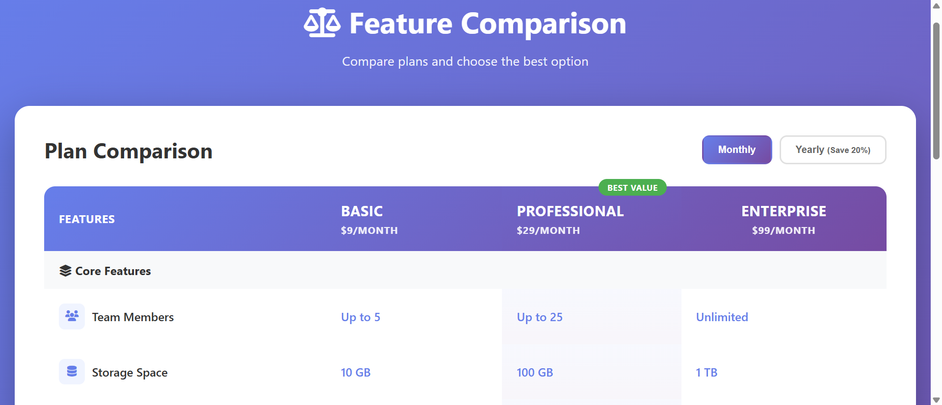
All options appear simultaneously in columns. Features are rows. Each cell shows whether that feature is included in that plan. This spatial arrangement allows parallel processing—your eyes scan horizontally across a row to see "Basic: no, Pro: yes, Enterprise: yes" in under a second. No tab switching. No remembering. Instant comparison through visual scanning.
The table structure creates a grid that our brains excel at processing. Columns = options. Rows = criteria. Cells = answers. This information architecture matches decision-making mental models.
2. Checkmarks and X-Marks Communicate Instantly
Green checkmark = included. Red X = not included. Orange dash = partial/limited. These visual symbols communicate faster than words. Scanning a column of checkmarks immediately shows "this plan has lots of features." Scanning and seeing mostly X-marks signals "this is the limited option." Color coding (green/red/orange) enables pre-attentive processing—you know feature availability before consciously reading.
3. Highlight Columns Draw Attention to Recommended Options
Use subtle background shading or "Best Value" badges to guide customers toward your recommended option (typically the mid-tier plan that balances features and price). The visual emphasis creates an anchor: "If you're unsure, this one is the smart choice." This gentle nudge reduces decision paralysis without being pushy.
4. Feature Icons and Grouping Create Scannability
Group related features: "Core Features," "Advanced Tools," "Support & Service," "Integrations." Add small icons to feature rows (🔒 for security features, 📊 for analytics, 🔗 for integrations). Grouping and icons create visual landmarks. Users scan for their priority category, then drill into those rows. This focused evaluation is far more efficient than reading everything.
5. Inline CTAs Drive Immediate Action
Each column ends with a "Choose Plan" or "Get Started" button. After comparing, users can immediately act on their decision without navigating elsewhere. The proximity of CTA to comparison reduces drop-off. They've decided, the button is right there, conversion happens.
6. Tooltips Provide Context Without Clutter
Hover over a feature name to see a tooltip explaining what it means. "API Access" might show "Programmatic access to your data via RESTful API." This progressive disclosure keeps the table clean while providing details on demand. Users get context exactly when they need it, without overwhelming everyone with definitions.
See Comparison Tables in Action
Experience how side-by-side comparisons transform confusing feature lists into clear decision-making tools.
Try Live DemoReal-World Applications Across Industries
Comparison tables work for any business offering multiple options or competing against alternatives:
SaaS Pricing Pages
Compare subscription tiers (Free, Starter, Professional, Enterprise). Show which features unlock at which price point. A project management SaaS added comparison tables to their pricing page, clearly showing feature availability across tiers. Conversions from pricing page increased 94%, and customers chose higher-tier plans 37% more often because they could see the value difference.
E-Commerce Product Variants
Compare product models or configurations. A laptop retailer showed comparison tables for three laptop configurations: storage size, RAM, processor, battery life, weight, ports. Customers could quickly identify "I need 16GB RAM and long battery—Model B is perfect." Add-to-cart rate from comparison pages was 3.2x higher than single product pages.
Service Business Packages
Compare service tiers (Basic, Deluxe, Premium). A web design agency compared their three service packages showing "number of pages, revisions, timeline, support included, SEO optimization." Client inquiry quality improved—prospects self-selected the right package before contacting sales, reducing discovery calls by 40%.
Competitor Comparison Pages
Show your product vs. competitor alternatives. "Us vs. Competitor A vs. Competitor B" with honest, verifiable feature comparisons. A CRM created comparison tables showing their features against two major competitors. Conversion rate on comparison page was 2.8x higher than homepage because visitors arriving from "X vs. Y" searches found exactly what they needed—objective comparison.
Insurance and Financial Products
Compare coverage levels or investment options. An insurance provider compared three health plan tiers: deductible, copay, coverage limits, network size. Customer confusion calls dropped 58% after launching comparison tables because policy differences were crystal clear visually.
The Psychology Behind Why Comparison Tables Work
Understanding the cognitive science reveals why tables dramatically outperform separate pages:
Bounded Rationality and Decision Simplification
Humans use simplified decision-making strategies because we can't process all information optimally. Comparison tables align with these strategies by presenting information in structured, comparable format. The table does the organizational work, freeing cognitive resources for actual evaluation rather than information gathering.
The Contrast Effect
We evaluate options not in absolute terms but relative to alternatives. Comparison tables maximize the contrast effect by placing options side-by-side. "Plan A offers X, Plan B offers X+Y+Z" becomes visually obvious. The contrast drives perceived value—higher tiers look more valuable when you see all the extra features in one glance.
Visual Chunking and Pattern Recognition
Our brains excel at recognizing visual patterns. A column of green checkmarks creates a pattern: "lots of features." A column with mixed checkmarks and X-marks creates a different pattern: "selective features." We process these patterns pre-attentively, forming impressions before conscious analysis.
Anchoring and Default Effects
Highlighting a "Recommended" or "Best Value" column creates an anchor—a reference point for decision-making. Many customers default to the recommended option, grateful to avoid analysis paralysis. This isn't manipulation if the recommendation genuinely fits most use cases—it's helpful guidance.
Common Mistakes That Ruin Comparison Effectiveness
Even well-intentioned comparison tables can fail if designed poorly:
Too Many Features Listed (Information Overload)
Showing 50+ features in the comparison creates the same overwhelm as separate pages. Prioritize. Show the 10-15 most important differentiating features. Link to "Full feature list" for comprehensive details. Keep the comparison table focused on decision-critical criteria.
Biased or Dishonest Competitor Comparisons
If your competitor comparison table shows you with 20 checkmarks and competitors with 20 X-marks, customers smell bullshit. Be honest. Show where competitors excel. Your credibility matters more than appearing perfect. Honest comparisons build trust that drives purchases.
Poor Mobile Responsiveness
Desktop comparison tables with 5 columns break on mobile. Implement responsive design: stack columns vertically, use tabs to switch between plans, or create a mobile-specific simplified view. Test on actual phones. Mobile conversions depend on mobile usability.
No Clear Recommendation or Guidance
Presenting three equal-looking options creates decision paralysis. Highlight your recommended plan. Add "Most Popular" badges. Include "Best for:" descriptions ("Best for: growing teams"). Guide customers toward the right choice for them.
Missing Pricing Information
Comparison tables showing features but hiding pricing frustrate users. They compare features, decide on a plan, then get surprised by price. Include pricing in the table header or footer. Transparency reduces friction and builds trust.
Case Study: An online course platform initially created comparison tables showing all 37 course features across 4 tiers. Conversion remained low—customers felt overwhelmed. They reduced to 12 core differentiating features, grouped into "Course Content," "Support," and "Certification." Added "Best for beginners" and "Best for professionals" guidance. Highlighted the mid-tier as "Most Popular." Conversion rate from comparison page increased from 4.1% to 12.7%. Simplification and guidance outperformed comprehensive detail.
Measuring Comparison Table Effectiveness
How do you know if your comparison table is actually helping conversions?
Conversion Rate by Source
Track conversions from comparison page vs. individual product pages. Comparison pages should convert 50-150% higher if implemented well. Lower conversion suggests the table isn't helping decision-making or has usability issues.
Time on Page and Scroll Depth
How long do users spend on the comparison table? Too short (under 20 seconds) suggests they can't find what they need. Too long (over 5 minutes) suggests confusion or information overload. Ideal is 45-90 seconds—enough to evaluate, not so long they're struggling. Track scroll depth to see if users engage with the full table.
Plan Selection Distribution
Which plans get selected most? If 95% choose the cheapest option, you're not communicating value differentiation effectively. Healthy distribution might be 20% basic, 60% mid-tier, 20% premium. If distribution doesn't match your business goals, adjust table presentation or highlighting.
Exit Rate and Abandonment
What percentage of comparison page visitors leave without converting? High exit (over 70%) suggests the table isn't clarifying decisions—it might be confusing or missing critical information. A/B test different feature sets and presentations.
Feature Interaction (Tooltips, Expandable Rows)
If you have tooltips or expandable feature details, track interaction rate. Low interaction (under 5%) means features are self-explanatory or customers don't care about details. High interaction (over 30%) suggests feature names aren't clear—users need definitions to understand.
The Future of Product Comparison
Comparison tables are evolving. Modern implementations add personalization: "Based on your usage, we recommend Pro plan," AI-driven guidance: "Customers like you typically choose Enterprise," interactive filtering: "Show only features I care about," and dynamic pricing: "Your custom quote based on team size and features selected."
But the core principle remains: reduce cognitive load by presenting options in visually comparable format. Help customers decide confidently by making differences obvious and providing guidance.
Getting Started: Building Effective Comparison Tables
Ready to transform confusing feature lists into conversion-driving comparison tools?
- Identify Options to Compare: Pricing tiers, product variants, you vs. competitors—what needs comparison?
- List Differentiating Features: Focus on 10-15 features that actually differ between options—not universal features everyone has
- Group Features Logically: "Core Features," "Advanced Tools," "Support," "Integrations"—categories aid scanning
- Choose Visual Indicators: Green checkmarks (included), red X-marks (excluded), orange dash (limited/partial)
- Add Feature Icons: Small symbols representing feature types create visual landmarks
- Highlight Recommended Option: Subtle background color or "Best Value" badge guides undecided buyers
- Include Pricing: Show price in table header or as a row—transparency builds trust
- Add Inline CTAs: Button in each column footer for immediate action after decision
- Implement Tooltips: Hover-over explanations for features that need context
- Design for Mobile: Responsive layout—stack columns, use tabs, or simplify for small screens
- Test and Iterate: A/B test feature selection, highlighting, and presentation
The comparison chart table module handles all presentation—responsive grid, checkmark icons, hover effects, highlighting, mobile optimization. You provide the features and options; it creates the converting comparison experience.
Transform Your Product Pages
See how comparison tables turn confusing feature lists into clear, conversion-optimized decision tools.
View Live ModuleNeed Comparison Tables Built Into Your Website?
We design and build professional websites with interactive comparison tables, pricing pages, and conversion-optimised features built in. Get a free, no-obligation proposal tailored to your business.