A frustrated visitor lands on your FAQ page looking for a specific answer. They need to know if you ship internationally. Or how to cancel a subscription. Or whether your software integrates with their existing tools. But instead of finding a quick answer, they face a wall of text—20 questions all expanded at once, forcing them to scroll endlessly through irrelevant information.
Here's what happens next: They don't find their answer because they gave up after 30 seconds of scrolling. They leave your site. And they either contact support (creating unnecessary work for your team) or worse, they abandon their purchase and go to a competitor whose FAQ page actually helped them. Your FAQ page, meant to reduce friction, just created massive frustration.
Why Traditional FAQ Pages Create More Problems Than They Solve
FAQ pages should be self-service problem-solving tools. When done well, they reduce support tickets, improve customer satisfaction, and accelerate purchasing decisions. But most FAQ pages fail spectacularly at this job:
1. Everything Is Visible At Once (Information Overload)
When all 15-20 FAQ questions are displayed with their full answers visible simultaneously, you've created cognitive overload. Visitors can't quickly scan to find their specific question. Their eyes jump around looking for keywords. They miss the answer they need because it's buried in the middle of a dense wall of text. The page feels overwhelming rather than helpful.
2. No Clear Visual Hierarchy or Organization
Questions about billing sit next to technical support questions next to general information about your company. There's no logical grouping or categorization. Visitors waste time reading irrelevant questions trying to find the one category that applies to them. Without structure, even well-written FAQs become unusable.
3. Impossible to Scan Quickly
When answers are always visible, the questions don't stand out. Visitors can't quickly scan just the questions to find what they're looking for. Instead, they have to visually filter through both questions and answers, dramatically slowing down the search process. What should take 10 seconds takes 2 minutes—or never happens at all.
4. Mobile Experience Is a Disaster
On desktop, scrolling through 20 expanded FAQs is annoying. On mobile, it's unusable. Each question and answer takes up significant vertical space. Visitors scroll forever. Many give up before reaching the bottom because the page feels endless. Mobile users are the majority—if your FAQ doesn't work on phones, it doesn't work.
5. No Engagement or Interactivity
Static FAQs are passive documents. There's nothing to do except scroll and read. No interaction means no engagement. And low engagement means visitors don't invest the effort needed to find their answer. They bounce instead.
Real-World Data: A SaaS company replaced their traditional scrolling FAQ page (20 questions all expanded) with an accordion-style FAQ. Support tickets asking questions already covered in the FAQ dropped by 43%. Time on the FAQ page increased from an average of 22 seconds to 1 minute 18 seconds—visitors were actually staying long enough to find answers instead of immediately giving up.
How FAQ Accordions Transform User Experience
An accordion FAQ section isn't just prettier—it's strategically designed to match how humans actually search for information:
1. Collapsible Panels Keep Content Scannable
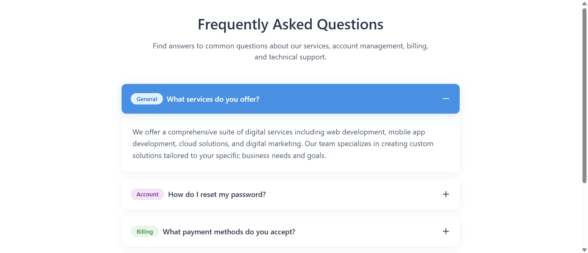
By default, only the questions are visible. Answers are hidden inside collapsible panels. This creates perfect scannability—visitors can quickly read through all the questions in 10-15 seconds, identify the one they need, and click to expand only that answer. No scrolling through irrelevant content. No information overload. Just efficient, targeted help.
When a visitor clicks a question, it smoothly expands to reveal the answer with a subtle animation. The visual feedback confirms their action worked. They read the answer. If it's what they needed, they're done. If not, they collapse it and try another. The interaction is intuitive and satisfying.
2. Category Badges Provide Visual Organization
Each question has a small colored badge indicating its category: General, Account, Billing, Technical, etc. These visual tags allow visitors to quickly filter mentally—"I have a billing question, so I'm looking for green badges." This categorization dramatically reduces cognitive load. Instead of reading every single question, visitors scan for their category.
The color coding is subtle but effective. It doesn't dominate the design, but it provides just enough visual distinction to help users navigate quickly.
3. Smooth Animations Guide Attention
When an accordion panel expands, it doesn't just instantly appear. It smoothly slides down with a gentle animation. This motion guides the visitor's eye to the newly revealed content. Their attention naturally follows the movement to the answer. The animation also provides satisfying tactile feedback—the interface feels responsive and polished.
Similarly, when one panel is open and you click another, the first collapses smoothly while the second expands. The coordinated movement feels intentional and professional rather than jarring or glitchy.
4. Active States Provide Clear Feedback
When a question is expanded, the button changes background color (typically to your brand's primary color) and the text turns white. The plus icon changes to a minus. This visual transformation clearly indicates "this is open, this is the active question." Users always know their current state.
This seems like a small detail, but clear interface states dramatically improve usability. Visitors never wonder "did my click work?" or "which question am I currently viewing?" The interface communicates its state explicitly.
5. Mobile-Optimized by Design
Because accordions show only one answer at a time, they're naturally mobile-friendly. On a small screen, visitors see a compact list of questions. They tap one, read the answer, and move on. No endless scrolling. No tiny text crammed together. The vertical space efficiency makes accordions perfect for mobile-first design.
Pro Tip: The accordion should allow only one panel to be open at a time (not multiple simultaneously). This prevents the page from getting too long and losing the scannability benefit. Users can always reopen a previous question if needed, but forcing focus on one answer at a time improves comprehension.
Real-World Applications Across Industries
FAQ accordions work universally, but the specific questions and categories vary by business type:
E-Commerce and Retail
Common categories: Shipping & Returns, Payment Methods, Product Information, Order Tracking. A fashion e-commerce site reduced "where's my order?" support emails by 51% after adding an accordion FAQ to their help center. Customers could quickly find shipping timeframes, return policies, and tracking information without contacting support.
SaaS and Software Companies
Common categories: Account Management, Billing & Subscriptions, Technical Support, Integrations, Security. A project management software added an accordion FAQ to their pricing page addressing common objections (data security, team size limits, export options). Conversion from the pricing page increased by 28% because prospects' questions were answered immediately.
Service Businesses (Consultants, Agencies)
Common categories: Services & Process, Pricing & Packages, Timeline & Availability, Results & Guarantees. A digital marketing agency used accordion FAQs on service pages to address common objections ("How long until I see results?" "What if I'm not satisfied?"). Sales calls became more efficient because prospects arrived already understanding the process.
Healthcare and Professional Practices
Common categories: Appointments & Scheduling, Insurance & Billing, Procedures & Treatments, Patient Resources. A dental practice added accordion FAQs covering insurance questions, procedure explanations, and preparation instructions. Front desk calls asking basic questions dropped by 39%, freeing staff to focus on patient care.
Educational Institutions and Course Sellers
Common categories: Enrollment & Registration, Course Content, Technical Requirements, Certification & Credits. An online coding bootcamp used accordion FAQs to address common student concerns (prerequisites, time commitment, job placement). Application completions increased because prospective students felt informed and confident.
See It In Action
Experience how smooth accordion interactions can transform overwhelming FAQ pages into efficient self-service tools.
Try Live DemoThe Psychology Behind Why Accordions Work
Understanding the cognitive science helps you appreciate why accordions dramatically outperform traditional FAQs:
Progressive Disclosure Reduces Cognitive Load
Our working memory can only hold 5-7 items at once. When you show 20 expanded FAQs simultaneously, you're overwhelming cognitive capacity. Accordions use progressive disclosure—showing only what's needed when it's needed. This aligns with how our brains naturally process information, making the experience feel effortless instead of exhausting.
The Zeigarnik Effect (Interactive Engagement)
We remember incomplete or interrupted tasks better than completed ones. When users click to expand an accordion, they're actively engaging with the content. This interaction creates investment. They're not passively scrolling—they're making choices, clicking, revealing information. Active participation increases both attention and retention.
Visual Hierarchy Speeds Information Retrieval
Category badges, color changes for active states, and the collapsed/expanded structure create clear visual hierarchy. Our brains process visual patterns before reading text. Visitors can identify their question category (via badge color) and active state (via button color) before consciously reading words. This pre-attentive processing dramatically speeds up navigation.
Satisficing Behavior in Information Seeking
Users don't read everything—they "satisfice," seeking just enough information to satisfy their immediate need. Accordions support this behavior perfectly. Visitors scan questions, find one that might answer their query, expand it, and if satisfied, they're done. No forced reading of irrelevant content.
Common Mistakes That Ruin FAQ Effectiveness
Even with accordions, poor implementation can sabotage your FAQ page:
Writing Vague or Jargon-Heavy Questions
"What is our refund policy?" is clear. "How does our post-transaction value reimbursement framework operate?" is incomprehensible. Use the actual words your customers use. If they say "get my money back," don't write "process reimbursement requests."
Answers That Are Too Long or Complex
FAQ answers should be concise—2-3 sentences maximum. If you need 4 paragraphs to explain something, that content belongs in a detailed help article linked from the FAQ, not in the FAQ itself. Keep answers scannable and actionable.
No Logical Categorization
Random question order makes accordions almost as useless as expanded FAQs. Group related questions together. Use category badges consistently. Create a mental model visitors can follow: General → Account → Billing → Technical, or whatever structure matches your business.
Missing the Most Common Questions
Check your support ticket data. What do customers actually ask about? Those questions should be in your FAQ. Don't guess what might be helpful—use real customer inquiry data to determine what to include.
Broken Links or Outdated Information
If your FAQ says "contact support at oldmail@company.com" and that email doesn't work, you've created frustration instead of solving it. Audit your FAQ quarterly. Update information. Fix broken links. Remove outdated questions.
Case Study: An e-learning platform initially created their FAQ by guessing what students might ask. Support tickets remained high. They then analyzed 6 months of support emails, identified the 15 most frequent questions, and rebuilt their accordion FAQ around those actual questions. Support ticket volume dropped 47% within two months. The lesson: use real data, not assumptions.
Measuring FAQ Accordion Effectiveness
How do you know if your accordion FAQ is actually working? Track these metrics:
Support Ticket Reduction
The primary goal of a good FAQ is reducing support burden. Track support tickets/emails before and after implementing an accordion FAQ. A successful FAQ should reduce tickets for questions it covers by 30-50%.
Time on Page and Scroll Depth
Use Google Analytics and heat mapping tools to measure engagement. Visitors should spend 45-90 seconds on the FAQ page (long enough to find and read an answer). Scroll depth should be moderate—not 100% (meaning they had to scroll forever) but not 20% (meaning they bounced immediately).
Accordion Interaction Rate
Use event tracking to measure how many visitors actually click to expand accordion panels. High interaction rate (50%+) indicates the FAQ is engaging and useful. Low interaction suggests visitors aren't finding relevant questions or don't understand how accordions work.
Exit Rate vs. Navigation to Other Pages
If visitors find their answer in the FAQ, they might leave the site (if their question was post-purchase support). Or they might proceed to a product page, checkout, or contact form (if their question was pre-purchase). High exit rate isn't bad if the FAQ solved their problem. Low navigation to conversion pages might indicate the FAQ isn't answering sales-blocking questions.
Search Query Analysis (If FAQ Has Search)
If your FAQ includes a search function, analyze what users search for. Frequent searches for topics not covered in your FAQ indicate gaps you should fill.
The Future of Self-Service Support
FAQ accordions are becoming table stakes, not differentiators. Modern customers expect instant, self-service answers. The businesses that win are those making information effortless to find.
The next evolution combines accordion FAQs with smart search, AI-suggested questions based on user behavior, and integrated video answers. But the foundation remains the same: make it easy for users to find the specific information they need without forcing them through irrelevant content.
A well-designed accordion FAQ isn't just a support cost reduction tool—it's a conversion optimizer. When pre-purchase questions are answered immediately, friction disappears and purchases happen. When post-purchase questions are resolved quickly, satisfaction increases and refunds decrease.
Getting Started: Building Your Accordion FAQ
Ready to transform your FAQ from ignored wall of text to efficient self-service tool? Here's what you need:
- Analyze Support Data: Pull 3-6 months of support tickets/emails and identify the 15-20 most frequent questions
- Categorize Questions: Group into 3-5 logical categories (General, Account, Billing, Technical, etc.)
- Write Clear Questions: Use the exact words customers use, not internal jargon or corporate speak
- Keep Answers Concise: 2-3 sentences maximum; link to detailed articles for complex topics
- Add Category Badges: Visual tags that help users quickly identify relevant questions
- Test on Mobile: Ensure accordions work smoothly on phones and tablets
- Update Regularly: Review quarterly, add new common questions, remove outdated information
The accordion module handles all technical implementation—smooth animations, mobile responsiveness, accessible keyboard navigation, proper ARIA labels for screen readers. You provide the questions and answers, and it transforms them into an interactive, user-friendly experience.
Transform Your FAQ Page
See how accordion interactions can turn frustrating FAQ pages into efficient self-service tools that reduce support burden.
View Live Module