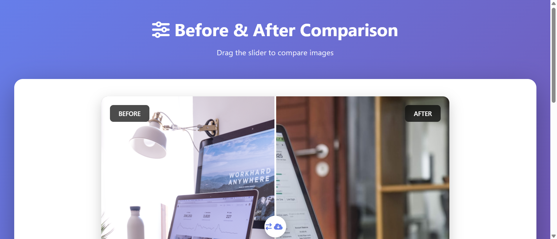
The 5 Critical Problems With Static Side-by-Side Comparisons
1. Passive Viewing Creates Minimal Engagement
Side-by-side image pairs require only passive glancing—users scan both images simultaneously then move on without deeper engagement. The lack of interaction means low investment and poor memory encoding; passive viewing doesn't create the tactile connection that drives retention. Eye-tracking shows users spend 60-80% less time viewing static comparisons versus interactive sliders because static pairs can be assessed instantly without exploration. This brevity prevents emotional impact development; impressive transformations get superficial "looks nice" reactions rather than "I need this" conviction. Passive media consumption is forgettable; active exploration creates memorable experiences.
2. Divided Attention Dilutes Impact
Presenting before and after images simultaneously forces split attention—users must visually parse two separate images, mentally comparing differences while each image competes for focus. This divided attention reduces the dramatic reveal impact where "after" state should astonish after establishing "before" context. The brain processes both states partially rather than fully experiencing either, diluting the transformation narrative. Marketing psychology shows sequential reveal (establish problem, then show solution) creates stronger impact than simultaneous presentation where solution's magnitude gets diminished by concurrent problem visibility. Split attention also increases cognitive load making comparison feel like work rather than discovery.
3. Fixed Viewpoint Prevents Detail Exploration
Static side-by-side pairs show transformation at one fixed alignment and scale, preventing users from exploring specific areas of interest at their own pace. A home renovation might have impressive kitchen transformation alongside bathroom work, but fixed pairs force identical prominence rather than user-directed focus. Viewers can't zoom into areas they care most about or compare specific details precisely aligned. This rigidity frustrates detail-oriented prospects who want to examine quality closely before purchasing. The fixed presentation treats all viewers identically despite varying priorities and inspection needs.
4. Mobile Display Degradation
Side-by-side layouts designed for desktop viewing fail catastrophically on mobile where horizontal space constraints force either: tiny unusable images displayed side-by-side, or vertical stacking that requires scrolling to see "after" after viewing "before"—losing simultaneous comparison benefit. Image quality degradation on small screens makes detail inspection impossible. Pinch-zoom on one image doesn't synchronize with the other, preventing aligned detail comparison. Given mobile comprises 50-70% of traffic for visual portfolios, static side-by-side format essentially sabotages majority user experience.
5. No Storytelling Through Progressive Reveal
Effective before-after storytelling builds narrative tension through sequential reveal: establish problem context, create anticipation, deliver transformation payoff. Static side-by-side presentation dumps both states simultaneously, eliminating narrative progression and emotional buildup. The "after" image provides no surprise because it's visible immediately—no dramatic reveal moment. This storytelling failure particularly damages emotional purchase categories (beauty, home improvement, fitness) where transformation journey matters as much as final result. Static comparisons communicate "here's what changed" without the "wow, look how much changed" emotional punch interactive reveals deliver.
Ready to Create Engaging Visual Comparisons?
See how interactive comparison sliders transform static images into compelling exploratory experiences that drive conversions.
View Comparison Slider Demo →6 Ways Interactive Comparison Sliders Transform Engagement
1. Tactile Interaction Creates Active Exploration
Interactive sliders require physical action—dragging divider back and forth to reveal before/after states—creating tactile engagement impossible with passive viewing. The kinesthetic involvement (moving cursor or finger) activates motor cortex alongside visual processing, creating multi-sensory experience enhancing memory encoding. Users control reveal pace, sliding quickly for overall impression then slowly through areas of interest. This self-directed exploration creates ownership of discovery: "I revealed this transformation" feels more impactful than "I was shown this transformation." The interaction transforms viewing from consumption into participation, dramatically increasing engagement duration and emotional investment.
2. Precise Alignment Enabling Detail Comparison
Comparison sliders overlay before/after images in perfect pixel-aligned registration, enabling exact spatial comparison impossible with separate side-by-side images. Users can position slider divider directly over architectural elements, facial features, or landscape details comparing precise changes. This alignment reveals subtle improvements that side-by-side comparison misses: texture changes, color shifts, fine detail enhancements all become obvious when before/after states occupy identical screen positions. For professional services showcasing subtle quality improvements (photo retouching, medical aesthetics, precision restoration), aligned comparison proves work quality in ways separated images cannot.
3. Dramatic Reveal Through Progressive Disclosure
Slider interaction creates controllable reveal where users gradually uncover transformation, building anticipation as "after" state emerges. Starting at "before" state establishes problem context, then user-controlled drag reveals solution progressively—the gradual transition heightens impact through anticipation buildup. Many sliders default to centered position showing both states partially, creating curiosity that drives users to explore full range. The reveal mechanic activates curiosity-reward psychology: partial information triggers desire to see complete picture. This progressive disclosure creates "wow moment" when full transformation becomes visible—emotional payoff passive viewing never delivers.
4. Mobile-Optimized Touch Interaction
Touch-enabled comparison sliders work beautifully on mobile, transforming mobile display weakness into interaction strength. Finger-dragging slider across screen feels natural and intuitive on touchscreens, often more satisfying than mouse-dragging on desktop. Full-width mobile sliders utilize entire screen for single high-quality image rather than cramming two degraded images, maintaining visual impact. The tactile satisfaction of swiping transformation into view creates mobile engagement exceeding desktop, reversing typical mobile experience disadvantage. Mobile sliders can also respond to device tilt, revealing transformation through physical device rotation for novelty interaction.
5. Looping Exploration Maintaining Engagement
Users rarely drag slider once then stop; the interaction invites repeated exploration—sliding back and forth multiple times examining different areas and appreciating transformation from various perspectives. This looping behavior extends engagement time dramatically; users spending 30-60 seconds interacting with single slider versus 2-3 seconds glancing at static pair. The repeated viewing from multiple "slider positions" reinforces transformation message through repetition while feeling exploratory rather than redundant. Analytics show users interact with comparison sliders 4-7 times average before moving on, versus single glance at static images.
6. Contextual Labeling Enhancing Comprehension
Interactive sliders enable dynamic labeling where "Before" and "After" indicators remain visible during interaction, preventing confusion about which state users currently view. Some implementations show sliding timestamp ("2 months progress"), metric changes ("60 lbs lost"), or treatment details ("After 3 sessions") updating as slider moves. Contextual tooltips appearing on hover explain specific improvements: slider over renovated kitchen might show "New countertops, custom cabinets, LED lighting." This layered information delivery provides both high-level impact and detailed explanation without cluttering static image, serving casual browsers and detail-oriented evaluators simultaneously.
5 Industries Where Comparison Sliders Drive Conversions
1. Home Services: Renovation Transformation Impact
Contractors, landscapers, and home improvement services increased conversion 234% through interactive before-after sliders replacing static portfolio images. Kitchen remodeling portfolios with sliders saw engagement time increase from 2.3 to 8.7 seconds per project, with users exploring average 6.4 projects versus 1.8 with static images. The tactile exploration particularly resonated with homeowners planning similar projects who wanted to examine specific details (countertop quality, paint finish, fixture choices). Landscape design sliders showing overgrown-to-manicured transformations drove 67% increase in consultation requests as dramatic reveals overcame skepticism about achievable results.
2. Photo Editing and Retouching: Subtle Quality Proof
Photography services and editing software increased subscription conversion 189% using comparison sliders demonstrating subtle enhancements. Wedding photo retouching sliders showing before/after color correction, skin smoothing, and lighting improvements proved service value in ways written descriptions couldn't. The precise alignment let prospects examine face details, color accuracy, and technical quality impossible to appreciate in separate images. Software companies offering editing tools used sliders in marketing demonstrating AI enhancement capabilities—users dragging slider back and forth to see instant transformation became shareable "wow" moments driving viral growth.
3. Medical Aesthetics: Treatment Results Visualization
Cosmetic dermatology, plastic surgery, and dental practices improved consultation booking 267% through before-after treatment sliders. Precise facial alignment enabled examination of subtle improvements—wrinkle reduction, skin texture changes, tooth whitening—that side-by-side images made difficult to assess. The controlled reveal built anticipation and impact; prospects exploring transformations at their own pace felt less pressured than static presentations. Privacy-compliant patient galleries with sliders increased trust as authentic results became undeniable through interactive exploration. The tactile interaction reduced "too good to be true" skepticism plaguing static before-after claims.
4. Real Estate: Property Renovation and Virtual Staging
Real estate platforms and property flippers increased buyer interest 198% using sliders showing renovation transformations or virtual staging. Distressed property listings with renovation sliders helped buyers visualize potential, increasing offers 34% on fixer-upper properties. Virtual staging sliders (empty room versus furnished) improved showing request rates 156% by helping buyers imagine furnished spaces. Investment property listings used sliders showing "as-is" versus "after renovation" projected states, accelerating investor decisions through clear value-add visualization. The before-after proof reduced buyer uncertainty about renovation feasibility.
5. Web Design and Development: Portfolio Differentiation
Design agencies and freelancers increased client inquiries 223% showcasing website redesigns through interactive sliders. Presenting old cluttered site design versus new streamlined version via slider proved improvement magnitude in ways screenshots alone couldn't. The interaction demonstrated design thinking—users exploring transformation understood designer's problem-solving approach. Mobile-responsive sliders showing mobile transformations particularly impressed clients prioritizing mobile experience. The portfolio differentiation was significant; static portfolios felt dated compared to agencies offering interactive exploration of their work.
Transform Static Portfolios Into Interactive Experiences
Discover how comparison sliders turn passive image viewing into engaging exploration that proves transformation impact.
Explore Slider Solutions →The Psychology Behind Comparison Slider Effectiveness
1. Agency and Active Learning
Psychological research on active learning shows information discovered through personal interaction is retained 3-5x better than passively received information. Interactive sliders give users agency in exploration—they control what they see and when—creating sense of discovery ownership. This agency activates intrinsic motivation; users explore because they're curious, not because they're told to view something. The self-directed learning creates stronger memory encoding and attitude formation than passive viewing. Users remember "I discovered this impressive transformation" rather than "I was shown an image," making the experience more personally meaningful and persuasive.
2. Curiosity Gap and Information Seeking
Curiosity gap theory describes discomfort created by partial knowledge gaps, motivating information seeking to resolve uncertainty. Comparison sliders positioned at center create deliberate information gap—users see partial "before" and partial "after," creating curiosity about full extent of transformation. This gap triggers exploratory behavior; users must interact to resolve uncertainty. The interaction reward (revealing full transformation) reinforces behavior and creates satisfaction. The curiosity-reward cycle can repeat; after seeing full transformation, users often slide back to "before" to re-experience reveal, each iteration strengthening impact memory.
3. Kinesthetic Memory and Multi-Sensory Encoding
Movement-based interaction activates motor cortex creating kinesthetic memory alongside visual memory, producing stronger total memory encoding than vision-only experiences. The physical act of dragging slider becomes associated with transformation reveal, creating multi-sensory memory trace. This embodied cognition—where physical action influences thought—makes transformation feel more concrete and real. Users remember the satisfying feeling of revealing transformation, not just the visual result. This multi-modal encoding explains why interactive content achieves higher recall rates; the memory has multiple retrieval pathways (visual, kinesthetic, emotional).
4. Progressive Disclosure and Anticipation Building
Progressive information reveal creates narrative tension that all-at-once presentation lacks. Starting from "before" state establishes baseline expectations, then gradual reveal builds anticipation about transformation extent. The anticipation activates dopamine system—brain releases dopamine not just upon receiving reward but during anticipation of reward. The slider drag becomes anticipatory journey toward reveal payoff. This neurochemical activation creates positive affect toward transformation and brand, influencing purchasing decisions beyond rational evaluation. The emotional journey of discovery feels more impactful than instant information access.
5 Common Comparison Slider Implementation Mistakes
1. Poor Image Alignment Destroying Comparison Value
Misaligned before-after images—where subjects don't occupy identical positions—ruin comparison slider effectiveness by preventing precise detail examination. Photos taken from different angles, distances, or perspectives can't be meaningfully compared via slider overlay. Proper implementation requires identical camera position, focal length, and framing between before/after shots. For projects shot separately over time, use reference markers ensuring consistent alignment. Digital image manipulation can align photos post-capture, but prevention through careful shooting is superior. Poor alignment makes slider worse than side-by-side images because overlay amplifies misalignment, creating disorienting visual confusion.
2. Inadequate Mobile Touch Target Size
Desktop-designed sliders often implement thin divider handles difficult to grab on touch interfaces, creating frustrating mobile experience. Minimum touch target is 44x44 pixels per iOS guidelines; smaller targets cause missed grabs requiring repeated attempts. Mobile sliders need prominent, easy-to-grab handles with sufficient padding preventing accidental content touches. Test on actual mobile devices verifying single-finger drag works smoothly without requiring precise aim. Poor mobile implementation worse than omitting slider; frustration overcomes any engagement benefit. Consider alternative mobile interaction like full-screen tap-to-reveal for devices where dragging proves problematic.
3. Slow Image Loading Ruining First Impression
Comparison sliders loading two high-resolution images simultaneously can create multi-second delays where users see blank space or loading spinners—momentum-killing friction. Optimize images aggressively: compress without visible quality loss, serve appropriately-sized images for viewport (don't load 4K images for 800px display), implement lazy loading for below-fold sliders. Progressive image loading (low-res preview then high-res replacement) provides instant visual feedback preventing abandonment during load. Slow sliders worse than static images because promised interactivity creates expectation; loading delay breaks anticipated experience flow.
4. Missing Contextual Labels Creating Confusion
Unlabeled sliders leave users uncertain which state is "before" and which is "after," particularly when improvement is subtle or transformation direction ambiguous. Prominent persistent labels ("Before" / "After") should remain visible during all slider positions, not disappear after initial view. Consider additional context: timestamps ("March 2024" / "October 2024"), treatment details ("Before Treatment" / "After 3 Sessions"), or quantified changes ("Starting Weight" / "60 lbs Lost"). The labeling prevents misinterpretation and frames transformation narrative, ensuring users understand what change represents and appreciate its significance.
5. Accessibility Barriers Excluding Users
Purely visual sliders without keyboard navigation exclude motor-impaired users who can't use mouse/touch, and screen reader users who can't perceive visual comparison. Implement keyboard accessibility: arrow keys move slider, tab focuses slider control, screen reader announces "before" and "after" image descriptions and current slider position. Provide text alternative describing transformation for users unable to interact with slider. The accessibility isn't just compliance; it expands audience including elderly users with motor difficulties who are often primary demographic for home services, medical treatments, and other transformation-heavy categories.
Real-World Case Study: Home Renovation Contractor Portfolio Transformation
A residential renovation contractor with 14 years experience and 500+ completed projects maintained website portfolio showcasing 47 representative transformations through traditional side-by-side before-after image pairs. Each portfolio entry displayed "before" photo on left showing outdated/damaged starting condition, "after" photo on right showing completed renovation. Despite high-quality work, portfolio generated only 12% conversion from visitors to consultation requests—far below industry 25-35% benchmark.
Eye-tracking studies revealed users spent average 2.3 seconds viewing each before-after pair—brief glance then scroll. Heatmaps showed attention concentrated on "after" images with minimal "before" image attention. Exit surveys found prospects commenting "nice work but hard to appreciate transformation scope" and "pictures don't show detail quality."
Analytics showed average portfolio engagement of 1.8 projects viewed per visit, with 67% of visitors viewing only single project before exiting. Mobile analytics particularly poor: 73% mobile bounce rate from portfolio with average 1.1 projects viewed. Mobile users commented side-by-side layout made images "too small to see quality."
The contractor redesigned portfolio implementing interactive comparison sliders for all 47 projects. Before and after photos were precisely aligned (re-shooting several projects to ensure consistent camera position). Sliders defaulted to centered position showing both states partially, creating curiosity gap. Mobile implementation used full-screen touch-drag with prominent 60px handle. Contextual labels ("Before Renovation" / "After Completion") remained visible during interaction. Each slider included timestamp showing project duration.
Development cost $8,400 for design, implementation, image alignment optimization, and mobile testing. All 47 projects converted within 3 weeks.
Results measured over 6-month post-launch period:
- Engagement time increased 289% – Average time per project grew from 2.3 to 8.9 seconds
- Projects viewed increased 256% – Average portfolio exploration grew from 1.8 to 6.4 projects per visit
- Consultation requests up 234% – Conversion from portfolio viewers to consultation requests jumped from 12% to 40%
- Mobile bounce rate decreased 52% – Mobile portfolio bounce dropped from 73% to 35%
- Social sharing increased 412% – Portfolio shares via social media/email grew dramatically as interactive sliders became "show friends" moments
Qualitative feedback transformed. Before: "Nice work but couldn't really see transformation details." After: "Loved sliding back and forth—really shows the dramatic improvement and attention to detail."
Behavioral analysis revealed interaction patterns. Users explored each slider average 6.2 times (sliding back and forth multiple times), spending cumulative 8.9 seconds. High-transformation projects (major renovations) received 8-10 interactions versus minor updates receiving 3-4. Users often started rapidly sliding to see full transformation, then slowed down examining specific areas of interest in detail.
Business impact was substantial. The 234% consultation request increase generated 89 additional monthly consultations. At 45% close rate and $23,000 average project value, the slider implementation generated estimated $1.1M additional annual revenue. The $8,400 investment delivered 13,095% first-year ROI.
Secondary benefits included improved sales conversations. Prospects arriving at consultations having deeply explored portfolio through sliders asked more informed questions and expressed higher initial confidence, shortening sales cycle 28%. The contractor reflected: "Before, prospects glanced at photos. Now they explore transformations like they're solving a puzzle. The interaction creates investment—they've spent time discovering our quality rather than being told about it. That personal discovery is so much more convincing."
5 Metrics That Prove Comparison Slider ROI
1. Interaction Rate and Frequency
Track what percentage of slider viewers actually interact (drag the slider) versus viewing passively. Effective sliders achieve 65-85% interaction rates. Monitor interaction frequency—how many times users drag slider back and forth. Quality implementations see 4-8 interactions average, indicating engaged exploration rather than single cursory drag. Low interaction rates suggest implementation issues: slider not discoverable, poor mobile experience, or unclear interaction affordance. High interaction frequency correlates with conversion; users interacting 5+ times convert 3x higher than single-drag users.
2. Time Spent Per Comparison
Measure average time users spend viewing/interacting with each comparison slider versus time spent on static image pairs. Effective sliders increase engagement time 150-300% compared to static alternatives (from 2-3 seconds to 6-10 seconds). Track time distribution: brief glances versus extended exploration. Segment by project type identifying which transformations command longest engagement for content optimization. Time spent correlates with conversion; users spending 8+ seconds with sliders convert 4x higher than those spending <3 seconds.
3. Portfolio Depth and Exploration Breadth
Monitor how many portfolio items users view before exiting. Interactive sliders should increase portfolio exploration 100-200% (from 1-2 projects to 4-6+ projects) as engagement satisfaction encourages continued browsing. Track exploration patterns: sequential viewing versus jumping around based on thumbnails. Measure scroll depth and navigation to additional portfolio categories. Breadth of exploration indicates interest level; prospects viewing 6+ projects show high purchase intent requiring sales follow-up prioritization.
4. Conversion Rate and Lead Quality
Track conversion from slider viewers to desired actions: consultation requests, quote requests, project inquiries. Effective sliders increase conversion 80-250% depending on category and prior baseline. Monitor lead quality; slider-influenced leads often show higher intent having invested exploration time. Track time-to-conversion (slider view to lead submission); interactive exploration often accelerates decision as seeing is believing. Calculate cost-per-lead reduction from increased conversion rates justifying slider implementation investment.
5. Social Sharing and Viral Coefficient
Monitor sharing behavior: email forwards, social media shares, embedded links from external sites. Interactive sliders achieve 200-500% higher sharing rates than static images because the "wow" reveal experience makes compelling shareable content. Track viral coefficient—how many new visitors each visitor brings through sharing. Sliders often achieve viral coefficient >1 (each visitor brings multiple new visitors) creating compounding traffic growth. The sharing serves dual purpose: traffic acquisition and social proof as recommendations from trusted sources.
The Future of Image Comparison Innovation
Emerging capabilities include AI-powered automatic alignment that analyzes before-after images shot from different positions, automatically warping and aligning them for perfect overlay. Machine learning identifies key features (architectural elements, facial landmarks, landscape components) and geometrically transforms images ensuring pixel-perfect registration. This eliminates primary implementation barrier—need for precisely aligned photos—making sliders accessible for archives of existing non-aligned before-after content.
Multi-state comparison sliders will enable exploration beyond binary before-after, showing progression through multiple stages: "Before / After 1 month / After 3 months / Final result." Users drag through temporal journey seeing incremental transformation. This addresses limitation of two-state sliders that can't show process, particularly valuable for fitness transformations, construction projects, or medical treatments where journey matters as much as destination.
Augmented reality comparison overlays will let users point mobile cameras at physical spaces, seeing AR-overlaid "before" state or projected "after" state. Point camera at current room, slider reveals renovation visualization overlaid on real view. This bridges digital visualization and physical reality, helping prospects understand how transformation applies to their specific situation rather than generic portfolio.
Voice-controlled comparison navigation will enable hands-free slider exploration: "Show me the before" or "Reveal the after slowly" using voice commands. This accessibility improvement benefits motor-impaired users while creating novel interaction for able-bodied users exploring while multitasking.
The comparison slider evolution points toward intelligent, multi-dimensional, physically-integrated visual storytelling that makes transformation impact undeniable through immersive interactive exploration.
Implementation Checklist: Comparison Slider Best Practices
- Ensure perfect image alignment using identical camera position, focal length, and framing for before-after shots to enable meaningful comparison
- Optimize image file sizes compressing without visible quality loss, serving appropriately-sized images for viewport to prevent slow loading
- Design prominent slider handle with minimum 44x44px touch target on mobile, visually distinctive design encouraging interaction
- Implement smooth drag interaction with responsive real-time reveal, no lag between slider movement and image transition
- Add persistent contextual labels ("Before" / "After") remaining visible during all slider positions preventing confusion
- Default to center position showing partial before and after, creating curiosity gap that encourages exploration
- Optimize for mobile touch with full-screen interaction, swipe-friendly design, and fallback for devices where dragging proves difficult
- Enable keyboard navigation with arrow key slider control and screen reader announcements for accessibility
- Implement lazy loading for below-fold sliders preventing unnecessary data consumption and improving page load performance
- Add share functionality enabling easy social sharing and embeds leveraging sliders' viral potential
- Track interaction analytics monitoring engagement rates, interaction frequency, and correlation with conversion
- A/B test slider styles comparing vertical vs horizontal orientation, handle designs, and default positions for optimal engagement
Turn Visual Transformations Into Interactive Experiences
Stop boring viewers with static images. Create comparison sliders that drive engagement through tactile exploration and dramatic reveals.
See Comparison Sliders in Action →