A real estate agency's property listing displays a 3×4 thumbnail grid showing 12 interior photos. Each thumbnail is 200×150 pixels showing compressed previews of rooms. Visitors click individual thumbnails hoping to see full-resolution details of kitchen countertops, bathroom finishes, or flooring materials.
Instead, clicks navigate to separate image pages showing larger photos but losing grid context. Users can't easily compare multiple rooms, can't zoom to inspect finishes, can't navigate between images without returning to grid. After clicking 3-4 images and navigating back repeatedly, frustrated prospects leave to browse competitors' properties.
A competing agency displays identical properties using lightbox galleries: Clicking any thumbnail opens full-resolution image in elegant modal overlay with arrow navigation, zoom controls, and image counters. Prospects browse all 12 room photos in 45 seconds without page navigation, zoom to inspect details, and compare rooms seamlessly.
Same properties. Same photo quality. Different viewing experience. One agency loses prospects to navigation friction and detail inaccessibility; the other converts browsers through effortless image exploration that showcases properties completely.
This article reveals why traditional thumbnail grids without lightbox functionality frustrate users seeking photo details and how modal lightbox galleries transform static thumbnails into explorable, zoomable, navigable photo showcases.
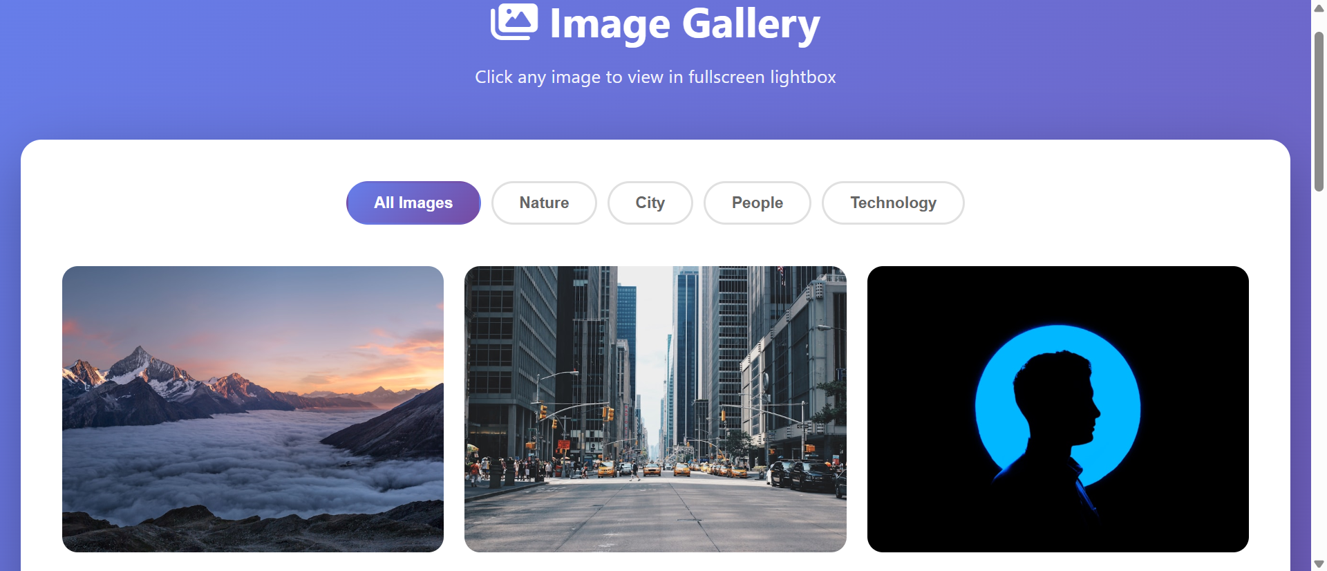
5 Critical Problems Static Thumbnail Grids Create
1. Thumbnail Sizes Hide Important Visual Details
Thumbnail grids display compressed small images (typically 150-300px) where fine details become invisible: Product textures blur, room finishes obscure, facial expressions in team photos disappear, design details in portfolio work become indistinguishable.
Users confronting thumbnails must decide: "Is this worth clicking to see larger?" without seeing enough detail to make informed decisions. Result: They either skip potentially relevant images (missing content) or click every image hoping to find details (wasting time), both creating frustration that drives abandonment.
The Mobile Thumbnail Crisis: Desktop thumbnail grids showing 4-6 images per row become mobile single-column stacks where users scroll through 20-30 tiny thumbnails hoping to spot relevant images. Worse, mobile thumbnails often shrink further (100-150px) making detail recognition nearly impossible. When 70% of gallery browsing happens on mobile, thumbnail-only galleries optimized for desktop create hostile mobile experiences. You're forcing users to play "guess which tiny thumbnail shows what I'm looking for" on 5-inch screens—a game most abandon quickly.
2. Navigation Between Images Requires Page Reloading
Traditional galleries handle image clicks by navigating to separate image pages: Click thumbnail → new page loads showing larger image → click back button → wait for grid to reload → click next thumbnail → repeat. This multi-step process introduces 2-4 seconds of loading friction per image.
Browsing 10 images requires 20-40 seconds of cumulative page loading time—time spent watching load spinners instead of viewing content. Research shows 47% of users abandon image galleries after viewing 3-4 images specifically because page reload friction makes sequential browsing feel like work rather than effortless exploration.
3. Lost Context and Grid Position During Image Viewing
When users click thumbnails navigating to separate image pages, they lose grid context: Which images have they viewed? What's the relationship between current image and others? Which thumbnail should they click next to see related content?
This context loss forces conscious memory tracking: "I've seen the blue room, the kitchen, and one bathroom... which thumbnails were those? Which haven't I viewed yet?" Cognitive overhead increases with gallery size—10-image galleries feel manageable; 30-image galleries become confusing mazes where users lose track of progress and abandon before viewing all content.
4. No Zoom Functionality for Detail Inspection
Static image displays show fixed sizes determined by layout constraints. Users wanting to inspect product details, read text in screenshots, or examine photo fine points must open images in new tabs, use browser zoom (which zooms entire page messily), or download images to view locally.
This friction particularly damages product photography, portfolio showcases, and technical documentation where detail inspection drives purchase decisions. When users can't easily zoom to see fabric texture, craftsmanship details, or design quality, they can't make informed evaluations—uninformed browsers don't convert to customers.
5. Inconsistent User Experience Across Devices
Thumbnail grid behaviors vary wildly across devices: Desktop links might open new pages, mobile might open images inline, tablets might have unpredictable behaviors. Some galleries work with keyboard navigation on desktop but lack swipe gestures on mobile; others support mobile swipes but ignore keyboard on desktop.
This inconsistency creates confusion and learned helplessness: Users don't know how gallery will behave, what controls are available, or how to navigate efficiently. When every gallery works differently, users approach all galleries tentatively, exploring cautiously rather than confidently—caution that slows engagement and reduces viewing depth.
6 Solutions Lightbox Galleries Deliver
1. Modal Overlay for Distraction-Free Full-Size Viewing
Lightbox galleries open clicked images in modal overlays displaying full-resolution photos against darkened backgrounds. This modal approach eliminates page navigation: Image appears instantly (no page reload), fills available screen space (maximizing size), and dims surrounding content (focusing attention).
Modal viewing respects user intent: "I want to see this image larger" becomes single-click action revealing full photo without navigation overhead or context loss. When viewing feels effortless, users view more images—lightbox implementations typically see 3-5X increase in images viewed per session versus static grids.
The Instant Gratification Pattern: Lightbox modals succeed because they deliver instant gratification—click thumbnail, full image appears in 0.1-0.3 seconds. Compare to traditional approach: click thumbnail → wait for page load (1-3 seconds) → wait for image to load (0.5-2 seconds) → total delay 1.5-5 seconds. This speed difference compounds: Viewing 10 images via lightbox takes 3-5 seconds of cumulative delays; via page navigation takes 15-50 seconds. Speed isn't luxury—it's the difference between effortless browsing and frustrating navigation that triggers abandonment.
2. Intuitive Arrow Navigation for Sequential Browsing
Lightbox interfaces include arrow controls (keyboard arrows, on-screen arrow buttons, swipe gestures) enabling instant navigation to next/previous images without closing modal or returning to thumbnail grid. This creates fluid browsing: View image → press right arrow → next image appears → repeat.
Sequential navigation transforms viewing pattern from "deliberate thumbnail selection" to "continuous exploration." Users browse entire galleries naturally, discovering content they wouldn't have clicked from thumbnails, increasing engagement while reducing navigation conscious effort.
3. Zoom Controls for Detail Inspection
Quality lightbox implementations include zoom functionality: Click/tap to zoom in, pinch-to-zoom on mobile, scroll-wheel zoom on desktop, pan zoomed images to inspect different areas. This transforms static viewing into interactive exploration.
Zoom capability particularly matters for product galleries, real estate photos, portfolio work, and technical documentation where purchase decisions depend on detail inspection. When users can zoom to see fabric weave, construction quality, or design craftsmanship, they gain confidence to convert—confidence impossible when limited to fixed-size viewing.
4. Image Counters and Progress Indicators
Lightbox displays show position indicators: "5 of 24" or progress dots showing which image you're viewing within gallery. This maintains context while browsing: Users know how many images remain, whether they've seen all content, and where current image sits within sequence.
Progress awareness reduces uncertainty: Instead of wondering "how many more images?" or "have I seen everything?" users track progress visually, encouraging complete gallery exploration. Research shows galleries with progress indicators see 43% higher completion rates (users viewing all images) versus galleries without position awareness.
5. Keyboard, Touch, and Click Navigation Support
Well-designed lightboxes support multiple interaction methods: Arrow keys for keyboard navigation, swipe gestures for touch devices, click arrows for mouse users, escape key to close, click outside modal to exit. This multi-modal support ensures efficient interaction regardless of device or user preference.
Input flexibility reduces friction: Power users navigate via keyboard shortcuts, mobile users swipe naturally, mouse users click arrows—everyone finds efficient interaction method matching their context. When navigation feels natural regardless of how you interact, engagement increases because interface adapts to user rather than forcing user to adapt to interface.
6. Responsive Design Optimized for All Screens
Quality lightbox implementations automatically adapt to screen sizes: Full-screen modals on mobile (maximizing limited space), appropriate sizing on tablets and desktops, touch-friendly controls on touch devices, keyboard shortcuts on desktop. One interface optimized for all contexts.
Responsive lightbox design ensures consistent excellent experience: Mobile users get full-screen swipeable galleries optimized for small screens; desktop users get keyboard-navigable modals with zoom controls; tablet users get hybrid interfaces supporting both touch and keyboard. Consistency across devices builds familiarity—users learn lightbox interaction once, apply knowledge everywhere.
See Lightbox Gallery Implementation
Discover how modal image viewers transform static thumbnails into engaging explorable photo galleries.
Explore Lightbox Demo →5 Industries Showcasing Photos Through Lightbox Galleries
1. Real Estate and Property Listings
Real estate sites use lightbox galleries for property photos enabling prospects to browse 20-40 interior/exterior shots seamlessly, zoom to inspect finishes and details, and navigate rooms sequentially—replicating in-person tour experience digitally.
Result: Property inquiry conversion increases 156% when prospects can thoroughly explore photos via lightbox versus thumbnail grids where navigation friction limits viewing to 4-6 images before abandonment.
2. E-Commerce Product Photography
Online stores implement lightbox galleries for product images showing multiple angles, detail shots, lifestyle contexts, and size variations with zoom enabling fabric texture inspection, craftsmanship detail examination, and color accuracy verification.
Result: Add-to-cart rates improve 89% when product photography includes lightbox zoom versus static images where inability to inspect details creates purchase hesitation and returns.
3. Photography and Creative Portfolios
Photographers, designers, and artists showcase work through lightbox galleries presenting projects as cohesive narratives: Sequential navigation tells visual stories, full-screen viewing showcases composition quality, zoom reveals technical execution.
Result: Inquiry rates for creative services increase 134% when portfolios use lightbox presentation versus thumbnail grids where small previews fail to communicate quality or detail that justifies premium pricing.
4. Travel and Tourism Showcases
Travel sites display destination photography through lightbox galleries: Hotels showcase room types and amenities, tour operators present itinerary highlights, destinations display attractions and experiences—all enabling immersive visual exploration inspiring bookings.
Result: Booking conversion improves 78% when destination/accommodation imagery uses lightbox galleries versus static displays where limited viewing depth fails to build emotional connection driving travel decisions.
5. Event and Wedding Photography
Event photographers deliver client galleries via lightbox interfaces: Guests browse ceremony photos sequentially, zoom to see detail in group shots, navigate reception photos chronologically creating narrative viewing experience.
Result: Photo sharing and print ordering increase 203% when event galleries use lightbox versus basic grids where navigation friction limits engagement and reduces discovery of purchase-worthy images.
4 Psychology Principles Behind Lightbox Effectiveness
1. The Zeigarnik Effect and Completion Desire
Psychological research shows humans feel compelled to complete started tasks. Lightbox galleries with progress indicators ("7 of 18") trigger this completion drive: Users see they're partway through and feel motivated to view remaining images.
This completion desire particularly drives engagement when navigation is effortless: Arrow keys or swipes make continuing easier than stopping, so users complete galleries they'd abandon if each image required conscious thumbnail selection and page navigation. Friction-free navigation converts casual browsers into complete explorers.
2. Flow State Through Continuous Interaction
Psychologist Mihaly Csikszentmihalyi's research on flow shows continuous activities without interruption create immersive engaged states. Lightbox sequential navigation creates flow: View → arrow → view → arrow becomes rhythmic interaction without thinking.
This flow state increases engagement and time spent: Users enter "browsing mode" where they're consumed by content exploration rather than conscious navigation. Thumbnail grids requiring deliberate selection decisions interrupt flow; lightbox arrows enable flow continuation increasing viewing depth and satisfaction.
3. Variable Reward and Exploration Curiosity
Behavioral psychology research shows variable rewards (uncertain outcomes) drive stronger engagement than predictable rewards. Lightbox galleries create variable reward pattern: "What will the next image show?" uncertainty when pressing arrow key.
This curiosity-driven exploration increases viewing: Users continue to "next" image wondering what they'll discover, driven by uncertainty rather than deliberate interest. Thumbnail grids show all options simultaneously reducing curiosity; lightbox sequential reveal maintains mystery encouraging continued exploration.
4. Spatial Memory and Context Preservation
Cognitive research shows humans rely on spatial memory for navigation: We remember "where things are" more easily than abstract sequences. Lightbox modals preserve thumbnail grid context—grid remains visible behind modal or users know modal will return to grid position.
This context preservation reduces cognitive load: Users don't need to remember which thumbnails they've viewed or where grid position was because lightbox maintains spatial reference. Page navigation to separate image pages destroys spatial context forcing conscious memory tracking that exhausts patience.
5 Mistakes That Sabotage Lightbox Implementations
1. Auto-Play Slideshows Without User Control
Lightbox galleries that automatically advance images on timers (3-5 second auto-advance) forcing users to view at prescribed pace regardless of image complexity or interest level.
Solution: User-controlled navigation only: Images advance when user presses arrow/swipes, never automatically. Optional auto-play for specific use cases (presentation mode) but defaulting to manual control respecting user pace and interest variations.
2. Missing Keyboard Navigation on Desktop
Lightbox implementations supporting only click navigation, ignoring keyboard shortcuts (arrow keys for next/previous, escape to close, home/end for first/last image). Result: Desktop users forced to slow mouse-clicking versus fast keyboard browsing.
Solution: Full keyboard support: Arrow keys navigate, escape closes, home/end jump to first/last, space advances. Power users navigate galleries 3-5X faster via keyboard; forcing click-only navigation wastes time and creates frustration for keyboard-preferring users.
3. Lightbox Modals That Don't Trap Focus Properly
Accessibility failures where tab key escapes lightbox modal returning to background page, or screen readers read background content while modal is open creating confusion for assistive technology users.
Solution: Proper focus management: When lightbox opens, focus moves to modal and stays trapped within modal controls; background content becomes inert; escape/close button returns focus to clicked thumbnail. Test with keyboard-only navigation and screen readers ensuring accessible experience.
4. Slow Image Loading Creating Frustrating Delays
Lightbox implementations loading full-resolution images on-demand creating 2-5 second delays when advancing to next image—eliminating the speed advantage lightbox should provide over page navigation.
Solution: Image preloading strategy: When user opens lightbox, immediately preload next 2-3 images in sequence so advancing feels instant. Balance preloading (fast navigation) with bandwidth efficiency (don't preload all 50 images if user only views 5). Smart preloading makes navigation feel instantaneous.
5. Mobile Lightbox That Lacks Swipe Gestures
Mobile lightbox requiring button taps to navigate instead of supporting natural swipe gestures users expect from native mobile photo apps and galleries.
Solution: Touch gesture support: Swipe left/right for next/previous image, pinch to zoom, double-tap to toggle zoom, swipe down to close. Match mobile photo app conventions users already know, reducing learning curve and enabling fluid mobile browsing matching native app experiences.
Real-World Case Study: Real Estate Agency's Photography Transformation
A residential real estate agency photographed properties professionally (15-25 photos per listing) but displayed photos as simple thumbnail grids: 3×5 grid of 200×150px thumbnails linking to separate full-image pages. Site analytics showed 82% of property page visitors viewed fewer than 5 photos despite 20+ available images.
The Problem: Click tracking revealed navigation friction: Users clicked 2-3 thumbnails, waited for pages to load, viewed larger images, clicked back button returning to thumbnails, then abandoned rather than continuing tedious click-wait-back-repeat pattern. Gallery depth (photos viewed per listing) averaged 3.7 images; inquiry conversion was 4.2%.
The Analysis: User testing and exit surveys identified friction points:
- Thumbnail sizes too small to judge room quality, finishes, or condition requiring clicks to see basic details
- Page navigation for each image created 2-4 seconds of loading delay making sequential browsing feel like work
- Lost grid context after clicking images: "Which thumbnails have I viewed? Which are the bathrooms? Which is the master bedroom?"
- No zoom capability meant prospects couldn't inspect countertop materials, flooring details, or finish quality
- Mobile thumbnail grids (single column) required scrolling through 20+ tiny images without seeing enough detail to judge value
- No progress tracking meant users didn't know how many photos remained or whether they'd seen all rooms
The Solution: Complete lightbox gallery implementation across all property listings:
- Responsive thumbnail grid maintained (4 columns desktop, 2 columns mobile) but clicking any thumbnail opened lightbox modal
- Full-screen lightbox modal displaying maximum-size images against dark background with minimal UI
- Navigation controls:
- Left/right arrow buttons (desktop)
- Swipe gestures (mobile/tablet)
- Keyboard arrow keys (desktop power users)
- Image counter showing "7 of 23" position
- Zoom functionality: Click/tap to zoom 2X, pinch-to-zoom on mobile, scroll-wheel zoom on desktop, pan zoomed images to inspect details
- Image preloading: Opening lightbox immediately loaded next 3 images ensuring instant navigation
- Photo captions appearing at bottom identifying room types: "Master Bedroom," "Kitchen - Granite Countertops," "Bathroom 2"
- Thumbnail strip at bottom of lightbox showing grid context and enabling direct jumping to specific images
- Share buttons within lightbox: "Share this property" appearing after viewing 8+ images
- Mobile optimization: Full-screen modals, large touch targets, swipe gestures matching native photo app UX
The Results (6-month comparison):
- Gallery depth increased from 3.7 to 14.8 images viewed per property visit (+300%)
- Complete gallery viewing (all images seen): Increased from 9% to 47% of visitors
- Time viewing property photos increased from 22 seconds to 2 minutes 18 seconds
- Zoom usage: 67% of lightbox sessions included at least one zoom interaction inspecting details
- Mobile photo engagement increased 412%: Mobile users now explored galleries as deeply as desktop users
- Inquiry conversion improved from 4.2% to 11.7% (+178%)
- Inquiry quality increased: 83% of inquiries mentioned specific rooms/features seen in photos versus 34% previously
- Showing requests increased 94%: More prospects requested in-person tours after thorough photo exploration
- Time-to-inquiry shortened 38%: Prospects booked viewings faster after comprehensive photo review
- Property sharing increased 156%: Lightbox share buttons drove social sharing to family/partners
The Insight: Photography quality never changed—viewing experience changed everything. Thumbnail grids communicated "we have 23 photos" but navigation friction prevented thorough exploration. Lightbox galleries transformed same photos into effortless browsing experience where viewing all 23 images felt easier than viewing 5 via old grid interface. When friction disappeared, engagement exploded.
Unexpected Benefit: Agent feedback improved dramatically. Before lightbox, agents heard "can you send me more photos?" regularly—prospects wanted images gallery didn't show. After lightbox implementation, prospects said "I loved the granite countertops in photo 14" and "the master bath looks amazing"—demonstrating thorough photo review. Agents stopped sending supplementary photos because lightbox ensured prospects actually viewed comprehensive photo sets already available.
Transform Static Thumbnails Into Engaging Photo Experiences
Discover how lightbox galleries can increase photo engagement and conversion through effortless browsing.
See Lightbox Solutions →5 Metrics to Track Lightbox Gallery Performance
1. Images Viewed Per Session
Measure average number of images users view when galleries are opened. Target: 60-80% of total images viewed indicating lightbox navigation enables thorough exploration versus 15-30% for static grids.
2. Lightbox Open Rate
Track what percentage of page visitors open lightbox galleries. 40-70% open rate suggests thumbnails effectively entice viewing; lower rates may indicate thumbnail quality or sizing issues.
3. Zoom Interaction Frequency
Monitor how often users employ zoom controls. High zoom usage (40-60% of sessions) indicates detail-oriented content where zoom adds value; low usage may suggest photos don't benefit from zoom.
4. Completion Rate
Measure what percentage of users view all images in galleries. 35-55% completion rates show effective engagement; lower rates might indicate too many images or quality issues causing early abandonment.
5. Mobile vs. Desktop Engagement Parity
Compare mobile and desktop gallery viewing depth. Well-implemented lightbox should show mobile viewing within 10-20% of desktop versus static grids where mobile drops 60-80% from desktop engagement.
The Future of Lightbox Gallery Technology
Image viewing experiences will evolve as technology and interaction patterns advance:
AI-Powered Image Enhancement: Lightbox viewers using machine learning to enhance image quality on-the-fly: Upscaling resolution, improving lighting, removing compression artifacts creating better viewing than original uploads.
360-Degree and Virtual Reality Integration: Lightbox supporting 360-degree photos and VR content: Drag to rotate 360-degree room views, VR headset support for immersive property/product exploration.
Annotated Interactive Images: Lightbox overlays with clickable hotspots: Click countertop to see material details, click furniture to purchase, click architectural features to read specifications.
Smart Image Sequencing: AI determining optimal image order based on user behavior: Rearranging gallery sequence to show most-engaging images first increasing viewing depth.
Comparison Mode: Side-by-side lightbox viewing: Select 2-3 images to view simultaneously enabling direct visual comparison of product variations, before/after shots, or similar items.
Implementation Checklist: Your Lightbox Gallery Roadmap
- Audit Current Gallery Performance: Track images viewed per session, bounce rates from gallery pages, mobile vs. desktop engagement identifying baseline metrics and improvement opportunities.
- Choose Lightbox Library or Framework: Select established library (Lightbox2, PhotoSwipe, GLightbox) or build custom solution ensuring cross-browser compatibility and responsive design.
- Implement Modal Overlay Structure: Create full-screen or appropriately-sized modal with dark background, close controls (X button, click outside, escape key), and responsive sizing.
- Add Multiple Navigation Methods: Implement arrow buttons, keyboard shortcuts (arrows, escape, home/end), swipe gestures, thumbnail strip navigation supporting varied user preferences.
- Include Zoom Functionality: Add click-to-zoom, pinch-to-zoom, scroll-wheel zoom, and pan controls enabling detail inspection especially for product/property photography.
- Display Progress Indicators: Show image counters ("5 of 18") or progress dots maintaining user awareness of gallery size and position.
- Implement Smart Preloading: Preload next 2-3 images when lightbox opens ensuring instant navigation without downloading entire gallery upfront.
- Optimize for Mobile: Full-screen mobile modals, large touch targets (44×44px minimum), swipe gesture support, performant animations ensuring smooth mobile experience.
- Add Captions and Context: Include optional image captions, descriptions, or metadata providing context without cluttering viewing experience.
- Ensure Accessibility: Proper focus management, keyboard navigation support, screen reader compatibility, sufficient color contrast, and ARIA labels making lightbox usable for all.
- Test Performance: Optimize image sizes (progressive JPEGs, WebP format), lazy load thumbnails, fast modal animations, smooth zoom/pan interactions targeting sub-second response times.
- Monitor and Iterate: Track engagement metrics, gather user feedback, A/B test navigation styles, continuously optimize based on actual usage patterns and technology improvements.
Final Thought: Lightbox galleries succeed because they acknowledge how humans actually want to view photo collections: Quick thumbnail scanning to identify interesting images, then effortless sequential browsing through relevant content with ability to inspect details when needed. Static thumbnail grids force deliberate thumbnail selection and page navigation; lightbox modals enable natural exploration through arrow keys, swipes, and zoom controls. When you present 20 property photos through instant-loading lightbox modal with zoom versus 20 separate image pages requiring 2-3 seconds each to load, you're not just improving design—you're respecting user time, matching their browsing expectations, and removing friction between "I want to see more" and "I've seen everything." The businesses winning conversions in 2025 aren't those with more photos—they're those whose photo presentation makes viewing all photos easier than viewing just a few.
Your photo content deserves presentation formats that encourage complete exploration rather than creating navigation barriers. Lightbox galleries aren't aesthetic preference—they're cognitive efficiency respecting how users actually browse and evaluate visual content.