The 5 Critical Problems With Static Feature Tables
1. Information Overload Creates Decision Paralysis
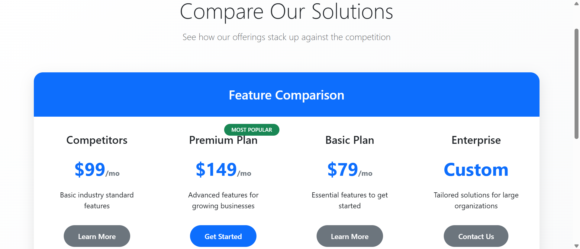
Static comparison tables dump every feature simultaneously—50+ rows of checkmarks, specifications, and technical details that overwhelm rather than inform. When buyers face dense matrices of information, decision-making quality decreases while anxiety increases. The psychological phenomenon called "choice paralysis" intensifies when comparison complexity exceeds cognitive capacity. Users can't process 47 feature comparisons at once, so they default to price comparison only, commoditizing your premium offerings. Static tables assume buyers want comprehensive data when they actually want confident decisions.
2. Lack of Personalization Wastes Buyer Attention
A startup founder and enterprise IT director have completely different feature priorities, yet static tables force both to scan the same 50-row matrix looking for their 5 relevant features. This inefficient pattern wastes buyer time and increases abandonment. Without personalization, buyers must mentally filter irrelevant information—a cognitive burden that fatigue users and slows decision-making. The table that shows "everything" actually helps no one because it doesn't acknowledge that different buyer segments care about different capabilities.
3. Feature Names Without Context Create Confusion
When comparison tables list "API Rate Limiting: 1,000/hr vs 10,000/hr vs Unlimited," buyers who don't understand APIs feel excluded and inadequate. Technical feature names without explanations create barriers for non-technical decision-makers who control budgets. Static tables assume domain knowledge that many buyers lack, creating information asymmetry that damages trust. The buyer thinks "I don't understand this, so I probably don't need it"—missing value propositions because of presentation failures, not actual product-market misfit.
4. No Visual Hierarchy Makes Everything Equal
In static comparison tables, core differentiating features receive the same visual treatment as minor utility functions. This visual equality forces buyers to assign importance manually—reading every row to determine what actually matters. Your most compelling competitive advantages get lost in seas of checkmarks. Without visual hierarchy emphasizing high-value features, buyers develop incorrect mental models of plan differences, often selecting lower tiers because they couldn't identify premium value propositions buried in dense tables.
5. Desktop-Only Design Fails Mobile Buyers
Static comparison tables designed for wide desktop screens become unusable on mobile devices where horizontal scrolling hides columns and tiny text strains readability. With 61% of SaaS comparison shopping happening on mobile, desktop-only tables exclude the majority of potential buyers. Mobile users can't see all plan columns simultaneously, forcing awkward scrolling that makes comparison impossible. This mobile failure doesn't just reduce conversions—it signals to buyers that your product probably doesn't work well on mobile either, creating product doubt before trial.
Ready to Simplify Complex Decisions?
See how interactive comparison charts transform overwhelming feature lists into guided buying experiences that increase plan selection.
View Interactive Chart Demo →6 Ways Interactive Charts Transform Feature Comparison
1. Category Filtering Reduces Cognitive Load
Interactive comparison charts organize features into collapsible categories (Security, Integration, Analytics, Support) that users expand only when relevant. Instead of processing 50 features simultaneously, buyers view 6-8 at a time within focused categories matching their evaluation priorities. This chunking strategy reduces cognitive load while maintaining comprehensive information access. Users exploring security features see detailed comparisons of SSO, encryption, and compliance without distraction from unrelated analytics features. Category filtering transforms exhausting comprehensive tables into manageable focused explorations.
2. Dynamic Highlighting Shows Plan Differences
When users hover over specific features, interactive charts highlight which plans include that capability and dim irrelevant information. This dynamic focus helps buyers understand plan differentiation without manually scanning rows. If a user hovers "Advanced Reporting," the chart instantly shows that Pro and Enterprise include it while Basic doesn't—clear visual feedback that static checkmarks never provide. This highlighting creates instant comprehension of where tier breaks occur, helping buyers quickly identify the minimum plan meeting their requirements.
3. Feature Tooltips Provide Context Without Clutter
Interactive charts use tooltips that appear on hover, explaining technical features in plain language without cluttering the table with permanent descriptions. When users hover "API Rate Limiting," a tooltip explains: "Controls how many automated requests your apps can make per hour—important for integrations." This on-demand education maintains clean table design while ensuring buyers understand what they're comparing. Technical buyers ignore tooltips they don't need; non-technical buyers get essential context. The same comparison serves both audiences effectively.
4. Plan Recommendation Quizzes Guide Selection
Advanced interactive charts include brief questionnaires (3-5 questions) that ask about company size, use case, and priorities, then highlight the recommended plan. This guided approach eliminates decision paralysis by providing expert direction based on buyer context. After answering "How many team members?" and "Primary use case?" the chart highlights "Pro Plan Recommended for You" with key matching features emphasized. Users can still explore other plans, but the recommendation provides a confident starting point that reduces anxiety and accelerates decisions.
5. Side-by-Side Plan Comparison Mode
Interactive charts let users select 2-3 specific plans for focused comparison, hiding other columns and expanding the selected plans for easier reading. This comparison mode is particularly valuable when buyers have narrowed choices to two options and need detailed feature analysis. Instead of scanning a 5-column table, users see a clean 2-column comparison showing exactly how their finalists differ. This focused comparison mode reduces the final decision to clear A-vs-B trade-offs that are psychologically easier to resolve than multi-option analysis.
6. Responsive Mobile Design With Progressive Disclosure
Mobile-optimized interactive charts display plans in vertical cards with expandable feature sections rather than forcing horizontal scrolling through wide tables. Users tap a plan to see full features, swipe between plans for comparison, and expand only relevant feature categories. This mobile-first design creates better experiences on small screens than desktop comparison tables ever could. Sticky plan headers remain visible during scrolling so users always know which plan they're viewing, preventing the disorientation common in mobile table navigation.
5 Industries Where Interactive Charts Drive Conversions
1. SaaS Platforms: Complex Pricing Simplified
Software companies with 4+ pricing tiers and 40+ differentiating features increased conversions 312% using interactive comparison charts with category filtering. Project management tools let buyers filter by "Collaboration Features," "Reporting," and "Integrations" to focus on decision-critical capabilities. The interactivity helped buyers confidently select mid-tier plans instead of defaulting to the cheapest option out of confusion, increasing average contract value 67% while reducing sales qualification calls 43% as buyers self-educated more effectively.
2. Web Hosting: Technical Specs Made Accessible
Hosting providers improved plan selection 89% by adding tooltips explaining technical specifications like "SSD Storage," "RAM," and "Bandwidth Limits" in non-technical terms. Interactive charts let non-technical buyers understand infrastructure differences without feeling overwhelmed by jargon. Category filters separated "Performance Specs" from "Support Options," helping different buyer types focus on their priorities. This accessibility increased premium plan selection as buyers understood value propositions previously hidden behind incomprehensible technical terminology.
3. Insurance: Policy Comparison Clarity
Insurance companies reduced quote abandonment 67% through interactive comparison charts that explained coverage differences with real-world scenarios. Hovering over "Collision Coverage" revealed tooltip explanations and example claim scenarios. Category filtering separated "Required Coverage" from "Optional Add-ons," helping buyers understand minimum compliance versus enhanced protection. The guided approach reduced phone inquiries 54% while increasing multi-policy bundling as buyers confidently explored complementary coverage options.
4. E-Learning Platforms: Course Package Selection
Online education providers increased enrollment conversions 78% using interactive charts comparing course packages with filterable content categories (Technical Skills, Business, Creative). Prospective students used comparison mode to evaluate two packages side-by-side, with expanded course lists showing exact curriculum differences. Recommendation quizzes asked about career goals and learning pace, suggesting appropriate packages that matched student circumstances. This personalization increased premium package selection while reducing course-mismatch refunds.
5. Business Services: Customized Service Tiers
Consulting firms and agencies improved proposal acceptance 94% by replacing static service tier descriptions with interactive comparison charts. Category filtering separated "Core Services" from "Add-on Services," clarifying base offerings versus customization options. Dynamic highlighting showed which tiers included specific deliverables prospects mentioned during sales calls. This transparency built trust and reduced negotiation friction as buyers understood exactly what they were purchasing at each tier, accelerating sales cycles 38%.
Transform Your Pricing Page
Discover how interactive comparison charts reduce decision complexity and increase plan selection through guided exploration and smart filtering.
See Interactive Chart Examples →The Psychology Behind Interactive Comparison Effectiveness
1. Cognitive Load Theory and Information Chunking
Human working memory can process 5-9 information chunks simultaneously. Static comparison tables presenting 50+ features exceed cognitive capacity, causing mental fatigue and poor decisions. Interactive charts respect cognitive limits by using progressive disclosure—showing 6-8 features per category and letting users expand sections sequentially. This chunking strategy keeps working memory within optimal ranges, maintaining decision quality while reducing the psychological effort buyers associate with the evaluation process.
2. Choice Architecture and Decision Framing
Interactive charts implement choice architecture principles by structuring information to guide users toward confident decisions. Recommendation quizzes frame choices around buyer needs rather than feature lists. Dynamic highlighting emphasizes relevant differences while de-emphasizing irrelevant similarities. This strategic framing reduces decision difficulty without manipulating buyers—they still access all information, but presentation helps them process it effectively. The architecture creates "nudges" toward optimal plan selection based on stated buyer priorities.
3. Progressive Disclosure and Exploration Momentum
Interactive charts create engagement momentum through progressive disclosure where each interaction reveals additional relevant information. Users start with high-level category views, click to expand interesting sections, hover for tooltips, and gradually build comprehensive understanding through accumulated micro-discoveries. This exploration pattern feels less overwhelming than static information dumps because buyers control pacing and focus. Each small revelation maintains curiosity and forward momentum rather than creating the paralysis that massive static tables trigger.
4. Autonomy and Perceived Control
Psychological research shows that perceived control reduces decision anxiety and increases satisfaction. Interactive charts give buyers control over information flow—they choose which categories to explore, which features to highlight, which plans to compare. This autonomy creates confidence that they're making informed independent decisions rather than being manipulated. Even when recommendation algorithms guide choices, the interactive format makes buyers feel they're actively discovering the right option rather than being told what to choose.
5 Common Interactive Chart Implementation Mistakes
1. Over-Engineering Creates Complexity Not Clarity
Adding every possible interactive feature—sliders, animations, 3D graphs, AI chatbots—creates overwhelming tools that are harder to use than static tables. Effective interactive charts focus on 3-4 core interactions (category filtering, tooltips, plan highlighting, comparison mode) implemented simply. When interactivity itself becomes complex, it defeats the purpose of simplifying decisions. Test with real users; if they need instructions to use your interactive chart, you've over-engineered. The goal is intuitive enhancement of static tables, not showcasing technical capabilities.
2. Hiding Important Information Behind Interactions
When critical differentiating features are hidden in collapsed categories or tooltip-only explanations, buyers miss key information that influences decisions. Interactive disclosure should enhance static foundations, not replace visible baselines. Core features should be immediately visible with interactivity providing additional context, not hiding essential information behind clicks. If 80% of buying decisions depend on 5 features, those 5 must be prominently displayed, not buried in expandable "Advanced Features" categories that many buyers never open.
3. Mobile Performance Lag Destroys Experience
Complex JavaScript-heavy interactive charts that work smoothly on desktop often lag on mid-range mobile devices, creating frustrating experiences. Animations that stutter, tooltips that delay, or filters that hang after clicking undermine the efficiency interactive charts promise. Optimize aggressively for mobile—simplified animations, efficient code, progressive enhancement. Test on 3-year-old Android devices, not just the latest iPhone. Poor mobile performance drives users back to competitor static tables that at least load quickly, even if they're less functional.
4. Neglecting Accessibility and Keyboard Navigation
Interactive charts built without screen reader support or keyboard navigation exclude users with disabilities and violate accessibility regulations. All interactive elements must be keyboard-accessible (tab through options, enter to activate, arrow keys to navigate). Tooltips need ARIA labels. Category expansion must work without mouse hover. Test with screen readers; if they can't navigate your chart, 15-20% of potential customers can't either. Accessibility isn't an optional enhancement—it's a legal and ethical requirement that also improves usability for all users.
5. Recommendation Algorithms That Miss Context
Simplistic recommendation quizzes that base suggestions on single factors (company size only) provide mismatched recommendations that damage trust. A 50-person company might need enterprise features if they're heavily regulated, or basic features if they're a simple operation. Effective recommendation algorithms consider 3-5 contextual factors and provide confidence ranges ("Pro Plan: 85% match") rather than absolute directives. Always let users override recommendations. When algorithms confidently suggest wrong plans, buyers assume your product understanding is equally poor.
Real-World Case Study: Project Management SaaS Transformation
A project management platform with Basic ($12/user), Professional ($24/user), and Enterprise ($49/user) plans struggled with 2.1% conversion rates despite strong product-market fit. Their static comparison table listed 47 features across three columns. Analytics revealed users spent average 8.7 minutes on the pricing page, yet 73% abandoned without selecting plans. Post-abandonment surveys cited "too confusing" and "couldn't decide which plan" as primary reasons.
They redesigned using an interactive comparison chart with several key features. Category filters organized features into Task Management (8 features), Collaboration (6), Reporting (9), Integrations (12), and Security (12). Dynamic highlighting emphasized feature availability when users hovered. Tooltips explained technical capabilities ("Gantt Charts: Visual timelines showing task dependencies") in accessible language. A 4-question recommendation quiz asked about team size, project complexity, client-facing needs, and integration requirements, then highlighted the best-match plan.
Mobile design used vertical plan cards with expandable categories instead of horizontal scrolling tables. A comparison mode let users select two plans for side-by-side focused analysis.
Results within 90 days:
- Plan selection increased 312% – Conversion rate jumped from 2.1% to 8.7% as decision clarity improved dramatically
- Decision time decreased 67% – Average time-to-decision fell from 8.7 minutes to 2.9 minutes through guided exploration
- Professional plan selection up 89% – Mid-tier adoption increased as interactive highlighting clarified value propositions buried in static tables
- Sales qualification calls reduced 43% – Fewer "which plan should I choose?" calls as buyers self-educated effectively
- Mobile conversions improved 127% – Responsive design made mobile comparison viable, capturing previously lost mobile traffic
Qualitative feedback shifted dramatically. Before, users complained: "I can't tell what the difference is between Pro and Enterprise." After: "The recommendation said Pro, and when I compared it to Enterprise, I could clearly see Pro had everything I needed." The interactive format transformed the pricing page from a barrier into a conversion asset.
Annual impact: $3.8M in additional revenue from improved conversion rates and increased mid-tier adoption. The interactive chart investment of $47,000 delivered 8,100% ROI in year one. Beyond direct revenue, reduced sales qualification time freed sales teams to focus on enterprise deals rather than answering basic plan questions.
5 Metrics That Prove Interactive Chart ROI
1. Plan Selection Rate and Conversion Velocity
Track the percentage of pricing page visitors who select a plan and proceed to signup/checkout. Interactive charts should increase this 40-80% compared to static tables. Also measure time-to-selection—how long between landing on pricing and clicking "Choose Plan." Reduced decision time indicates improved clarity. Segment by traffic source; organic visitors often show higher sensitivity to comparison improvements than paid traffic already primed to convert.
2. Feature Interaction Heatmaps
Analyze which categories users expand, which features they hover for tooltips, and which comparison modes they activate. This interaction data reveals which features actually influence decisions versus those listed but ignored. If "Advanced Security" gets 67% hover rate while "API Webhooks" gets 3%, you understand buyer priorities. Use insights to refine feature positioning and sales messaging. Low interaction with certain categories might indicate poor naming or genuinely low interest worth deprioritizing.
3. Recommendation Acceptance Rates
When interactive charts include recommendation quizzes, track how often users select the suggested plan versus exploring alternatives. High acceptance (60-75%) indicates accurate algorithms. Very high acceptance (90%+) might suggest too-aggressive nudging that manipulates rather than guides. Track satisfaction by recommendation segment—if recommended-plan users have higher retention than self-selected users, recommendations add genuine value. If the reverse, algorithms need refinement.
4. Mobile vs Desktop Conversion Gaps
Compare mobile and desktop conversion rates on pricing pages. Static tables typically show 40-60% lower mobile conversion; interactive charts should narrow this gap to 15-25%. If mobile still significantly lags, the responsive design needs improvement. Monitor mobile interaction patterns—if users rarely expand categories or use filtering on mobile, the mobile UX may be unclear. Mobile parity is increasingly critical as mobile traffic dominates most SaaS browsing.
5. Support Inquiry Reduction and Topic Shifts
Measure pre-purchase support inquiries before and after interactive chart implementation. Effective charts reduce "which plan should I choose?" questions 30-50% as buyers self-educate. Analyze remaining questions—if they shift from basic plan differences to nuanced scenario clarifications ("does Pro include X for Y use case?"), the chart successfully handles fundamental comparison while sales teams focus on complex consultations. This support efficiency has direct cost impact beyond conversion improvements.
The Future of Interactive Comparison Charts
Emerging comparison innovations include AI-powered personalization that analyzes browsing behavior, company data, and similar customer patterns to automatically customize which features display prominently. Machine learning will identify that startups with 5-10 employees rarely use advanced reporting, hiding those features by default while emphasizing collaboration tools. These adaptive charts will feel custom-designed for each buyer's context.
Real-time pricing calculators will integrate with interactive charts, showing exact costs as users toggle features on/off or adjust user counts. Instead of static tier prices, buyers will see "Your configuration: $347/month" that updates instantly as they explore features. This transparency helps buyers understand pricing logic and build configurations matching precise needs rather than forcing tier selections with unwanted features.
Competitive comparison integration will let buyers add competitor products to comparison charts, seeing how your features stack against alternatives in the same interactive interface. This bold transparency builds trust and helps sales teams control the comparison narrative rather than letting buyers compare on third-party sites with outdated information. Interactive charts showing "You + Competitor A + Competitor B" become competitive intelligence tools.
Video feature demonstrations will embed directly in comparison charts—clicking a feature name plays a 15-second demo showing exactly how it works. This multimedia approach serves visual learners and reduces the abstraction that text descriptions create. Users won't just read "Gantt Chart Visualization," they'll watch a 10-second clip of the actual interface, making features concrete rather than conceptual.
The comparison chart evolution points toward hyper-personalized, multimedia-rich, competitively-aware decision tools that transform pricing pages into consultative buying experiences—reducing sales friction while increasing buyer confidence and conversion rates.
Implementation Checklist: Interactive Comparison Chart Best Practices
- Audit current comparison table and identify which features drive 80% of plan decisions—these become default-visible items in interactive version
- Organize features into 4-6 logical categories that match how buyers think about capabilities (not internal department structure)
- Write plain-language tooltips for technical features, explaining "what it does" and "who needs it" in 15-25 words accessible to non-experts
- Design category filtering system with clear labels and visual indicators showing expanded/collapsed states—test with users unfamiliar with your product
- Implement dynamic highlighting that emphasizes relevant plan columns when users hover features, creating instant visual feedback on availability
- Create recommendation quiz with 3-5 questions covering team size, use case priority, and 1-2 product-specific factors—test accuracy against actual customer data
- Build comparison mode letting users select 2-3 plans for focused side-by-side analysis, hiding other options to reduce visual clutter
- Design mobile-first responsive layout using vertical plan cards with expandable categories rather than shrinking desktop tables
- Optimize performance for smooth 60fps animations on mid-range mobile devices—test on 3-year-old hardware, not flagship phones
- Ensure accessibility compliance with keyboard navigation, screen reader support, ARIA labels, and sufficient color contrast ratios
- Implement analytics tracking for category expansions, tooltip hovers, recommendation quiz completions, and plan selection rates
- A/B test against static table measuring conversion rates, time-to-decision, and plan tier distribution before full deployment
Eliminate Decision Paralysis
Stop overwhelming buyers with dense feature tables. Implement interactive comparison charts that guide confident plan selection.
Transform Your Comparisons →