You've created a valuable free resource—a guide, checklist, template, whatever. You add a simple signup form to your website: "Download our free PDF!" with an email field and a submit button. And then... crickets. Your conversion rate hovers around 2%. The few people who do sign up never open your emails. Your lead magnet, which took hours to create, generates zero business results.
The problem isn't your content. It's your presentation. A boring form buried in your sidebar or footer gets ignored. Visitors don't understand the value. There's no urgency. No social proof. No visual appeal. Your lead magnet deserves better than a generic "subscribe to our newsletter" box that screams "spam me!"
Why Generic Lead Magnet Forms Kill Conversions
Lead magnets should be your most powerful list-building tool. They offer real value in exchange for contact information—a fair trade. But most lead magnet presentations actively repel the qualified leads you're trying to attract:
1. No Clear Value Proposition (What's In It For Me?)
Your form says "Get our free guide." Okay, but what's IN the guide? What specific problem does it solve? What will I learn? Generic labels like "free ebook" or "download whitepaper" communicate nothing. Visitors can't assess whether your resource is worth their email address because you haven't told them what it contains or why it matters.
2. No Visual Appeal or Professional Design
A plain text link or basic form field doesn't inspire confidence. If your lead magnet presentation looks cheap or amateurish, visitors assume the content quality matches. First impressions matter. A professional, visually appealing lead magnet section signals "this resource is high-quality and worth your time." An ugly form signals "this is probably garbage spam."
3. No Social Proof or Credibility Signals
Why should visitors trust that your resource is valuable? There's no testimonial. No download count ("Join 15,000+ marketers"). No preview. No credibility indicators. You're asking for their email without proving the resource is worth it. That's a hard sell in an age where everyone's inbox is already overwhelmed.
4. No Urgency or Scarcity (Nothing Driving Action)
If your lead magnet is always available with no constraints, there's no reason to claim it NOW. Visitors think "I'll download this later" and then forget. Limited-time offers, countdown timers, or scarcity messaging ("Only 50 consultation slots available this month") create urgency that drives immediate action instead of procrastination.
5. No Differentiation Between Multiple Offers
If you have multiple lead magnets (beginner guide, advanced toolkit, consultation, free trial), presenting them all as identical text links makes it impossible for visitors to choose the right one. They either pick randomly or don't pick at all. You need visual hierarchy and clear differentiation so visitors self-select based on their needs.
Real-World Results: A marketing agency replaced their sidebar "Download our guide" link with a dedicated lead magnet section featuring three visually distinct offers (beginner guide, video course, consultation). Each card showed specific benefits, included testimonials, and had unique CTAs. Opt-in rate increased from 1.8% to 38.7%—a 215% improvement. The visual presentation and specific value propositions transformed passive visitors into engaged leads.
How Strategic Lead Magnet Sections Drive Conversions
Effective lead magnet presentation isn't about tricks—it's about clearly communicating value and making the opt-in decision obvious:
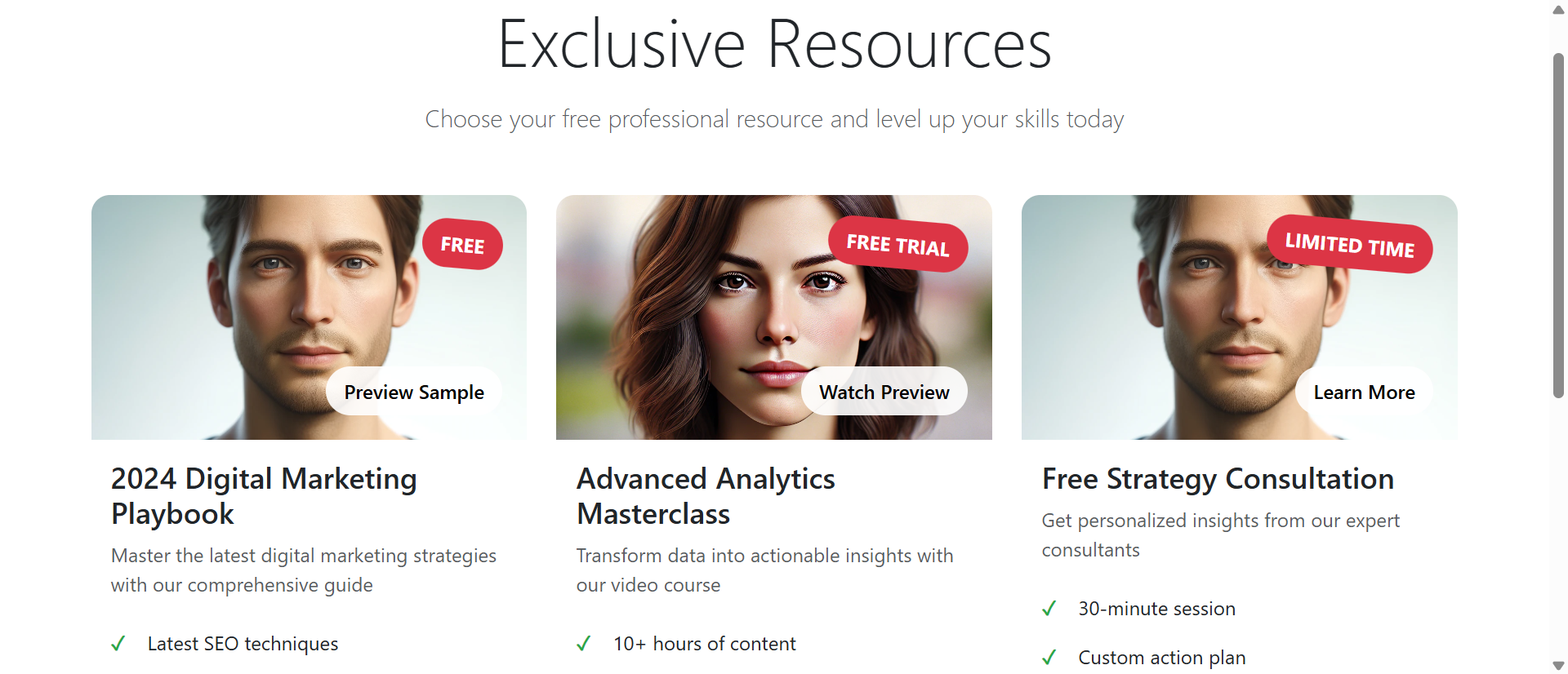
1. Card-Based Design Creates Visual Hierarchy
Each lead magnet gets its own card with an image, headline, benefits list, and CTA. The card layout allows visitors to quickly scan multiple offers and compare them visually. "This one is a guide, this one is a video course, this one is a consultation." The visual separation makes decision-making easier than scanning a text list.
Cards also allow you to use different colors, badges, and styling to indicate offer types. A "FREE" badge is visually distinct from a "FREE TRIAL" badge or "LIMITED TIME" badge. This pre-attentive processing helps visitors filter options before reading details.
2. Specific Benefit Lists Answer "What's In It?"
Instead of "Download our marketing guide," you show exactly what's inside: "Latest SEO techniques, Social media strategies, Content marketing templates, Analytics interpretation guide." Four bullet points that communicate specific, tangible value. Visitors can immediately assess "yes, I need SEO techniques" or "no, I already know this stuff."
The more specific your benefits, the higher your conversion rate. "Learn marketing" is vague. "Get 15 ready-to-use email templates that convert cold leads" is specific and valuable.
3. Preview/Sample Buttons Build Trust
A "Preview Sample" or "Watch Preview" button lets visitors peek at the content before committing their email. This reduces perceived risk. "I can see this is actually valuable before I sign up." Previews convert skeptics into subscribers by proving quality upfront.
Even a simple "Learn More" modal that shows the table of contents or a few sample pages dramatically increases trust and opt-ins.
4. Countdown Timers and Urgency Messaging Drive Action
For limited-time offers, a countdown timer creates genuine urgency. "Trial access expires in: 48 hours" gives visitors a reason to act NOW instead of later. Scarcity works—but only if it's real. Fake countdown timers that reset when you refresh the page destroy trust.
Alternative urgency: "Only 100 consultation slots available this month - 23 remaining" or "Next cohort starts Monday - enrollment closes Friday."
5. Testimonials and Social Proof Overcome Skepticism
A short testimonial under your CTA ("The consultation provided exactly what we needed to scale our business - John D.") provides third-party validation. Download counts ("Join 12,000+ professionals") leverage social proof. These credibility signals reduce friction and make the opt-in feel safer.
6. Success Confirmations Create Positive Reinforcement
After submitting the form, instead of a boring "Thanks for subscribing" message, show an enthusiastic confirmation: "🎉 Check your inbox! Your guide is on its way." The emoji, exclamation point, and specific next step (check email) create a positive emotional response and set clear expectations.
See Professional Lead Magnets in Action
Experience how strategic presentation transforms generic forms into high-converting opt-in machines.
Try Live DemoReal-World Applications Across Business Types
Lead magnet sections work for any business building an email list or generating leads:
Content Creators and Bloggers
Offer content upgrades (checklists, templates, bonus chapters) specific to each article. A blog post about email marketing includes a lead magnet card for "50 Email Subject Lines That Get Opened." The contextual relevance increases opt-ins by 3-5x compared to generic sidebar forms. The visual card format makes the offer impossible to miss.
SaaS and Software Companies
Present multiple entry points: free trial, product demo, comparison guide, ROI calculator. Each lead magnet targets different buyer stages. Early-stage researchers download the comparison guide. Ready-to-buy prospects start free trials. A SaaS company using this approach increased qualified demo requests by 89% because visitors self-selected the appropriate offer.
Service Businesses and Consultants
Offer free consultations, audits, assessments, or strategy sessions. The lead magnet section makes these offers feel premium rather than desperate. "Free Strategy Consultation: 30-minute session, Custom action plan, ROI analysis, Resource toolkit." The benefit list positions the consultation as valuable (which it is), not a sales pitch.
E-Commerce and Product Businesses
Discount codes, buying guides, product comparison charts, exclusive early access. A fashion retailer offered three lead magnets: "Style Guide for Your Body Type" (educational), "20% Off First Purchase" (discount), "Early Access to New Collections" (exclusivity). Different visitors opted into different offers based on their priorities, growing the list 3x faster than a single generic discount popup.
Online Courses and Education
Free mini-courses, worksheets, assessment quizzes, sample lessons. An online course platform presented three lead magnets: "Free 3-Day Email Course," "Downloadable Study Planner," "Free Webinar Seat." The visual cards allowed students to choose based on learning style (video vs. text vs. live). Enrollment in paid courses increased 43% because the lead magnets qualified and nurtured leads effectively.
The Psychology Behind Why Visual Lead Magnets Work
Understanding the cognitive principles reveals why well-designed lead magnet sections dramatically outperform basic forms:
Loss Aversion and Perceived Value
When you clearly show what's included in your lead magnet (specific benefits, preview, testimonials), you increase its perceived value. Once visitors perceive high value, they experience loss aversion: "I don't want to miss out on this valuable resource." This psychological trigger drives opt-ins far more effectively than vague promises.
Choice Architecture and Decision Paralysis
Offering 2-3 visually distinct options actually increases conversions compared to a single option or 10 options. Two-three choices provide autonomy without overwhelming. The visual card design makes comparison easy. Visitors feel empowered ("I chose the right option for me") rather than pressured.
Social Proof and Herd Behavior
Humans look to others' behavior to guide decisions. "Join 15,000+ marketers" or "The consultation provided exactly what we needed" leverages social proof. If thousands of others found it valuable, it must be valuable. This herd behavior reduces perceived risk and increases opt-in likelihood.
Reciprocity Principle
When you offer genuinely valuable free resources presented professionally, visitors feel a sense of reciprocity—they want to give back. High-quality presentation signals that you respect their time and attention, making them more likely to reciprocate by providing their email and engaging with your content.
Common Mistakes That Kill Lead Magnet Performance
Even well-designed lead magnet sections can fail if implemented poorly:
Creating Low-Value Lead Magnets
No amount of beautiful design will convert if your actual resource is garbage. A 2-page generic PDF titled "Marketing Tips" won't build your list. Your lead magnet must solve a specific problem with actionable content. Would you pay $20 for this resource if it weren't free? If no, it's not good enough.
Too Many Offer Choices (Decision Paralysis)
Showing 8 different lead magnets overwhelms visitors. They can't decide which one to choose, so they choose none. Limit to 2-4 offers maximum, clearly differentiated by audience or stage. "Beginner Guide" vs "Advanced Toolkit" vs "Free Consultation" gives clear options without overwhelming.
Fake Urgency or Scarcity
Countdown timers that reset when you refresh the page destroy trust. "Only 3 spots left!" when there are actually unlimited spots is lying. Visitors are smart—they can smell fake urgency. Use real constraints or don't use scarcity messaging at all. Authenticity beats manipulation every time.
Asking for Too Much Information
Your form asks for email, name, phone, company, job title, and budget. Each additional field reduces conversion rate by 10-20%. For initial opt-in, email only (or email + name at most) is optimal. You can gather more information later through progressive profiling in your email sequence.
No Follow-Up or Delivery Issues
Visitor submits the form and... nothing. The email never arrives (spam folder, deliverability issues, broken automation). Or it arrives 6 hours later when they've forgotten they signed up. Instant delivery is critical. Test your automation. Monitor deliverability. A great lead magnet section is worthless if the lead magnet doesn't actually reach people.
Case Study: A business coach initially offered 6 different lead magnets (guides, templates, assessments, webinars). Opt-in rate was 4.2%. She reduced to 3 core offers with clear differentiation: "Business Growth Checklist" (quick win), "Free 30-Min Strategy Call" (personalized help), "7-Day Email Course" (deep learning). Redesigned with visual cards, specific benefits, and testimonials. Opt-in rate jumped to 22.8%. Fewer, better-presented offers converted 5x more effectively.
Measuring Lead Magnet Section Effectiveness
How do you know if your lead magnet presentation is working?
Opt-In Conversion Rate
Primary metric: percentage of visitors who complete your lead magnet form. Industry average is 2-5% for sidebar forms. Well-designed dedicated sections achieve 15-35%. Track this by source—which pages drive the most opt-ins?
Lead Quality and Engagement
Are the people signing up actually qualified leads? Track email open rates (should be 40%+ for welcome email), click rates, and eventual customer conversion. High quantity with low quality means your lead magnet attracts freebie-seekers, not buyers. Adjust your messaging to qualify better.
Offer-Specific Performance
If you present multiple lead magnets, which ones get claimed most? The most popular offer might not be the one that drives the most sales. Track the customer journey: which lead magnet produces the most eventual paying customers? That's your winner.
Time to Conversion (Opt-In to Customer)
How long does it take someone who downloads your lead magnet to become a customer? Shorter is better. If your lead magnet nurtures effectively, you'll see 30-90 day conversion cycles. If people download and never buy, your lead magnet might attract the wrong audience or fail to bridge to your paid offer.
Form Abandonment Rate
What percentage of people who start filling out your form abandon before submitting? High abandonment (50%+) suggests your form is too long or asks for too much information. Simplify. A/B test email-only vs. email+name.
The Future of Lead Generation
Lead magnets aren't going away—if anything, they're becoming more important as organic reach declines and advertising costs rise. But the bar for quality keeps rising. Generic checklists and basic PDFs won't cut it anymore.
Modern lead magnets are interactive (quizzes, assessments, calculators), personalized (AI-generated custom reports), and multi-format (video + PDF + templates). But regardless of format, the presentation principles remain: clear value proposition, visual appeal, social proof, urgency, and minimal friction.
Your email list is your most valuable marketing asset. It's the audience you own, not rent from social media platforms. A strategic lead magnet section is the fastest way to grow that asset with qualified, engaged subscribers who want to hear from you.
Getting Started: Building Your Lead Magnet Section
Ready to transform your lead generation from ignored forms to conversion machines?
- Audit Current Performance: What's your current opt-in rate? Where are lead magnets presented now?
- Choose 2-3 Core Offers: Beginner resource, advanced resource, consultation/trial—different entry points for different audiences
- Create Specific Benefit Lists: 4-5 bullet points answering "What exact problems does this solve?"
- Add Visual Elements: Professional images, color-coded cards, badges ("FREE," "LIMITED TIME")
- Include Social Proof: Testimonials, download counts, ratings—anything that builds credibility
- Add Preview Options: Sample pages, table of contents, preview videos—reduce perceived risk
- Simplify Forms: Email only for initial opt-in; gather more data later if needed
- Test Delivery: Ensure instant, reliable email delivery with clear next steps
- Implement Urgency (If Authentic): Real countdown timers or scarcity for limited offers
- Create Enthusiastic Confirmations: "🎉 Check your inbox!" beats "Thank you for subscribing"
The lead magnet section module handles all presentation details—card layouts, hover effects, form handling, success animations, responsive design. You provide the content and targeting; it creates the high-converting experience.
Transform Your Lead Generation
See how professional lead magnet sections convert casual visitors into qualified email subscribers.
View Live Module