The 5 Critical Problems With Dropdown Navigation
1. Nested Layers Create Navigation Abandonment
Traditional dropdown menus force hierarchical thinking that doesn't match how users explore. When important content requires hovering through Products → Software Solutions → Enterprise Tools → Feature X, 73% of users abandon before reaching their destination. Each nested level adds cognitive load and increases the risk of mouse-slip exits. Users don't navigate websites like file systems—they scan for relevant keywords and visual cues that dropdowns hide behind hover states.
2. Hover-Dependent Interaction Fails on Touch Devices
Dropdown menus rely on mouse hover states that don't translate to mobile and tablet browsing. On touch devices, the first tap opens the dropdown, but users must then precisely tap small text links in cramped vertical lists. This creates frustrating two-step interactions where mega menus display everything immediately. With 63% of web traffic coming from mobile devices, hover-dependent navigation actively excludes the majority of your audience from efficient site exploration.
3. Limited Visual Hierarchy Hides Content Value
Dropdown menus present options as plain text lists without visual differentiation. Whether you're linking to your most important landing page or a tertiary support document, everything looks identical in a dropdown. This lack of visual hierarchy means users can't quickly identify high-value content versus secondary options. Important pages get the same visual weight as footer links, wasting the opportunity to guide users toward conversion-focused destinations.
4. No Content Preview Creates Uncertainty
When users hover over "Services," they see a list of words—not what those services actually deliver. This forces users to click blind, hoping the page matches their needs. Mega menus solve this by showing descriptions, icons, and even thumbnails that preview content before users commit to clicking. Without this preview capability, dropdown navigation creates unnecessary friction where users must click multiple pages to find relevant information instead of identifying it instantly.
5. Narrow Width Limits Organization Options
Traditional dropdowns are constrained by the width of the parent menu item, forcing content into cramped vertical lists. When you have 20+ subcategories under "Products," users face overwhelming scrolling through a narrow column. This width limitation prevents logical grouping, visual categorization, or multi-column layouts that would make large navigation structures scannable. The result is navigation that feels cluttered and disorganized even when your site architecture is logical.
Ready to Transform Your Navigation?
See how mega menu systems increase content discovery and reduce bounce rates through visual organization and instant content preview.
View Mega Menu Demo →6 Ways Mega Menus Transform Site Navigation
1. Full-Width Multi-Column Layouts Showcase Everything
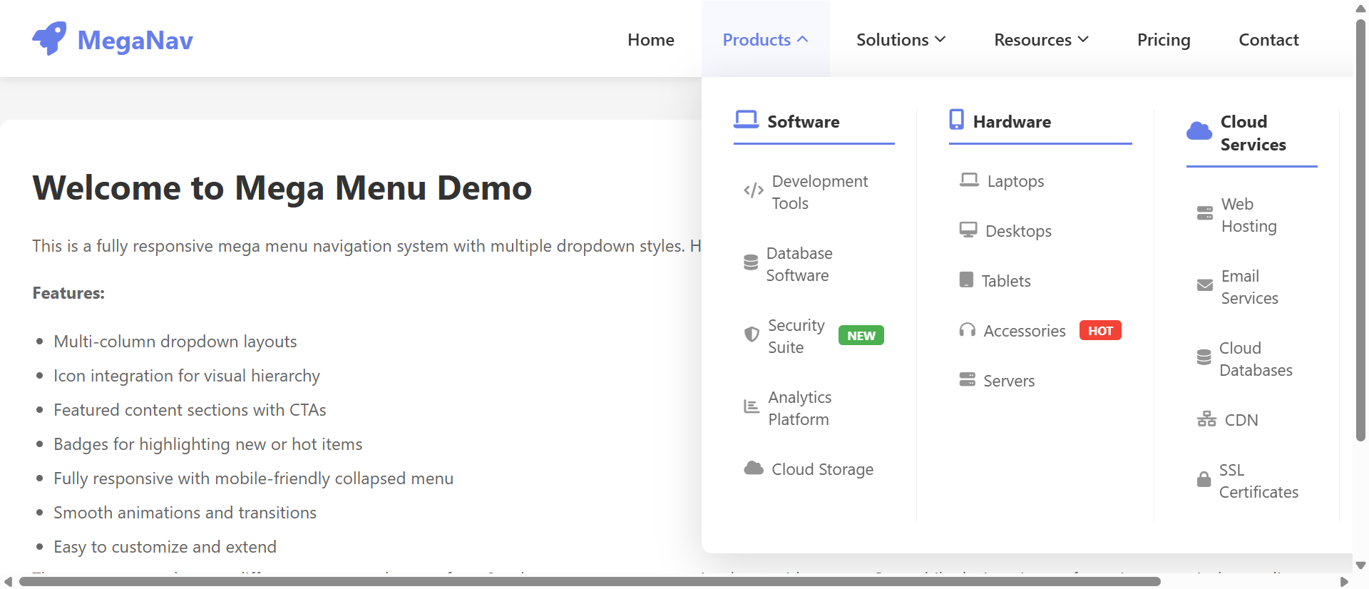
Mega menus utilize the full width of your website to display navigation options in organized multi-column grids. Instead of forcing users to scroll through vertical lists, you can present 30+ options simultaneously in a scannable layout. This approach transforms navigation from a sequential hunt-and-peck process into a visual browsing experience where users absorb all available options in one glance. Categories can be grouped logically across columns with visual separators, making even complex site architectures feel organized and approachable.
2. Visual Categorization Through Icons and Imagery
Mega menus leverage icons, thumbnails, and category images that create instant visual associations with content types. When users see a shopping cart icon next to "E-Commerce Solutions" or a calendar graphic beside "Event Planning," they process navigation options 67% faster than text-only links. These visual cues reduce cognitive load and help users with different learning styles navigate effectively. Images also add personality and brand differentiation that plain text dropdowns cannot deliver.
3. Descriptive Previews Reduce Navigation Uncertainty
Each mega menu item can include a short description (10-15 words) that clarifies exactly what users will find on the destination page. This preview eliminates the guesswork inherent in dropdown navigation where link text alone must convey meaning. Users can read "Custom WordPress development with advanced plugin integration" beneath "WordPress Services" and immediately know if that matches their needs—no click required. This preview capability dramatically reduces bounce rates from users clicking wrong pages.
4. Featured Content Promotes Strategic Priorities
Mega menus allow you to highlight new products, popular pages, or conversion-focused content through visual emphasis—larger cards, featured imagery, or "Popular" badges. While dropdown menus treat all links equally, mega menus let you guide users toward your business priorities. You can feature your newest service offering with a prominent image while still providing access to your full catalog, driving traffic to strategic pages without hiding secondary content.
5. Touch-Friendly Click-Based Interaction
Unlike hover-dependent dropdowns, well-designed mega menus work on click/tap, making them fully functional on mobile and tablet devices. Users tap a top-level menu item and the full mega menu panel slides into view with all options immediately accessible through large touch targets. This creates a consistent cross-device experience where navigation works the same way whether users browse on desktop, tablet, or smartphone. Mobile users get the same visual organization benefits as desktop visitors.
6. Built-In Search and Filtering Options
Advanced mega menus can include search fields or quick filters directly within the navigation panel. When users open "Products," they can immediately search for specific features or filter by category without navigating to a separate search page. This search-within-navigation approach is particularly valuable for e-commerce sites with large catalogs or SaaS products with extensive feature sets. Users find specific content faster while still having the option to browse categories visually.
5 Industries Where Mega Menus Drive Discovery
1. E-Commerce: Product Category Navigation
Online retailers with large product catalogs (500+ SKUs) saw category browsing increase 312% after implementing mega menus with product thumbnails and category descriptions. Fashion retailers use mega menus to display "New Arrivals," "Trending Now," and seasonal collections alongside standard categories, driving users toward high-margin products. The visual product previews reduce the clicks required to find desired items from 4.7 to 1.8 on average, directly improving conversion rates.
2. SaaS Platforms: Feature Showcase
Software companies increased trial signups 67% by using mega menus to showcase product features with icons and benefit-focused descriptions. Instead of hiding "Analytics Dashboard," "Team Collaboration," and "API Integration" in nested dropdowns, mega menus display all capabilities simultaneously with visual hierarchy emphasizing premium features. Users understand the product's full scope before clicking, leading to more qualified demo requests and reduced sales cycle length.
3. Educational Institutions: Program Discovery
Universities and online learning platforms improved program enrollment 89% through mega menus that categorize degrees by field, level, and format. Prospective students can view "Business Programs" organized into undergraduate/graduate columns with program descriptions, duration, and delivery format (online/campus) visible without clicking. This transparent navigation reduces the research burden and helps students find relevant programs 3.4x faster than traditional dropdown navigation.
4. Healthcare Systems: Service Line Navigation
Hospital networks increased appointment booking 78% by organizing medical services in mega menus with specialty descriptions and featured physicians. When users click "Find a Doctor," they see specialties organized by body system (Cardiology, Orthopedics, Neurology) with short descriptions of conditions treated. This organization matches how patients think about healthcare needs rather than forcing them to understand medical department hierarchies.
5. Professional Services: Expertise Demonstration
Law firms and consulting agencies improved consultation requests 94% through mega menus that showcase service areas with case study previews and industry focus indicators. Instead of generic "Practice Areas" dropdowns, mega menus display services with industry-specific icons (Manufacturing, Healthcare, Finance) and preview descriptions of typical engagements. This specificity helps prospects self-qualify and contact firms with clearly relevant expertise.
Transform Your Site Architecture
Discover how mega menu navigation systems create intuitive browsing experiences that guide users to conversion-focused content.
Explore Mega Menu Solutions →The Psychology Behind Mega Menu Effectiveness
1. Hick's Law and Organized Choice Architecture
While Hick's Law suggests that more choices increase decision time, mega menus actually reduce cognitive load through visual organization and categorization. When 40 options are organized into 6 clear categories with visual hierarchy, users process them faster than 15 options in an undifferentiated dropdown list. The key is that mega menus add structure that helps users eliminate irrelevant categories instantly rather than reading every option sequentially.
2. Visual Processing Speed and Pattern Recognition
Humans process visual information 60,000x faster than text. Mega menus leverage this by using icons, colors, and spatial positioning to create navigational patterns users recognize instantly. When "Products" always appears in the left column with a blue icon and "Support" in the right column with an orange icon, users develop spatial memory that makes navigation feel effortless. This visual consistency creates usability advantages that text-only dropdowns cannot replicate.
3. Preview Effect and Click Confidence
Psychological research shows that uncertainty increases anxiety and reduces action. When mega menus preview content through descriptions and imagery, they eliminate the uncertainty that causes users to hesitate before clicking. Users develop confidence that the destination page will match their expectations, reducing bounce rates and increasing content engagement. This preview capability transforms navigation from a gamble into an informed decision.
4. Recognition Versus Recall Memory
Mega menus support recognition memory (easier) rather than recall memory (harder). Users don't need to remember that "Advanced Analytics" lives under Products → Software → Enterprise → Features—they simply scan the mega menu and recognize the option when they see it with its accompanying icon and description. This recognition-based navigation reduces cognitive effort and makes websites feel more intuitive, especially for infrequent visitors who haven't memorized your site structure.
5 Common Mega Menu Implementation Mistakes
1. Overwhelming with Too Many Options
Mega menus should organize content, not dump your entire sitemap into navigation panels. When mega menus include 100+ links across 12 columns, they create the same overwhelm they're designed to prevent. Limit mega menus to 30-40 strategic links organized into 4-6 logical categories. Additional content belongs in footer navigation or site search, not in primary mega menus that should focus on high-value discovery paths.
2. Neglecting Mobile Navigation Experience
Desktop mega menus that work beautifully often break on mobile when developers simply shrink them down. Effective mobile mega menu implementations use accordion-style expansion where tapping "Products" reveals categories, then tapping "Software Solutions" reveals specific products. This progressive disclosure maintains organization while accommodating small screens. Don't force pinch-and-zoom on mobile mega menus—redesign the interaction pattern for touch devices.
3. Poor Visual Hierarchy Creates Scanning Difficulty
When every link in a mega menu has the same font size, color, and styling, users must read everything to find relevant options. Effective mega menus use typography (larger category headers), color (accent colors for featured items), and spacing (clear column separation) to create scannable layouts. Featured content should be visually distinct through imagery or highlighted backgrounds. Without this hierarchy, mega menus become dense walls of text that defeat their organizational purpose.
4. Slow Loading and Animation Performance
Mega menus with large images, videos, or complex animations that lag on click create frustrating delays. Users expect instant navigation—when mega menus take 800ms to fully expand and render, they feel sluggish. Optimize images, use CSS transforms for smooth animations, and lazy-load mega menu content only when users interact with top-level items. Performance should match the instant feel of simple dropdowns despite showing more content.
5. Inconsistent Interaction Patterns
When some top-level items trigger mega menus while others are direct links, or when hover opens some menus but click opens others, users never develop consistent mental models of how navigation works. Maintain uniform interaction across all top-level items—if "Products" opens on click, "Services" should too. If mega menus appear for some items, use consistent visual indicators (down arrows, icons) so users know what to expect before interacting.
Real-World Case Study: Enterprise Software Navigation Transformation
A B2B SaaS platform offering project management, CRM, and analytics tools struggled with product discovery. Their nested dropdown navigation buried specific features 3-4 clicks deep, and only 14% of visitors explored beyond the homepage. Feature awareness was so low that sales calls began with "Did you know we also offer...?" conversations about capabilities customers hadn't discovered.
They implemented a mega menu system organizing products into three primary columns (Project Management, Customer Relationship, Business Intelligence) with feature subcategories beneath each. Each feature included a two-line description and a representative icon. They added a fourth column for "Popular Features" highlighting their most-used capabilities and newest releases.
Results within 60 days:
- Deep-page discovery increased 289% – Users exploring product feature pages beyond the homepage jumped from 14% to 54%
- Demo requests up 67% – Qualified demo bookings increased as users discovered feature combinations matching their needs
- Bounce rate decreased 34% – First-visit bounce fell from 61% to 40% as users found relevant content faster
- Support ticket reduction of 23% – "How do I..." questions declined as users discovered features through navigation
- Cross-sell opportunities identified 156% faster – Sales teams could reference specific features users had already viewed in navigation analytics
The transformation didn't just improve navigation metrics—it fundamentally changed how the company positioned itself. Instead of hiding product depth, they showcased comprehensive capabilities that differentiated them from competitors. The mega menu became a discovery tool that drove product education and qualified lead generation simultaneously.
Annual impact: $2.3M in additional revenue attributed to improved feature discovery and reduced sales cycle length from better-informed prospects. The navigation redesign paid for itself within 11 days of implementation.
5 Metrics That Prove Mega Menu ROI
1. Navigation Depth and Pages Per Session
Track how many pages users visit after interacting with mega menu navigation versus traditional dropdowns. Effective mega menus increase pages per session by 40-60% as visual organization encourages exploration. Monitor which mega menu categories drive the deepest site engagement and refine visual hierarchy to emphasize high-performing pathways.
2. Click Distribution Across Navigation Options
Analyze click patterns within mega menus to identify which categories, featured items, and descriptions drive the most engagement. Heat mapping reveals whether users actually utilize the full mega menu or focus on specific sections, informing optimization priorities. Compare click distribution before and after implementation to quantify how mega menus shift traffic toward strategic pages.
3. Mobile Navigation Completion Rate
Measure the percentage of mobile users who successfully navigate to interior pages using mega menu systems versus dropdown alternatives. Well-implemented mobile mega menus should achieve 70%+ navigation completion rates compared to 40-50% for traditional dropdowns on small screens. This metric reveals whether your responsive mega menu design actually works on touch devices or just looks good on desktop.
4. Time to Target Content Discovery
Track how long users take to reach specific high-value pages from the homepage using mega menu versus dropdown navigation. Session recordings can reveal whether users find key content in one click from mega menus versus 3-4 clicks through nested dropdowns. Reduced discovery time correlates directly with improved conversion rates as users reach decision-ready content faster.
5. Bounce Rate from Mega Menu Entry Points
Monitor bounce rates for pages accessed through mega menu clicks versus other navigation methods. Lower bounce rates (typically 25-35% reduction) indicate that mega menu descriptions and previews set accurate expectations, delivering users to relevant content. High bounce rates from specific mega menu items signal misalignment between the navigation description and actual page content.
The Future of Mega Menu Navigation
Emerging mega menu innovations include AI-personalized navigation that reorganizes mega menu content based on user behavior, industry, or account type. Enterprise software platforms are testing adaptive mega menus that show different features to marketing users versus sales users, making navigation contextually relevant rather than universally generic.
Visual product previews are evolving beyond static thumbnails to include hover-activated video clips and interactive demos accessible directly from mega menu panels. E-commerce sites will let users preview product features, compare options, and even add items to cart without leaving the mega menu interface.
Voice-optimized mega menu navigation will translate visual organizational structures into voice command hierarchies, allowing users to say "Show me enterprise analytics features" and receive the equivalent of a mega menu category readout through voice assistants. This audio navigation will maintain the organizational benefits of mega menus in screenless environments.
Search-integrated mega menus will combine the browsing benefits of mega menus with the precision of search, allowing users to type queries that filter mega menu options in real-time. Instead of choosing between search or browse, users will do both simultaneously—typing "project" to instantly highlight project management features within the mega menu structure.
The mega menu evolution points toward navigation that's simultaneously more visual, more personalized, and more context-aware—transforming from static organizational tools into intelligent discovery systems that adapt to individual user needs.
Implementation Checklist: Mega Menu Best Practices
- Audit current site architecture and identify top 30-40 most important pages that deserve mega menu placement based on conversion value and user demand
- Organize content into 4-6 logical categories that match user mental models (how customers think about your offerings) rather than internal org charts
- Design visual hierarchy using larger typography for category headers, icons for visual scanning, and featured backgrounds for strategic content promotion
- Write descriptive preview text (10-15 words) for each mega menu item that clarifies destination page content and value proposition
- Implement responsive mobile design with accordion-style progressive disclosure or full-screen mobile mega menus optimized for touch interaction
- Optimize loading performance with lazy-loading for mega menu content, optimized images under 50KB, and CSS transform-based animations for 60fps smoothness
- Add keyboard navigation support with tab-through functionality and escape-to-close behavior for accessibility compliance
- Create consistent interaction patterns across all top-level menu items (all click-to-open or all hover-to-open, with clear visual indicators)
- Implement analytics tracking for mega menu interactions, click distribution, and navigation completion rates to measure effectiveness
- Design featured content areas within mega menus for promoting new products, popular pages, or conversion-focused landing pages
- Test across devices and browsers with real users, paying special attention to touch interaction on tablets and smartphones
- Establish update workflow for maintaining mega menu content as products, services, and strategic priorities evolve
Upgrade Your Navigation Experience
Stop hiding valuable content in nested dropdowns. Implement mega menu navigation that turns browsing into discovery.
See Mega Menu in Action →Need Professional Navigation for Your Website?
We design and build websites with mega menus, intuitive navigation, and mobile-friendly layouts that help visitors find what they need. Get a free, no-obligation proposal.