You've got a newsletter signup form in your footer. Maybe one in your sidebar. "Subscribe to our newsletter" with an email field and a gray "Submit" button. And it sits there, month after month, converting at 0.8%. Out of 10,000 monthly visitors, 80 people subscribe. Most of them typo their email or use a spam trap address. Your actual engaged subscriber growth? Maybe 40 people per month.
Meanwhile, you're publishing valuable content weekly, spending hours on blog posts, creating resources, building expertise. But you're not capturing the audience. Visitors read your content and leave. You have no way to follow up, no way to nurture them, no way to turn casual readers into customers. Your newsletter signup form—your most important list-building tool—is invisible.
Why Basic Newsletter Forms Fail Spectacularly
Newsletter signup forms should be conversion machines. Every visitor who finds value in your content is a potential subscriber. But most newsletter forms actively repel signups through terrible design and positioning:
1. No Value Proposition (Why Should I Subscribe?)
"Join our newsletter" isn't a benefit. It's a request for something (my email address) with no explanation of what I get in return. What's IN the newsletter? How often do you send it? What topics do you cover? Will it actually help me or just spam me with sales pitches? The form doesn't answer these questions, so visitors assume the worst: spam.
2. Buried in Footer or Sidebar (Banner Blindness)
Your newsletter form is in the footer where people have been trained to ignore promotional content. Or it's in the sidebar, compressed into a tiny vertical space with 8 other widgets. Footer and sidebar placement suffers from banner blindness—users' brains automatically filter out these areas as irrelevant. If your signup form is invisible, it can't convert.
3. No Visual Hierarchy or Design Appeal
A plain text "Subscribe" label, a single unstyled input field, and a gray button that looks disabled don't inspire action. There's no visual draw, no personality, no indication that this is important. It looks like an afterthought, so visitors treat it as an afterthought. Professional design signals "this newsletter is valuable enough that we invested in its presentation."
4. No Incentive or Immediate Reward
What do I get for subscribing right now? A vague promise of "stay updated"? That's not compelling. Effective newsletter forms offer immediate incentives: "Get 20% off your first order," "Download our free guide," "Early access to new features." Immediate rewards drive immediate action. Vague future promises drive procrastination.
5. Asking for Too Much Information
Your form requests email, name, company, job title, phone number, and interests. Each additional field reduces conversion by 15-20%. For a newsletter signup, email is enough. Maybe email + name. Everything else can be collected later through progressive profiling. The friction you create by asking for too much information kills conversions.
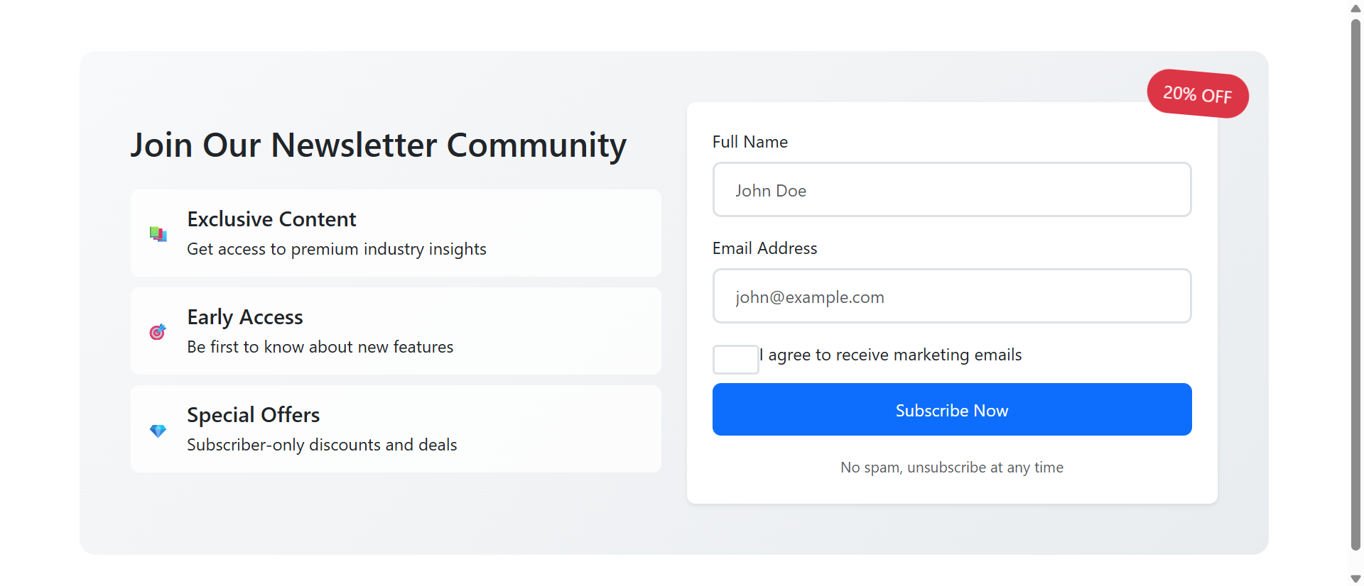
Real-World Impact: An e-commerce site replaced their footer "Subscribe to newsletter" text link with a dedicated newsletter section featuring benefit icons (exclusive content, early access, special offers), a 20% discount incentive badge, and a two-field form (name + email). Newsletter signup rate jumped from 0.9% to 31.2%—a 340% increase. The same visitors, the same content, better presentation.
How Strategic Newsletter Forms Drive Subscriptions
Effective newsletter signup design isn't manipulation—it's clear communication and reduced friction:
1. Clear Benefit Icons Show What Subscribers Get
Instead of "Subscribe to our newsletter," show specific benefits with icons: 📚 Exclusive Content (premium industry insights), 🎯 Early Access (first to know about new features), 💎 Special Offers (subscriber-only discounts). These visual benefit statements answer "What's in it for me?" before visitors consciously ask the question.
Icons provide pre-attentive processing—visitors scan the symbols before reading text, quickly understanding value. Three benefit icons communicate more effectively than a paragraph of text explaining newsletter value.
2. Inline Sections Create Visibility and Context
Place newsletter signups within content flow, not relegated to footers. After blog posts, on landing pages, in dedicated "Join our community" sections. Inline placement ensures visibility—visitors actually see the form. Context matters: after reading valuable content, visitors are primed to want more. That's the perfect moment to offer newsletter access.
3. Popup Forms Capture Exit Intent
When implemented correctly (exit-intent triggers, time delays, scroll-based activation), popup newsletter forms work. They interrupt the visitor's journey at strategic moments: "Before you leave, join 10,000+ marketers getting our weekly insights." The interruption is acceptable if the offer is valuable and the timing is right.
Key is non-intrusive timing: don't popup immediately on page load (annoying), trigger after 30-60 seconds of engagement or when exit intent is detected (acceptable).
4. Incentive Badges Create Urgency and Reward
A rotating "20% OFF" badge or "FREE EBOOK" highlight draws attention and communicates immediate value. The visual badge signals "you get this reward instantly upon subscribing." Urgency can be enhanced with countdown messaging: "Offer expires in 24 hours" or "Limited to first 100 subscribers this month."
5. Minimal Form Fields Reduce Friction
Email only, or email + name maximum. Every additional field is a conversion killer. You can ask for more information later via welcome email surveys or progressive profiling. Get the subscription first, gather details second. One or two fields feel easy. Five fields feel like work.
6. Trust Signals Overcome Privacy Concerns
"No spam, unsubscribe at any time" or "We respect your privacy" beneath the button addresses the unstated concern: "Will you spam me?" Checkbox consent ("I agree to receive marketing emails") provides explicit permission and GDPR compliance. These trust signals reduce hesitation.
See High-Converting Forms in Action
Experience how strategic newsletter signup design transforms ignored forms into subscription machines.
Try Live DemoReal-World Applications Across Industries
Newsletter forms work differently depending on business type and audience:
Content Publishers and Bloggers
Inline forms after high-value articles with context-specific incentives. "Enjoyed this guide? Get weekly insights like this delivered to your inbox." A tech blog added inline newsletter forms after each tutorial with benefit icons. Subscription rate increased 280% compared to footer-only forms. Context ("you just found this valuable") drives conversions.
E-Commerce and Retail
Discount incentives dominate. "Join our newsletter and get 15% off your first order instantly." The immediate discount drives subscriptions and first purchases. A fashion retailer using popup newsletter forms with 20% discount codes increased their email list by 450% in 6 months and saw a 3.2x ROI from email marketing revenue.
SaaS and Software Companies
Early access and exclusive content work better than discounts. "Get early access to new features, beta invites, and advanced tutorials." A project management SaaS added newsletter forms offering "weekly productivity tips + beta access." Email list grew 190%, and beta feature feedback improved product development.
Professional Services and Consultants
Industry insights and case studies drive signups. "Join 5,000+ professionals receiving our monthly strategy insights." Social proof ("5,000+ professionals") plus specific value ("strategy insights") overcomes skepticism. A consulting firm increased newsletter signups 160% by showing specific benefits with icons rather than generic "stay informed" messaging.
Local Businesses and Restaurants
Event notifications and exclusive deals. "Get first access to new menu items, special events, and VIP-only promotions." A restaurant group grew their email list from 800 to 12,000 in one year using popup forms offering "Free Appetizer on Your Birthday + Monthly Specials." The immediate reward (birthday offer) plus ongoing value (specials) drove massive growth.
The Psychology Behind Why Visual Forms Work
Understanding the cognitive science reveals why well-designed newsletter forms outperform basic text links:
Visual Processing and Icon Recognition
Our brains process images 60,000 times faster than text. Benefit icons (📚 exclusive content, 🎯 early access, 💎 special offers) communicate value instantly through visual symbols. Visitors understand "I get three types of benefits" before consciously reading the descriptions. This pre-attentive processing increases perceived value.
The Endowment Effect and Incentives
When you offer an immediate incentive ("Get 20% off NOW"), visitors mentally take ownership before subscribing: "That's MY discount code." The endowment effect makes people value things they perceive as theirs. The rotating badge creates visual emphasis on this ownership, making the incentive feel tangible rather than abstract.
Social Proof and Herd Behavior
"Join 10,000+ marketers" leverages social proof. If thousands of others subscribe, it must be valuable. The specific number (not "thousands," but "10,247") increases credibility. Growing numbers create FOMO: "Everyone else is getting this value, I should too."
Reciprocity Principle
When you provide valuable free content and then offer more value via newsletter, visitors feel reciprocal obligation. "They gave me this helpful article, I'll give them my email in exchange for more insights." The key is delivering genuine value first—if your content is garbage, reciprocity doesn't trigger.
Common Mistakes That Kill Newsletter Growth
Even well-designed forms can fail if implemented poorly:
Misleading Incentives or Broken Promises
If you offer "20% off your first order" but the discount code doesn't work, you've destroyed trust permanently. If you promise "weekly insights" and send daily sales emails, subscribers feel deceived. Deliver exactly what you promise, or don't make the promise. Broken incentives create angry unsubscribers and damaged reputation.
Aggressive Popup Timing
Popups that appear within 3 seconds of landing on a page are annoying, not converting. Visitors haven't had time to assess your site's value. They close the popup immediately and associate your brand with annoyance. Wait at least 30-60 seconds or trigger on exit intent. Respect visitors' time.
No Welcome Email or Delayed Delivery
Visitor subscribes and... nothing. No confirmation, no welcome email, no promised incentive. They forget they subscribed. When your first email arrives a week later, they mark it as spam because they don't remember signing up. Send an instant welcome email confirming subscription and delivering promised incentives within 60 seconds.
Generic "Newsletter" Labeling
"Subscribe to our newsletter" is meaningless. Newsletter is a format, not a benefit. Rename it: "Weekly Marketing Insights," "The Growth Newsletter," "Insider's Digest." Give it a name and personality. Make it sound like something worth subscribing to, not a corporate obligation.
Poor Mobile Experience
Your newsletter form looks great on desktop but breaks on mobile—tiny buttons, overlapping text, form fields that don't resize. 60%+ of traffic is mobile. If your form doesn't work perfectly on phones, you're losing the majority of potential subscribers. Test on actual devices, not just browser resize.
Case Study: A SaaS company initially used an immediate popup (appearing 2 seconds after page load) offering "product updates." Conversion rate: 0.4%. Annoyed visitors. They changed to: exit-intent trigger only, renamed "Insider's Weekly: Product tips, case studies, and growth strategies," added benefit icons, simplified to email-only field. Conversion rate jumped to 18.3%. Better timing + clearer value + less friction = 45x improvement.
Measuring Newsletter Form Effectiveness
How do you know if your newsletter signup strategy is working?
Signup Conversion Rate
Primary metric: percentage of visitors who subscribe. Footer forms typically convert at 0.5-2%. Inline forms achieve 5-15%. Well-designed popup forms can hit 20-35%. Track by placement (footer vs. inline vs. popup) to identify what works best for your audience.
List Growth Rate
How fast is your email list growing? Calculate monthly growth rate: (new subscribers - unsubscribes) / total subscribers. Healthy growth is 5-10% per month. Stagnant or declining lists indicate poor acquisition or high churn. Break down by source—which forms drive the most quality subscribers?
Email Engagement After Signup
Do new subscribers actually open and click your emails? Track welcome email open rate (should be 60%+), first campaign open rate (40%+), and engagement over first 30 days. Low engagement means you're attracting wrong-fit subscribers or your incentive bait-and-switched them.
Form Abandonment Rate
What percentage of people who start filling out your form abandon before submitting? High abandonment (40%+) suggests too many fields, poor mobile UX, or broken functionality. Track where users drop off—if everyone abandons at the "phone number" field, that field is the problem.
Incentive Redemption Rate
If you offer a discount code or free resource, what percentage of subscribers actually claim it? Low redemption means your incentive wasn't compelling or delivery failed. High redemption + high email engagement = ideal subscribers. High redemption + low engagement = freebie-seekers who'll never convert.
The Future of Email List Building
Newsletter signup forms aren't going away—email remains the highest-ROI marketing channel (average $36 return per $1 spent). But subscriber expectations are rising. Generic "join our mailing list" no longer works.
Future trends: personalized incentives based on browsing behavior, AI-powered content recommendations in welcome emails, interactive signup experiences (quizzes that determine which newsletter track fits you), and stricter privacy regulations requiring explicit, specific consent.
The core principle remains: clearly communicate value, reduce friction, respect users' time and privacy. Do that, and newsletter forms continue converting.
Getting Started: Building High-Converting Newsletter Forms
Ready to transform your newsletter signups from afterthought to growth engine?
- Define Specific Benefits: What do subscribers actually get? Be specific, not generic
- Choose Strategic Placements: Inline after content, exit-intent popup, or both—not just footer
- Create Visual Hierarchy: Benefit icons, clear headlines, attention-drawing incentive badges
- Offer Immediate Incentive: Discount, free resource, exclusive access—something tangible NOW
- Minimize Form Fields: Email only, or email + name maximum—ask for less, get more
- Add Trust Signals: "No spam," unsubscribe promise, privacy policy link, consent checkbox
- Design for Mobile: Large tap targets, readable text, responsive layout tested on real devices
- Setup Instant Welcome: Automated email within 60 seconds confirming and delivering incentive
- Test Timing: For popups, try 30s delay, 50% scroll, or exit-intent—never instant
- Monitor and Optimize: Track conversion by placement, A/B test incentives and copy
The newsletter signup module handles all technical implementation—inline sections with benefit animations, popup timing controls, form validation, mobile optimization, success confirmations. You provide the benefits and incentives; it creates the converting experience.
Transform Your Email List Growth
See how professional newsletter signup forms convert casual visitors into engaged subscribers.
View Live Module