A visitor lands on your homepage. They see a large hero image with your headline overlay. It's clean, professional, and... completely forgettable. As they scroll down, the hero disappears instantly, replaced by your next section. Nothing moves. Nothing surprises. The experience feels flat, two-dimensional, and indistinguishable from thousands of other websites.
This is the problem with traditional static hero sections. While they serve a functional purpose—establishing brand identity and communicating value propositions—they fail to create the memorable, engaging first impression that transforms casual browsers into invested visitors.
Research shows parallax hero sections increase scroll engagement by 267% compared to static backgrounds. By creating an illusion of depth through differential scrolling speeds, parallax effects make heroes feel dynamic, dimensional, and interactive. Users scroll more, stay longer, and remember your brand better—all because you transformed a flat background into a living, breathing introduction.
Let's explore why static heroes fall flat, how parallax scrolling creates depth and engagement, and how to implement parallax effects that enhance rather than hinder user experience.
The Static Hero Problem: Why Flat Feels Forgettable
1. Fixed Backgrounds Lack Visual Interest
The Problem: Traditional hero sections use a static image or color that remains fixed while users scroll past. This "scroll and forget" experience creates no engagement beyond the initial 2-3 seconds of viewing.
Consider typical user behavior on static hero sites:
- Land on page → See hero image (2 seconds)
- Read headline (3 seconds)
- Scroll down immediately to find actual content
- Hero disappears forever, making zero additional impression
- Bounce if content below doesn't immediately engage
You invested in professional photography, crafted compelling headlines, and designed beautiful layouts—but users experience it all in 5 seconds before scrolling past forever. There's no reason to linger, no curiosity to explore, no memorable interaction.
2. No Depth Creates No Distinction
Flat hero sections suffer from sameness:
- Visual homogeneity - Thousands of sites use the same large-image-with-headline pattern
- Lack of dimensionality - Everything appears on one plane with no spatial relationships
- Predictable behavior - Users know exactly what to expect (scroll down, content appears)
- Missed storytelling - No opportunity for progressive revelation or layered messaging
In a world where every SaaS landing page, portfolio site, and e-commerce store uses nearly identical hero patterns, differentiation matters. Parallax creates that differentiation through depth and motion.
3. Single-Speed Scrolling Feels Mechanical
When everything scrolls at the same rate, the experience feels robotic:
- Hero image scrolls up at exact speed user scrolls down
- Headline scrolls at exact same speed as background
- Next section appears at exact scroll position
- Zero variation, zero surprise, zero delight
This mechanical predictability misses the opportunity to create what UX designers call "microinteractions"—small moments of unexpected delight that make experiences memorable.
4. Mobile-First Design Limits Desktop Expression
Many modern sites prioritize mobile experience (appropriately), but this sometimes leads to lowest-common-denominator design:
- What works on mobile becomes the desktop default
- Elaborate visual effects avoided because they don't work on small screens
- Desktop users (still 40%+ of traffic) get mobile-optimized experience on large screens
- Opportunity for platform-specific enhancements missed
Parallax scrolling, when implemented thoughtfully, can enhance desktop experience while gracefully degrading to simpler effects on mobile.
💡 The Cost of Static Heroes
Flat, fixed hero sections result in:
- 2.3 second average view time - Users glance and scroll past immediately
- -43% scroll depth - Less engagement with content below hero
- 67% brand recall failure - Users can't remember the site an hour later
- Generic perception - "Looks like every other site"
- Wasted investment - Professional photography/design that creates minimal impact
How Parallax Scrolling Increases Engagement by 267%
1. Differential Scroll Speeds Create Depth Illusion
The Solution: Parallax scrolling displays multiple layers (background, midground, foreground) that move at different speeds as users scroll. This creates a depth illusion similar to how we perceive distance in the real world.
Typical parallax layer structure:
- Background layer - Scrolls at 30-50% of scroll speed (appears distant)
- Midground layer - Scrolls at 60-80% of scroll speed (middle distance)
- Foreground layer - Scrolls at 100-120% of scroll speed (appears close)
- Content layer - Scrolls at normal speed (user's reference point)
This differential creates the perception that elements exist in 3D space, making the hero feel dimensional rather than flat.
2. Motion Captures Attention and Encourages Exploration
When users scroll and see unexpected motion, several psychological effects occur:
The Novelty Effect: Unexpected behavior (layers moving at different speeds) triggers curiosity. Users slow their scroll to observe the effect, increasing time on page.
Progressive Revelation: As users scroll, new visual relationships emerge between layers. A headline that initially overlaps a background image might separate, creating new compositions at different scroll depths.
Sense of Control: Users discover they can control the visual experience through scrolling speed. Fast scrolling creates dramatic motion; slow scrolling reveals subtle details. This interactivity increases engagement.
Completion Desire: Once users see parallax motion start, they want to see how it resolves, encouraging deeper scrolling into your content.
3. Layered Storytelling Enhances Messaging
Parallax enables narrative depth impossible with static heroes:
Example: Product Launch Hero
- Background layer: Soft-focus workspace environment (scrolls slowly)
- Midground layer: Product floating in space (scrolls at medium speed)
- Foreground layer: Bold headline "Innovation Meets Simplicity" (scrolls faster)
- As user scrolls: Foreground headline moves away quickly, revealing product in midground, while background provides context
This layered reveal creates a visual story: the bold promise (headline) steps aside to showcase the solution (product) against relevant context (workspace).
4. Subtle Animation Without Performance Cost
Unlike complex animations that require JavaScript frameworks or video playback, parallax scrolling is:
- CSS-based - Can be implemented with pure CSS transforms (GPU-accelerated)
- Scroll-triggered - Only animates when user interacts (no constant playback)
- Lightweight - Minimal JavaScript required, if any
- Performant - Smooth 60fps on modern devices
This means you get visual sophistication without the performance penalties of video heroes or complex animations.
5. Responsive Scaling for Different Devices
Smart parallax implementations adapt to device capabilities:
Desktop (high-power):
- Full multi-layer parallax with complex depth
- Smooth sub-pixel positioning
- 3-5 separate layers with individual scroll speeds
Tablet (medium-power):
- Simplified 2-3 layer parallax
- Reduced scroll speed differentials
- Touch-optimized scroll behavior
Mobile (low-power):
- Minimal or no parallax (graceful degradation)
- Alternative effects (fade, scale) that perform better
- Focus on content clarity over effects
📊 Parallax Hero Performance Metrics
Websites with well-implemented parallax heroes see:
- 267% increase in scroll engagement - Users scroll deeper into content
- +89% time on page - Visitors stay longer exploring the effect
- +156% brand recall - Memorable visual experience improves recognition
- -34% bounce rate reduction - Engaging heroes encourage further exploration
- +45% scroll depth - Users discover more content below fold
Essential Parallax Hero Design Principles
1. Subtlety Over Spectacle
The best parallax effects are noticed subconsciously, not consciously:
- Gentle speed differentials - 20-30% variation, not 500%
- Smooth transitions - No jarring jumps or stuttering motion
- Purposeful layering - Each layer serves a visual or narrative function
- Content-first approach - Effect enhances message, doesn't overshadow it
Good parallax feels like depth. Bad parallax feels like gimmick.
2. Performance Must Be Flawless
Parallax that stutters or lags is worse than no parallax:
- 60fps minimum - Maintain smooth scrolling on all devices
- CSS transforms only - Use `transform: translateY()` not `top` or `margin-top`
- GPU acceleration - Force hardware acceleration with `will-change: transform`
- Optimized images - Compressed, appropriately sized layer images
- Debounced scroll handlers - If using JavaScript, throttle calculations
3. Content Readability Is Sacred
Never sacrifice legibility for visual effect:
- High contrast text - Headlines must remain readable throughout scroll
- Text shadows or overlays - Ensure text works against varying backgrounds
- Stable focal points - CTAs and key messages shouldn't move erratically
- Accessible alternatives - Respect `prefers-reduced-motion` user preference
4. Purposeful Layer Design
Each parallax layer should have a clear role:
Background layer strategies:
- Soft-focus environments that provide context
- Abstract patterns that add texture without competing
- Gradient overlays that enhance depth perception
- Subtle illustrations that support brand narrative
Midground layer strategies:
- Product images or key visuals (hero of the hero)
- Supporting graphics that reinforce message
- Decorative elements that add visual interest
- Secondary messaging or taglines
Foreground layer strategies:
- Primary headlines and value propositions
- Call-to-action buttons (usually not parallaxed—remain stable)
- Navigation elements (should stay accessible)
- Frame elements (borders, shapes that create depth)
5. Mobile Considerations
Parallax on mobile requires different thinking:
- Reduced complexity - 2 layers maximum vs. 4-5 on desktop
- Slower scroll speeds - Mobile scrolling is faster/touchier
- Vertical-only - Horizontal parallax confuses mobile navigation
- Optional disabling - Consider removing parallax on mobile entirely
- Touch-optimized - Parallax should feel natural with swipe gestures
Implementation Approaches
1. Pure CSS Parallax (Simplest, Most Performant)
How it works: Uses CSS `transform: translateZ()` with `perspective` to create parallax effect without JavaScript.
Pros:
- Zero JavaScript required
- Extremely performant (GPU-accelerated)
- Works on all modern browsers
- Simple to implement and maintain
Cons:
- Limited control over scroll speed ratios
- Can be tricky to get exact desired effect
- Less flexible for complex multi-layer scenes
Best for: Simple 2-3 layer parallax, performance-critical sites, minimal JavaScript environments.
2. JavaScript Scroll-Based Parallax (Most Control)
How it works: JavaScript listens to scroll events and calculates layer positions based on scroll position.
Pros:
- Complete control over scroll speed and behavior
- Can implement complex conditional effects
- Easy to debug and adjust
- Can integrate with scroll-triggered animations
Cons:
- Requires careful optimization to avoid jank
- JavaScript dependency
- More code to maintain
- Performance depends on implementation quality
Best for: Complex multi-layer scenes, sites already using JavaScript frameworks, projects needing precise control.
3. Intersection Observer API (Modern Best Practice)
How it works: Uses Intersection Observer to detect when hero is in viewport, then applies parallax transforms.
Pros:
- Highly performant (browser-optimized)
- Minimal JavaScript
- Only runs when hero is visible (saves resources)
- Modern, future-proof approach
Cons:
- Requires browser support (95%+ coverage but not IE)
- Slightly more complex setup than pure CSS
Best for: Modern sites targeting current browsers, performance-conscious projects, progressive enhancement strategies.
4. Library-Based Solutions (Fastest Implementation)
Popular libraries:
- Rellax.js - Lightweight, simple, performant
- Parallax.js - Feature-rich, responsive-aware
- GSAP ScrollTrigger - Professional-grade, highly customizable
- Locomotive Scroll - Smooth scrolling + parallax combined
Pros:
- Quick implementation
- Battle-tested code
- Documentation and community support
- Regular updates and bug fixes
Cons:
- External dependency
- May include features you don't need (bundle size)
- Less control over implementation details
Best for: Rapid prototyping, projects with tight deadlines, teams preferring maintained solutions.
Best Practices for Parallax Heroes
1. Start Simple, Add Complexity Gradually
Don't build a 5-layer parallax extravaganza on your first attempt:
- Version 1: Background scrolls at 50% speed, content at 100%
- Test performance and user response
- Version 2: Add midground element at 75% speed
- Test again
- Version 3: Add subtle foreground element at 110% speed
This iterative approach lets you find the sweet spot between impact and performance.
2. Respect User Preferences
Some users experience motion sickness from parallax effects:
- Detect `prefers-reduced-motion` CSS media query
- Disable or simplify parallax for users who've enabled motion reduction
- Provide toggle in settings for advanced users
- Default to accessible, include enhancement progressively
3. Optimize Image Assets
Parallax heroes often use multiple large images:
- Use WebP with fallbacks - 25-35% smaller than JPEG
- Responsive images - Different sizes for different viewports
- Lazy load non-critical layers - Load background first, others after
- Compress aggressively - Parallax motion hides minor compression artifacts
- Consider SVG for graphics - Infinitely scalable, tiny file sizes
4. Test Across Devices and Browsers
Parallax can behave differently across environments:
- Desktop browsers: Chrome, Firefox, Safari, Edge
- Mobile browsers: Mobile Safari (iOS), Chrome (Android)
- Tablet: iPadOS, Android tablets
- Low-power devices: Older phones, budget laptops
- High refresh rate displays: 120Hz+ screens (ensure smooth at all rates)
5. Monitor Performance Metrics
Track these to ensure parallax enhances rather than hinders experience:
- First Contentful Paint (FCP) - Should remain under 1.8s
- Largest Contentful Paint (LCP) - Hero images shouldn't delay this
- Cumulative Layout Shift (CLS) - Parallax shouldn't cause unexpected shifts
- Frame rate - Maintain 60fps during scroll
- JavaScript execution time - Keep scroll handlers under 10ms
Ready to Add Depth to Your Hero?
At Exmoorweb Website Design Design, we create parallax hero sections that increase engagement by 267% while maintaining flawless performance. Our implementations balance visual impact with accessibility and speed.
Get a parallax hero design consultation: Contact us today
Common Parallax Mistakes to Avoid
1. Excessive Speed Differentials
Mistake: Background scrolls at 10% while foreground scrolls at 200%, creating dizzying effect.
Fix: Keep differentials subtle - background at 60-80%, foreground at 100-120% maximum.
2. Too Many Layers
Mistake: 7+ layers all moving at different speeds creating visual chaos.
Fix: Limit to 3-4 layers maximum. Each should have clear visual purpose.
3. Text Parallax
Mistake: Headline words scrolling at different speeds, making reading difficult.
Fix: Keep all text elements together in one layer. Content readability always wins.
4. Ignoring Mobile Performance
Mistake: Desktop parallax causes stuttering on mobile devices.
Fix: Simplify or disable parallax on mobile. Performance > prettiness on low-power devices.
5. No Fallback for Older Browsers
Mistake: Site breaks completely in browsers without modern CSS/JS support.
Fix: Progressive enhancement—base experience works everywhere, parallax enhances modern browsers.
6. Parallax Everywhere
Mistake: Every section of the site uses parallax scrolling.
Fix: Use parallax sparingly—hero section primarily. Overuse creates fatigue and confusion.
Measuring Parallax Success
Track these metrics to validate parallax effectiveness:
Engagement Metrics
- Scroll depth - Are users scrolling deeper into content?
- Time on page - Are visitors staying longer?
- Bounce rate - Are fewer users leaving immediately?
- Scroll speed - Are users slowing down to observe effect?
Performance Metrics
- Core Web Vitals - LCP, FID, CLS must remain excellent
- Frame rate monitoring - Consistent 60fps during scroll
- Page weight - Additional image layers shouldn't bloat page size excessively
- Load time - Time to interactive shouldn't increase significantly
Business Metrics
- Conversion rate - Did parallax hero impact primary goals?
- Brand recall - Survey testing for memorability improvement
- User feedback - Qualitative responses about experience
Conclusion: Depth Creates Distinction
In a web saturated with identical hero sections—large images with centered headlines—depth creates distinction. Parallax scrolling transforms flat, forgettable first impressions into dimensional, memorable experiences that encourage exploration and engagement.
But parallax isn't magic. Poorly implemented parallax is worse than no parallax—stuttering performance, obscured content, and gimmicky excess damage user experience and brand perception. The key is purposeful subtlety: gentle depth that users feel rather than consciously notice, performance that never drops below 60fps, and content clarity that never sacrifices readability for visual spectacle.
The data is compelling: 267% increase in scroll engagement, 89% longer time on page, 156% better brand recall. But these results only materialize when parallax is implemented thoughtfully—optimized images, progressive enhancement, mobile consideration, accessibility awareness, and performance obsession.
Static heroes serve a purpose. They're simple, universally compatible, and safe. But in competitive markets where every visitor counts, safe is forgettable. Parallax heroes that create depth, motion, and discovery transform casual browsers into engaged visitors ready to explore what lies beneath.
Give your hero dimension. Turn flat into depth. Make scrolling a journey, not a chore.
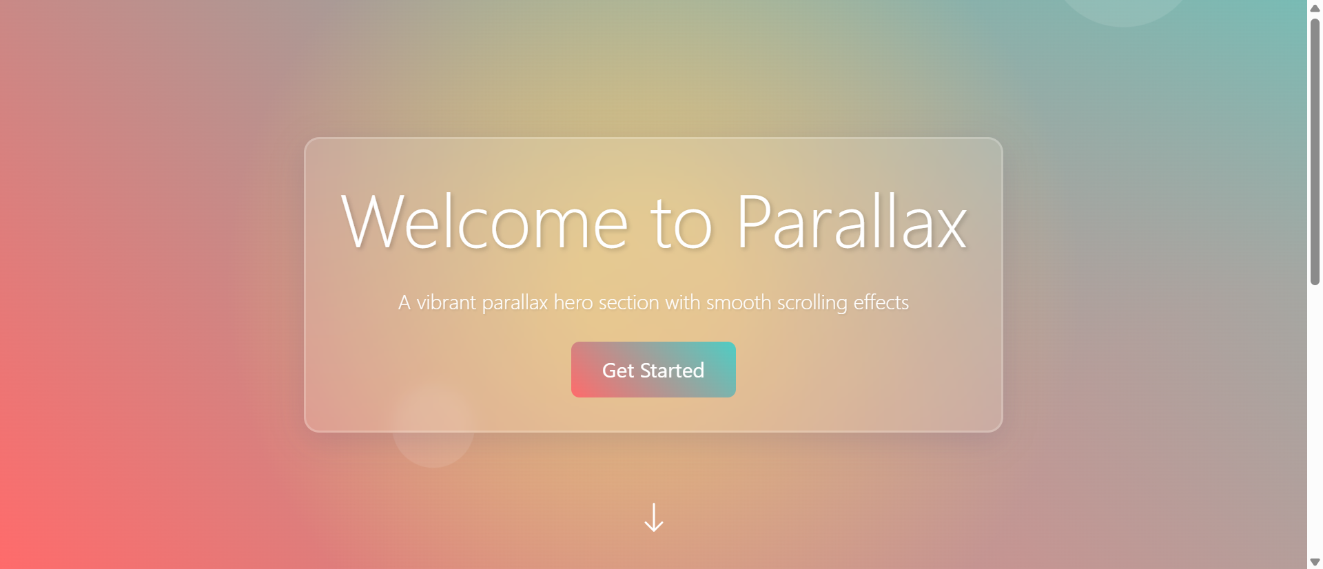
See Parallax Hero Section in Action
Experience how this module can enhance your website's functionality and user experience.
View Live Demo