A shopper has filled their cart with $347 worth of products. They've invested 12 minutes browsing, comparing, deciding. They click "Proceed to Checkout." The checkout form loads: 23 required fields across 4 pages. Account creation mandatory. Shipping costs hidden until final step. Payment page asks for information already entered. Error messages unclear. After two minutes of frustration, they close the tab. Your business just lost $347 not because your products were wrong or prices were bad, but because checkout was a nightmare.
This scenario costs e-commerce businesses $18 billion annually. Cart abandonment rate averages 69.9% across industries. While some abandonment is inevitable (comparison shopping, distractions), research shows 28% of abandonment is directly caused by complicated checkout processes. That's preventable revenue loss. Billions of dollars left on the table because checkout experiences create more friction than conversion.
Why Traditional Checkout Processes Destroy Conversion Rates
The path from "Add to Cart" to "Order Complete" is littered with abandonment triggers:
1. Forced Account Creation (The #1 Abandonment Trigger)
Requiring account registration before purchase kills 28% of conversions. Shoppers want to buy, not commit to lifetime relationship with your brand. They resent being forced to create credentials they'll forget, manage another password, and receive marketing emails. "Just take my money" shoppers who encounter mandatory registration often abandon rather than comply.
Guest checkout is non-negotiable. Let shoppers complete purchase with just email—offer account creation as optional post-purchase benefit.
2. Unexpectedly High Extra Costs (Shipping, Taxes, Fees)
Shoppers see cart total: $200. They reach final checkout step: suddenly $247 (shipping $35, taxes $12). This surprise creates betrayal feeling: "They hid the real cost until I invested time in checkout." 60% of shoppers cite unexpected costs as abandonment reason. Price transparency throughout shopping journey prevents this shock.
3. Long, Complex Multi-Page Checkout Forms
Checkout spanning 5-6 pages with 20+ form fields exhausts shoppers. Every additional field reduces completion rate by 1-3%. Every additional page creates abandonment opportunity. Mobile shoppers especially abandon complex forms—typing on phones is tedious. One-page checkout or minimal two-step (information → payment) dramatically outperforms multi-page marathons.
4. No Progress Indicators or Step Visibility
Multi-step checkout without progress indicator creates anxiety: "How many more pages?" Unknown journey length reduces completion. Simple progress bar ("Step 2 of 3") reduces abandonment by showing light at tunnel's end. Shoppers tolerate reasonable process when they know where they are and how much remains.
5. Limited Payment Options
Accepting only credit cards excludes shoppers who prefer PayPal, Apple Pay, Google Pay, digital wallets, buy-now-pay-later. Each additional payment method captures 5-15% more conversions. Modern shoppers expect choice. "We don't accept PayPal" often equals "We don't want your business."
6. Poor Mobile Optimization
60%+ of traffic is mobile, yet many checkouts are desktop-centric. Tiny form fields, small tap targets, multi-column layouts that break on phones, autofill that doesn't work—these mobile failures guarantee abandonment. Mobile checkout must be touch-optimized with large inputs, clear labels, and minimal typing.
Real-World Results: An electronics e-commerce site had 73% cart abandonment rate. Checkout process: mandatory account creation, 6-page checkout, no guest option, 27 form fields, shipping cost revealed on page 5. They redesigned to: guest checkout enabled, one-page checkout, 9 required fields (all others optional), shipping costs shown on cart page, Apple Pay and PayPal added, progress bar for multi-step users, autofill enabled. Cart abandonment dropped to 47%. Revenue increased $4.2M annually from improved checkout completion. Same products, same prices, dramatically different checkout experience.
How Streamlined Cart and Checkout Experiences Maximize Completion
Well-designed checkout isn't just less frustrating—it's psychologically optimized for purchase completion:
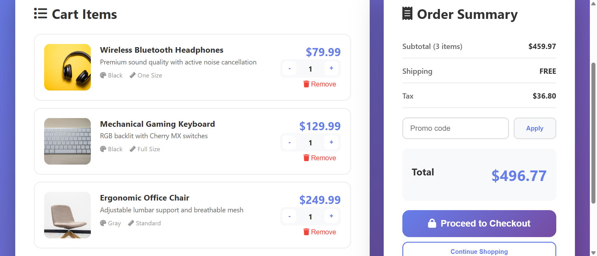
1. Inline Cart Review With Editable Quantities
Cart page shows all items with images, names, prices, quantity controls, and remove buttons. Shoppers can adjust quantities, remove items, see updated totals in real-time without page reloads. This gives final control before commitment. Clear visibility of cart contents and costs builds confidence. Include "Continue Shopping" link—letting shoppers add more increases order value.
2. Transparent Cost Breakdown From Cart Forward
Display subtotal, shipping estimate, taxes, discount codes, and final total on cart page before checkout begins. No surprises at final step. If shipping varies by location, show estimate or range: "Shipping: $8-$15 depending on location." Transparency prevents the price shock that kills conversions. Shoppers who see full cost early and proceed are committed buyers unlikely to abandon over price.
3. Guest Checkout as Primary Option
Make guest checkout the default, prominent path. "Checkout as Guest" button larger than "Create Account" option. Require only email for guest purchases—no password, no account fields. Post-purchase, offer: "Save your information for faster checkout next time?" with one-click account creation using order data. This converts some guests to accounts without forcing everyone.
4. One-Page or Minimal Two-Step Checkout
Consolidate checkout into single page with sections: Contact Info, Shipping Address, Payment Method. Or use two-step: Information (contact + shipping) → Payment. Avoid 5-page odysseys. Use progressive disclosure—show payment section only after shipping info completed. This feels less overwhelming than massive single form while avoiding multi-page abandonment risk.
5. Smart Form Design and Autofill Support
Use proper HTML5 input types (type="email", type="tel") to trigger correct mobile keyboards. Enable browser autofill with autocomplete attributes. Detect and auto-format phone numbers, credit cards. Validate fields in real-time with helpful error messages. "Invalid email" immediately after typing helps shoppers fix mistakes before submission. Every UX improvement that reduces effort increases completion.
6. Multiple Payment Method Icons and One-Click Options
Display accepted payment logos (Visa, Mastercard, PayPal, Apple Pay, etc.) on cart and checkout pages—builds trust and confirms options. Integrate express checkout buttons (Apple Pay, PayPal, Google Pay) that bypass form entry entirely. These one-click options convert 20-40% higher than manual entry because they eliminate typing.
7. Order Summary Sidebar (Always Visible)
Persistent sidebar showing cart items, quantities, and running total throughout checkout. As shoppers fill forms, they see what they're buying and total cost. This constant reminder reinforces purchase decision and prevents "wait, what am I buying again?" moments. Mobile: collapsible "Show order summary (3 items - $247)" dropdown at top.
8. Promo Code Field That Doesn't Trigger Abandonment
Prominent promo code fields remind shoppers "maybe I should search for a coupon" and trigger abandonment as they leave to hunt discounts. Instead: subtle "Have a promo code?" link that expands input when clicked. This reduces code-hunting abandonment while still enabling discount redemption for those who have codes.
See Optimized Checkout in Action
Experience how streamlined cart and checkout design eliminates friction and transforms browsers into buyers.
Try Live DemoReal-World Applications Beyond Traditional E-Commerce
Optimized checkout patterns work anywhere users complete transactions:
Retail E-Commerce (Physical Products)
Obviously the primary use case. Fashion, electronics, home goods—any product seller benefits. A clothing retailer reduced checkout from 5 pages to 1 page, added guest checkout, and enabled Apple Pay. Checkout completion increased 42%, mobile conversion increased 67%, and average order processing time dropped from 8 minutes to 2.5 minutes.
Digital Products and Software Sales
SaaS subscriptions, software licenses, digital downloads. Checkout should be even simpler—no shipping address needed. A software company reduced checkout to: email + payment method only. Conversion rate increased 89% because barrier to purchase nearly disappeared. Digital goods enable near-frictionless checkout.
Event Ticketing and Registrations
Concert tickets, conferences, courses. Checkout includes ticket selection, attendee info, payment. An event platform implemented one-page checkout with saved payment methods and saw ticket purchase completion increase 56%. Reducing time from "I want to attend" to "I have ticket" maximizes impulse purchases.
Service Bookings and Appointments
Spa appointments, consulting sessions, home services. Checkout includes service selection, date/time, contact info, payment/deposit. A home services platform added guest checkout and reduced required fields from 18 to 7. Booking completion increased 71% as friction disappeared.
Donation and Nonprofit Fundraising
Charitable giving checkout should be ultra-simple—donors are doing you a favor. One nonprofit reduced donation checkout from 3 pages with account requirement to single page with guest option. Donation completion increased 134%. Every unnecessary field in donation flow is money left on table.
The Psychology Behind Checkout Optimization
Understanding cognitive and behavioral science reveals why checkout design impacts completion:
Friction and Activation Energy
Every form field, every page transition, every cognitive decision increases "activation energy" required to complete purchase. Humans naturally follow path of least resistance. High-friction checkout creates high activation energy—many shoppers don't have energy to overcome it. Reducing friction (fewer fields, fewer steps) lowers energy requirement, enabling more completions.
Progress Perception and Goal Gradient Effect
Goal gradient hypothesis: motivation increases as goal approaches. Progress indicators leverage this—"Step 2 of 3" signals proximity to completion, increasing persistence. Without progress visibility, shoppers don't know if they're 20% done or 80% done, reducing motivation to continue.
Loss Aversion and Sunk Cost
Shoppers who invest time in checkout (filling forms) are more likely to complete due to sunk cost fallacy—they don't want to waste effort already invested. But this only works if checkout isn't too long. 2-3 minutes invested? They'll push through. 8-10 minutes invested? Even sunk cost can't overcome frustration.
Trust Signals and Security Indicators
Payment is trust-critical moment. Security badges (SSL, trusted payment processors, money-back guarantee), professional design, and familiar payment logos build confidence. "Is this site legitimate? Will they steal my credit card?" concerns are subconscious but powerful. Trust signals reduce anxiety that causes abandonment.
Common Checkout Mistakes That Kill Conversions
Even well-intentioned checkout can sabotage itself:
Mandatory Account Creation (Repeating for Emphasis)
This deserves second mention as #1 killer. 28% of shoppers abandon over forced registration. If you insist on accounts, at minimum: offer guest checkout prominently, enable social login (Google, Facebook), or allow account creation using order email post-purchase. Never force account before showing checkout form.
Asking for Information You Don't Need
Company name for personal purchases. Fax number. Secondary phone. Middle name. Date of birth. Every non-essential field increases abandonment 1-3%. Audit your checkout—if you're not using the data for fulfillment or legal compliance, delete the field. Optional fields are usually better left out entirely.
Poor Error Handling and Validation
Submitting entire form only to see "Error on page" with no indication which field is wrong frustrates shoppers. Implement inline validation: check fields as completed, show green checkmarks for valid entries, display helpful error messages immediately. "Credit card number invalid" is better than generic "Payment error." Good error handling prevents abandonment from fixable mistakes.
Hidden or Unclear Shipping Timeframes
Shoppers buying gifts or time-sensitive items need delivery estimates. "Will this arrive before Christmas?" If checkout doesn't show delivery dates, shoppers abandon rather than risk late arrival. Display estimated delivery date/range on cart and checkout pages. Clarity prevents abandonment from uncertainty.
No Cart Persistence Across Devices
Shopper adds items on phone, switches to desktop to complete purchase, finds empty cart. Without cross-device cart sync (requires account or unique link), shoppers must rebuild cart, causing frustration and abandonment. Implement cart persistence via account or emailed "save cart" links.
Case Study: A specialty foods store had beautiful product pages but archaic checkout: 4-page process, 19 required fields including fax number, no guest checkout, shipping costs hidden until page 4, mobile checkout broken. Cart abandonment: 81%. They hired UX consultant who redesigned to: 1-page checkout, 7 required fields, guest checkout default, shipping calculator on cart page, mobile-optimized with large touch targets, PayPal and Apple Pay added. Cart abandonment dropped to 52%. Order completion increased 56%. Revenue increased $780K annually. The consultant's fee paid for itself in 11 days through improved conversion.
Measuring Checkout Performance and Optimization
How do you know if checkout improvements are working?
Cart Abandonment Rate
Percentage of shoppers who add items to cart but don't complete purchase. Industry average: 69.9%. Target: under 60% (ambitious), under 50% (excellent). Track overall and by traffic source—mobile often has higher abandonment than desktop. Improvements that reduce abandonment directly increase revenue.
Checkout Funnel Drop-off by Step
Where in checkout do shoppers abandon? Cart page → shipping info → payment → confirmation. Identify highest drop-off point and optimize that step first. If 40% abandon at payment page, focus on payment method options, trust badges, or form simplification there.
Average Time to Complete Checkout
How long from "Proceed to Checkout" to "Order Complete"? Target: under 3 minutes for returning customers, under 5 minutes for new customers. Longer times indicate complexity or confusion. A/B test streamlined flows and measure time reduction.
Guest vs. Account Checkout Completion Rates
Compare completion rates: guest checkout vs. account-required. Expect guest option to increase completion 25-35%. If your data shows opposite, investigate why (maybe fraud prevention or returning customer benefits outweigh friction).
Mobile vs. Desktop Conversion Rates
Mobile conversion often lags desktop by 50-200%. This gap indicates mobile checkout problems. Aggressive mobile optimization should narrow gap to 20-40%. If mobile converts nearly as well as desktop, your checkout is well-optimized.
The Future of Checkout Experiences
Modern checkout is evolving: one-click purchasing (Amazon-style saved payment/address), biometric authentication (fingerprint/face ID for payment), augmented reality try-before-buy integrated with checkout, conversational commerce (chat-based checkout), cryptocurrency and alternative payment methods, and AI-powered fraud prevention that reduces false declines.
But core principles persist: reduce friction, build trust, respect shopper time, make payment easy.
Getting Started: Building High-Converting Checkout
Ready to recover abandoned revenue and maximize order completion?
- Enable Guest Checkout: Make it default option—no account required for purchase
- Show Total Costs Early: Display shipping, taxes, fees on cart page before checkout begins
- Minimize Form Fields: Required fields only—email, shipping address, payment method (7-10 fields max)
- Use One-Page Checkout: Or minimal two-step—avoid multi-page marathons
- Add Progress Indicators: If multi-step, show "Step X of Y"—visibility reduces anxiety
- Implement Autofill Support: Use proper HTML5 input types and autocomplete attributes
- Offer Multiple Payment Methods: Credit cards, PayPal, Apple Pay, Google Pay—choice captures more conversions
- Show Order Summary: Persistent sidebar (or mobile dropdown) displaying cart contents and total
- Add Real-Time Validation: Inline error messages help shoppers fix mistakes immediately
- Display Trust Signals: SSL badges, accepted payment logos, money-back guarantee
- Optimize for Mobile: Large touch targets, readable text, minimal typing, test on actual devices
- A/B Test Variations: Test field order, page layout, button copy, payment method prominence
The shopping cart checkout module handles all functionality—inline cart editing, quantity controls, cost breakdowns, guest checkout support, one-page checkout forms, payment integration, order summaries, mobile optimization. You configure your products and payment methods; it creates the frictionless checkout experience that converts carts into completed orders.
Maximize Checkout Completion
See how streamlined cart and checkout design transforms 69% abandonment into revenue-generating purchases through friction elimination.
View Live Module