It's Monday morning. The executive team logs in to review last week's performance. They open the weekly report: a 15-page PDF with tables of numbers, paragraph descriptions of metrics, and dense spreadsheet screenshots. Revenue is buried on page 7. Customer acquisition cost is in a footnote on page 11. Conversion rate requires comparing two separate tables. After five minutes of scrolling and searching, they close the report without absorbing anything meaningful. The data existed, but comprehension didn't happen.
This scenario repeats daily in organizations worldwide. Businesses collect massive amounts of data—sales, traffic, conversions, engagement, costs—then present it in formats optimized for accountants, not decision-makers. Dense reports require interpretation. Executives need instant comprehension. When critical metrics are hidden in text and tables, they get ignored. When metrics are invisible, problems go unnoticed and opportunities get missed.
Why Traditional Text-Based Reports Fail Leaders
The problem isn't lack of data—it's presentation format that makes insights invisible:
1. Cognitive Overload (Too Much, Too Dense)
Multi-page reports with hundreds of data points overwhelm readers. Human attention is limited. When everything is presented with equal weight—revenue, minor metrics, footnotes—nothing stands out. Executives scan for critical information, don't find it quickly, and give up. Important metrics get lost in noise.
The spreadsheet format compounds this. Rows and columns of numbers require focused analysis to extract meaning. "Q3 revenue: $847,293" sitting in cell F47 doesn't communicate whether that's good or bad, up or down, on-target or concerning without context and comparison.
2. No Instant Visual Hierarchy (Everything Looks Equal)
Text reports treat all information equally. Revenue has the same visual weight as office supply costs. A 40% increase looks identical to a 2% decline—both are just numbers in tables. Without visual differentiation, readers can't quickly identify what matters most or what requires immediate attention.
3. Missing Context and Trends (Numbers Without Meaning)
A metric in isolation is meaningless. "1,247 new customers this month"—is that good? Compared to what? Last month? Last year? The goal? Without context, numbers don't inform decisions. Traditional reports might include comparisons, but they're in different sections, different pages, or different documents entirely. The mental work of connecting current performance to historical context falls on the reader.
4. Delayed Discovery of Problems (Critical Issues Hidden)
When metrics require digging through reports to find, problems get discovered late. A sudden drop in conversion rate might be on page 9 of a weekly report. By the time someone notices—days later, if at all—the issue has compounded. Dashboard-style visibility would have surfaced the red flag immediately.
5. No Mobile or Quick-Glance Access
Executives work from phones, tablets, cars, coffee shops. They need quick metric checks between meetings. PDF reports don't work on mobile. Spreadsheets are unusable on small screens. The inability to quickly check key metrics on-the-go means decisions get delayed until "I'm back at my desk to check the report," which often means never.
Real-World Results: A SaaS company sent executives a 12-page weekly PDF report with KPIs buried in tables. Metric review time: maybe 10 minutes/week, often skipped entirely. Response to problems: 3-5 days after issues occurred. They built a statistics dashboard with 8 key metric cards (revenue, MRR, churn, CAC, LTV, conversions, traffic, support tickets), each showing current value, trend direction, and percentage change. Metric review time: 30 seconds/day. Problem response: same-day. A conversion rate drop was noticed within 2 hours instead of 3 days, saving $18,000 in lost revenue.
How Dashboard Cards Turn Data Into Insight
Statistics dashboard cards aren't just pretty—they're designed around how humans process information and make decisions:
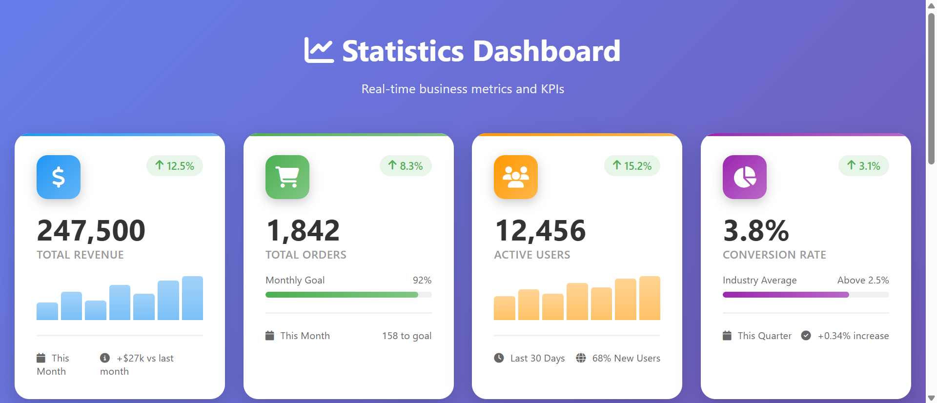
1. One Metric Per Card Creates Instant Focus
Each card displays one key metric prominently: "Revenue: $124,500" or "Conversion Rate: 3.8%." The single-focus design eliminates cognitive load. Your eyes land on a card, absorb one number, understand one thing, move to the next. No searching, no interpretation, no confusion. Critical metrics get individual spotlight rather than competing for attention in dense tables.
The large typography and whitespace create visual hierarchy. The most important element—the metric value—is the biggest, boldest element. Everything else (label, trend, context) supports understanding that primary number.
2. Color-Coded Trend Indicators Communicate Performance Instantly
Green upward arrow: metric is improving. Red downward arrow: metric is declining. These visual signals communicate faster than reading numbers. A glance across dashboard reveals: "Green, green, green, RED, green, green." You immediately know which metric needs attention without reading any text.
The color psychology leverages pre-existing associations. Green = good, red = alert, orange = caution. No training needed—everyone understands intuitively.
3. Percentage Change Shows Context Without Extra Tables
Each metric displays percentage change: "↑ 23.4% vs last month" or "↓ 8.1% vs last week." This immediate context answers: "Is this good?" without requiring mental math or separate comparison reports. You see both current state and trajectory in one glance.
4. Mini Charts Show Historical Trends Visually
Small sparkline or bar charts below metric values show the last 7 days, 30 days, or 12 months. These visual trend lines reveal patterns: steady growth, sudden spike, gradual decline, seasonal variation. Seeing the shape of performance history helps identify anomalies ("why did Tuesday spike?") and predict future trajectory.
The visual representation communicates faster than tables of historical data. An upward-trending line is instantly understood. A table of 30 daily numbers requires calculation to determine trend.
5. Grouped Cards Create Logical Information Architecture
Organize cards into sections: "Revenue Metrics" (MRR, ARR, churn), "Marketing Metrics" (traffic, conversions, CAC), "Product Metrics" (active users, feature adoption, support tickets). This grouping creates a mental model matching business structure. Executives reviewing marketing performance focus on that section without distraction from unrelated metrics.
6. Real-Time Updates Keep Data Current
Unlike static PDF reports generated weekly, dashboard cards update automatically—hourly, daily, or real-time depending on data source. Decision-makers always see current state, not yesterday's snapshot. Time-sensitive issues (server down, campaign underperforming, inventory low) surface immediately, not in next week's report.
See Dashboard Cards in Action
Experience how visual metric cards transform dense spreadsheet reports into instant comprehension and faster decisions.
Try Live DemoReal-World Applications Across Business Functions
Dashboard cards work for any role or department that makes data-driven decisions:
Executive Dashboards (Company-Wide KPIs)
CEOs need to monitor revenue, profit margins, customer acquisition, churn, cash runway. A 6-8 card executive dashboard shows these critical metrics at a glance. One CEO replaced 20-page monthly board reports with 10 dashboard cards. Board meeting prep time dropped from 4 hours to 15 minutes. Directors spent meeting time discussing strategy instead of interpreting reports.
Sales Team Performance Tracking
Display: deals closed, pipeline value, average deal size, win rate, sales cycle length. Sales managers check dashboards daily instead of waiting for end-of-week reports. A sales org using dashboard cards identified underperforming reps 2 weeks faster, enabling coaching before quota miss became crisis.
Marketing Campaign Monitoring
Track: ad spend, impressions, clicks, conversions, cost per acquisition, ROAS. Marketing teams monitor campaigns in real-time. One e-commerce brand caught a Facebook ad campaign underperforming within 3 hours using dashboard alerts, paused it, and reallocated budget—saving $4,200 in wasted spend that would have continued all weekend under old weekly reporting.
Product Usage and Engagement Analytics
Monitor: daily active users, feature adoption rates, session duration, user retention cohorts. Product managers use dashboards to validate feature launches. A SaaS product team saw feature adoption spike immediately after launch via dashboard, confirming user need—then watched it decline over 10 days, revealing onboarding issue they fixed quickly.
Customer Support and Satisfaction
Display: open tickets, average response time, customer satisfaction scores, resolution time. Support leaders identify capacity issues before queues explode. A support team using dashboard cards noticed response time creeping up Friday morning, called in backup coverage proactively, and maintained SLA instead of violating it.
The Psychology Behind Visual Data Comprehension
Understanding cognitive science explains why dashboard cards dramatically outperform text reports:
Pre-Attentive Visual Processing
Humans process certain visual attributes (color, size, position) before conscious attention. Red badges, upward arrows, large numbers are understood in milliseconds—faster than reading. Dashboard cards leverage this by encoding meaning in visual properties. You "know" performance at a glance before consciously analyzing.
Chunking and Working Memory Limits
Working memory holds 5-7 items simultaneously. Dense reports overload this capacity. Dashboard cards chunk information into discrete units—one metric per card. This matches cognitive limits. You process 6 cards as 6 distinct chunks, each independently comprehensible, instead of one massive report requiring mental parsing.
The Picture Superiority Effect
Visual information is remembered 65% better than text. Charts, colors, icons create stronger memory encoding than numbers in tables. Executives remember "revenue card was green with upward trend" more reliably than "Q3 revenue increased 14.7% to $847K." Visual encoding aids recall and pattern recognition over time.
Cognitive Load Reduction
Every design decision that reduces mental effort improves comprehension. Large numbers = no squinting. Color codes = no interpretation. Trend arrows = no calculation. Dashboard cards minimize cognitive load at every level, freeing mental resources for actual decision-making rather than data extraction.
Common Mistakes That Ruin Dashboard Effectiveness
Even well-intentioned dashboards fail if designed poorly:
Too Many Metrics (Information Overload)
Showing 40 metric cards defeats the purpose. You've recreated the spreadsheet problem with prettier formatting. Limit to 6-10 truly critical metrics. Everything else goes in secondary views or detailed reports. The dashboard is executive summary, not comprehensive reference.
Vanity Metrics Instead of Actionable KPIs
Tracking "total registered users" (always increasing) provides less value than "active users last 30 days" (reveals engagement). Choose metrics that inform decisions and indicate health, not just metrics that look impressive. If a metric declining doesn't trigger action, it shouldn't be on the dashboard.
No Clear Targets or Benchmarks
Showing "3.4% conversion rate" without context—is that good? Include targets: "3.4% (Goal: 4.0%)" or comparisons: "3.4% (↑ from 2.9%)." Context transforms numbers into meaning.
Inconsistent Update Frequency
Mixing real-time metrics with weekly-updated metrics creates confusion. "Why is revenue today's number but support tickets from last Thursday?" Either clarify update timing on each card or standardize update frequency across dashboard.
Poor Mobile Responsiveness
Dashboards accessed primarily on desktop miss 60%+ of usage opportunities. Executives check phones constantly. Dashboard cards must stack gracefully on mobile, maintaining readability and interaction. Test on actual phones, not just browser resize.
Case Study: A marketing agency built a client dashboard with 35 metric cards showing every possible stat. Clients reported feeling overwhelmed and uncertain what to focus on. The agency reduced to 8 core metrics (leads, conversions, cost per lead, ROAS, traffic, engagement, top channels, campaign performance), added "Goal" labels to each, and included mini trend charts. Client satisfaction with reporting increased 78%. Clients now checked dashboards 3x/week instead of ignoring monthly reports.
Measuring Dashboard Impact and Adoption
How do you know if your dashboard is actually being used and driving value?
Dashboard View Frequency
Track how often users access the dashboard. Healthy adoption: daily for operational dashboards, weekly for strategic dashboards. Low frequency (monthly or less) suggests dashboard isn't providing value or users don't trust data accuracy.
Time to Decision on Critical Issues
How quickly do problems get noticed and addressed? Measure: time from metric change to corrective action. Pre-dashboard: 3-7 days. Post-dashboard target: same-day or next-day. Faster response = dashboard is surfacing insights effectively.
Meeting Time Spent on Data Discussion
Do meetings start with "What do the numbers say?" or "Given what we know from dashboard, what should we do?" If dashboard works, meetings skip data presentation and jump to strategic discussion. Measure: percentage of meeting time on interpretation vs. action planning.
Data-Driven Decision Quality
Are decisions based on gut feel or metrics? Track: percentage of decisions citing specific dashboard metrics as justification. Increased data citation indicates dashboard is trusted source of truth informing strategy.
User Feedback and Requested Changes
Engaged users request specific metrics, ask for new cards, suggest improvements. No feedback suggests no usage. Active feedback loop indicates dashboard is valuable enough that users want to optimize it further.
The Future of Business Intelligence Dashboards
Modern dashboards are evolving beyond static metric displays: AI-generated insights ("Revenue spike likely due to email campaign sent Tuesday"), predictive forecasting ("At current trend, you'll hit Q4 target by Nov 28"), anomaly detection alerts ("Traffic down 34% vs. typical Friday—possible site issue"), natural language queries ("Show me conversion rate by traffic source last month"), and personalized views (different dashboards for CEO, CFO, CMO based on role).
But the core principle remains: translate data into instant visual comprehension. The faster someone can understand current state and identify what needs attention, the faster they can act.
Getting Started: Building Effective Metric Dashboards
Ready to transform dense reports into instant insight?
- Identify 6-10 Critical Metrics: What numbers actually drive decisions? Revenue, conversions, key user actions—focus ruthlessly
- Choose Appropriate Visualizations: Large numbers for absolute values, trend arrows for direction, mini charts for history
- Color-Code Performance: Green for on-target/improving, red for below-target/declining, orange for caution
- Add Contextual Comparisons: Show percentage change vs. last period, progress toward goals, year-over-year growth
- Group Related Metrics: Revenue metrics together, marketing metrics together—create logical sections
- Include Icons for Quick Recognition: Dollar sign for revenue, users for engagement, chart for analytics
- Show Update Timing: "Updated 5 minutes ago" or "Last updated: Nov 22, 9:47 AM"—trust requires recency clarity
- Design for Mobile First: Ensure cards stack and remain readable on phones—executives check metrics everywhere
- Enable Drill-Down: Click card to see detailed report—dashboard is overview, details are one tap away
- Set Up Automated Updates: Real-time or daily refreshes—manual updates kill adoption
- Test With Actual Users: Are they finding insights faster? Do they trust the data? Iterate based on feedback
The statistics dashboard cards module handles all presentation—responsive grid, trend indicators, mini charts, animations, mobile optimization. You connect your data sources; it creates the instant-comprehension experience that drives decisions.
Transform Reports Into Insight
See how visual dashboard cards turn overwhelming spreadsheet data into instant comprehension and faster, better decisions.
View Live Module