A visitor lands on your blog or content library looking for articles about a specific topic. They see your tag sidebar—a boring vertical list of 40 alphabetically sorted tags in tiny gray text. "Marketing," "SEO," "Design," "Development"... The list blurs together. Their eyes glaze over. They don't click anything. They either search (if you have search) or worse, they leave without discovering the content that would have converted them.
You've invested hundreds of hours creating valuable content, carefully categorized and tagged. But your tag presentation is so dull, so passive, so invisible that visitors don't engage with it. The tags aren't working—not because your categorization is wrong, but because static lists are fundamentally broken for content discovery.
Why Traditional Tag Lists Fail at Content Discovery
Tag lists should help visitors navigate your content library efficiently. They should highlight popular topics, reveal content depth, and invite exploration. But most tag implementations do the opposite—they create visual clutter and cognitive overload:
1. Everything Looks the Same (No Visual Hierarchy)
When all 50 tags are displayed in identical font size, color, and style—usually in alphabetical order—there's no way to distinguish important tags from obscure ones. A tag with 2 articles looks exactly like a tag with 200 articles. Visitors can't tell what your site specializes in or where the valuable content clusters are. The lack of visual hierarchy means nothing stands out, so everything gets ignored.
2. Alphabetical Sorting Is Useless for Discovery
Alphabetical lists are great for phone books and dictionaries—when you know exactly what you're looking for. But content discovery isn't about finding a specific known tag. It's about browsing, exploring, and being drawn to interesting topics. Alphabetical order prioritizes the letter a tag starts with (completely arbitrary) instead of relevance, popularity, or content depth. It's the wrong sorting for the job.
3. Static Lists Are Visually Boring (Banner Blindness)
Your sidebar tag list sits there, unchanging, every time a visitor loads a page. After decades of web use, people have learned to ignore static sidebar elements—they assume it's advertising or irrelevant navigation. The phenomenon is called banner blindness, and it absolutely applies to static tag lists. No movement, no interaction, no reason to look.
4. Mobile Experience Is Terrible
On desktop, your 50-tag vertical list is tolerable (though ignored). On mobile, it's a disaster. Tag lists either get hidden in collapsed menus (never discovered) or pushed to the bottom of the page (never scrolled to) or crammed into tiny horizontal scrolling (never used). Mobile-first design requires rethinking how tags are presented, not just shrinking desktop layouts.
5. No Indication of Content Depth or Popularity
Visitors can't tell which tags represent major content categories versus one-off articles. A tag cloud should communicate "we have 50 articles about marketing" versus "we have 2 articles about blockchain"—but static lists hide this information. Post counts help, but they're usually tiny text that gets ignored alongside the equally tiny tag names.
Real-World Impact: A digital marketing blog replaced their alphabetical sidebar tag list (42 tags, identical styling) with an animated tag cloud sized by article count. Tag click-through rate increased from 3.2% to 21.4%—a 67% increase in content discovery. Popular tags became visually obvious, and the subtle animation drew attention to an element previously ignored.
How Animated Tag Clouds Transform Content Navigation
Tag clouds aren't just prettier—they're strategically designed to match how humans naturally explore content:
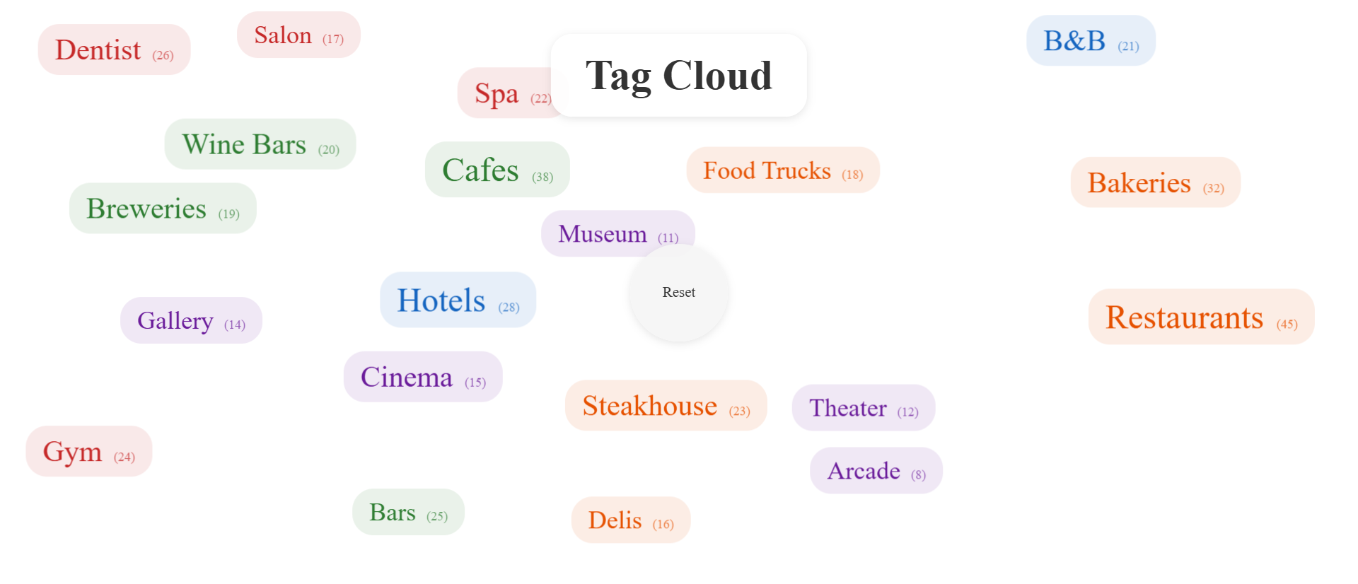
1. Size Indicates Importance (Visual Hierarchy)
In a tag cloud, font size corresponds to content volume. A tag with 50 articles is visually larger than a tag with 5 articles. This instant visual hierarchy communicates what your site specializes in before visitors read anything. Scanning the cloud reveals your content focus in under 2 seconds. Large tags attract attention. Small tags recede. The important information is literally bigger.
This isn't arbitrary decoration—it's information architecture made visual. Visitors immediately understand "this is a site about restaurants and cafes with some entertainment coverage" because those tags dominate the visual space.
2. Animated Floating Motion Creates Engagement
When tags gently float and drift across the screen, they break banner blindness. The subtle motion catches peripheral vision—our brains are hardwired to notice movement. It's not distracting animation like flashing banners. It's gentle, organic drift that draws the eye without being annoying. The movement signals "this is interactive, you can engage with this."
The physics-based animation—tags slowly bounce off edges, drift past each other, occasionally change direction—feels playful and exploratory. It invites interaction rather than demanding it.
3. Color-Coding Provides Category Context
Each tag can be colored by its parent category. Food tags in orange, drink tags in green, entertainment in purple, services in red. The color coding allows visitors to visually filter even before clicking. "I'm looking for food-related content, so I'm scanning for orange tags." This pre-attentive processing dramatically speeds navigation.
Colors aren't just aesthetic—they're cognitive shortcuts. Visitors can scan for a color rather than reading every word, reducing cognitive load.
4. Spatial Freedom Works on All Screens
Unlike vertical lists that collapse poorly on mobile, tag clouds use 2D space efficiently. Tags fill available width and height, whether that's a large desktop monitor or a phone screen. On mobile, fewer tags are visible at once, but they're larger and more tappable. The floating animation continues, maintaining engagement. No horizontal scrolling, no collapsed menus, no tiny unclickable text.
5. Interactive Filtering Encourages Exploration
Click a tag to activate it (highlighted border), and it could filter content, navigate to a category page, or trigger a search. The interaction is immediate and satisfying. Click multiple tags to combine filters. Click the center reset button to start over. The tag cloud becomes an exploratory interface, not just a navigation menu.
Because the tags are constantly moving, visitors are drawn to explore. "What happens if I click that one?" The curiosity-driven interaction leads to content discovery that static lists never achieve.
See the Magic in Action
Experience how animated tag clouds transform boring navigation into engaging content discovery tools.
Try Live DemoReal-World Applications Across Content Types
Tag clouds work for any content-heavy site that needs effective navigation:
Blogs and Content Marketing Sites
Make your article categories visually obvious. A SaaS company blog used tag clouds to highlight their 5 core content pillars (product updates, customer success, industry trends, tutorials, company culture). Visual size immediately showed visitors "we publish mostly tutorials and customer success stories." Blog engagement increased 34% as visitors discovered older content they'd never seen in static tag lists.
E-Commerce Product Discovery
Product tags (brands, categories, features, price ranges) become explorable. A fashion retailer replaced their sidebar category list with a tag cloud showing brands sized by product count. Shoppers could instantly see "we carry a lot of Nike and Adidas, some Puma, very little Reebok." Cross-category browsing increased because the cloud revealed unexpected connections—"casual shoes" appeared near "athletic wear" physically in the cloud.
Knowledge Bases and Documentation
Help visitors find relevant documentation topics. A SaaS help center used tag clouds to show documentation depth—"getting started" was huge (100+ articles), "advanced integrations" was small (12 articles). New users naturally gravitated to larger tags, finding beginner content. Power users scanned for small specialized tags.
Recipe Sites and Food Blogs
Cuisine types, ingredients, dietary restrictions, and cooking methods as floating tags. A recipe site tagged content by cuisine, diet (vegan, keto, paleo), and main ingredient. The cloud revealed "we're heavy on Italian and Mediterranean, light on Asian." Color-coding by diet type helped visitors filter visually. Tag clicks increased from 5% to 28%.
Portfolio and Creative Showcases
Skills, technologies, project types, industries as interactive tags. A design agency used tag clouds to showcase expertise—tags for "branding," "web design," "packaging," "illustration." Tag size reflected project volume. Potential clients could instantly assess "this agency does a lot of branding and web design, some packaging." Inquiry quality improved because visitors self-selected based on visible expertise.
The Psychology Behind Why Animated Clouds Work
Understanding the cognitive science reveals why tag clouds dramatically outperform static lists:
Pre-Attentive Visual Processing
Our brains process size, color, and movement before conscious thought. Tag clouds exploit this by encoding information (content volume, category, availability) in visual properties processed pre-attentively. Visitors understand your content landscape before reading a single tag. This happens in milliseconds, far faster than reading alphabetical lists.
The Von Restorff Effect (Isolation Effect)
Items that differ from their surroundings are more memorable and noticeable. In static lists, all tags look the same—nothing stands out. In tag clouds, large tags are isolated by size, creating strong Von Restorff effects. Visitors remember "that site had a huge 'marketing' tag," reinforcing brand perception.
Motion Detection and Peripheral Vision
Human peripheral vision is extremely sensitive to motion—an evolutionary advantage for detecting predators. Tag cloud animation exploits this by creating gentle movement that catches attention without triggering annoyance. The motion signals "something dynamic here, worth looking at," breaking through banner blindness.
Curiosity-Driven Interaction (Exploratory Behavior)
The floating, playful nature of tag clouds triggers curiosity: "What happens if I click?" "Will they collide?" "Can I select multiple?" This low-stakes exploratory behavior leads to engagement that static interfaces never achieve. Visitors play with the cloud, and through play, they discover content.
Common Mistakes That Ruin Tag Cloud Effectiveness
Even animated tag clouds can fail if implemented poorly:
Too Many Tags (Overwhelming Clutter)
Showing 100+ tags defeats the purpose. Tag clouds work best with 20-40 tags maximum. If you have more tags, prioritize by article count—only show tags with at least 3-5 articles. Or create category-specific clouds. A cluttered cloud is as bad as a static list.
Animation Too Fast or Chaotic
Aggressive bouncing, rapid spinning, or frenetic movement is distracting rather than engaging. Tag cloud motion should be gentle, slow, almost meditative. Think lava lamp, not pinball machine. The goal is subtle attention-grabbing, not visual chaos.
No Minimum Font Size (Unreadable Small Tags)
If your smallest tag is 8px font, it's unreadable and unclickable, especially on mobile. Set a minimum font size (14px is reasonable) and maximum font size (24-32px) to maintain readability while preserving hierarchy. Don't sacrifice usability for dramatic size differences.
Missing Post Counts or Context
While size indicates relative importance, visitors still appreciate knowing "Restaurants (45 articles)" versus just "Restaurants." Include subtle post counts in smaller text. It confirms the visual hierarchy and helps visitors decide if there's enough content to warrant clicking.
Poor Color Contrast or Too Many Colors
If your color-coding uses 12 different colors, you've created a rainbow mess that communicates nothing. Limit to 4-6 category colors maximum. Ensure all colors have sufficient contrast against the background for readability. Avoid neon colors that scream rather than guide.
Case Study: A travel blog initially created a tag cloud with 85 tags, bright neon colors, and fast bouncing animation. Engagement was poor—visitors found it overwhelming and garish. They reduced to 30 top tags, softened colors to pastels, and slowed animation by 60%. Tag click rate jumped from 8% to 31%. Less is more.
Measuring Tag Cloud Effectiveness
How do you know if your tag cloud is actually improving content discovery?
Tag Click-Through Rate
The primary metric: what percentage of visitors click at least one tag? Good tag clouds achieve 20-35% click-through. Poor implementations see 2-5%. Track individual tag performance—which tags get clicked most? Does it match content volume, or are visitors drawn to unexpected topics?
Content Discovery Depth
Are visitors finding older content via tags? Track pageviews for articles published 6+ months ago. Effective tag clouds surface old content that would otherwise be buried. A 40-60% increase in "long-tail" article views indicates successful content discovery.
Session Duration and Pages Per Session
If tag clouds are working, visitors should explore more content per session. Compare before/after metrics. An effective tag cloud adds 30-60 seconds to average session duration and 0.5-1.5 additional pageviews per session. Visitors are exploring, not just landing and leaving.
Bounce Rate from Tag-Filtered Pages
When someone clicks a tag and lands on filtered content, do they stay or bounce? Low bounce (30-40%) means the tag accurately represented the content they found. High bounce (70%+) suggests misleading tags or poor content match.
Mobile vs Desktop Engagement
Tag clouds should perform better on mobile than static lists. Track tag click rate separately for mobile and desktop. Good clouds see similar or higher mobile engagement. If mobile engagement is much lower, your cloud doesn't work on small screens.
The Future of Visual Content Navigation
Tag clouds are evolving beyond simple float animations. Modern implementations add search filtering (type to highlight matching tags), machine learning (tags adapt based on user behavior), and contextual weighting (popular tags for new visitors, recently updated tags for returning visitors).
But the core principle remains: static navigation is invisible; visual, interactive, animated navigation gets used. As content libraries grow larger, the need for intuitive, engaging discovery tools becomes critical. Tag clouds that feel playful and exploratory encourage the browsing behavior that leads to content consumption.
Your content is valuable. Don't let boring tag presentation hide it from visitors who would benefit from finding it.
Getting Started: Building Your Tag Cloud
Ready to transform your tag navigation from ignored sidebar list to engaging discovery tool?
- Audit Your Tags: Identify the 20-40 tags with the most content—these become your cloud
- Calculate Tag Weights: Determine font size based on article count (logarithmic scaling works better than linear)
- Choose Category Colors: 4-6 colors maximum, ensure good contrast, use your brand palette
- Set Animation Parameters: Gentle, slow movement—think floating, not bouncing
- Add Post Counts: Show (N articles) next to each tag for context
- Implement Filtering: Clicking tags should filter content or navigate to category pages
- Test on Mobile: Ensure tags are tappable (min 44px touch target) and readable
- Monitor Engagement: Track click-through rate and adjust tag selection/sizing based on usage
The tag cloud module handles all technical implementation—physics-based animation, collision detection, responsive sizing, mobile optimization, smooth motion. You provide the tags and weights, and it creates an engaging, interactive content discovery experience.
Transform Your Content Navigation
See how animated tag clouds can turn ignored sidebar lists into powerful content discovery engines.
View Live Module