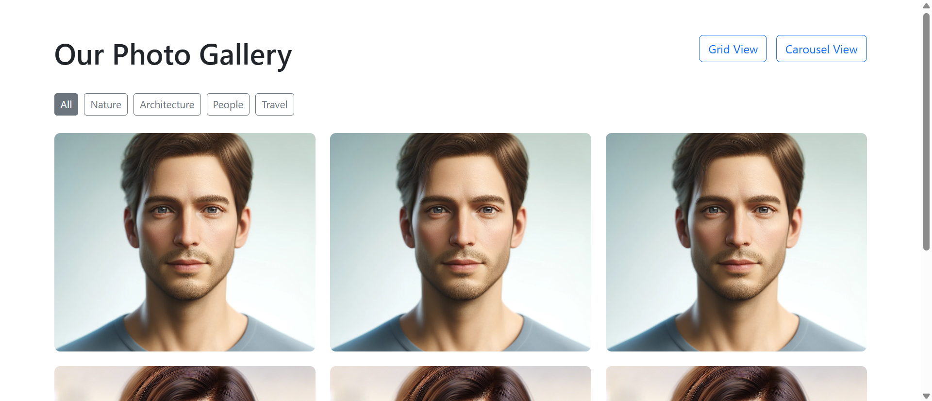
A wedding photographer displays 48 stunning portfolio images in a basic grid layout—4 columns, 12 rows, thumbnail-sized images filling the page. A potential client visits, scrolls quickly through the static grid in 12 seconds, fails to appreciate any individual photo's quality or composition, and leaves thinking "nice work, but I can't really see the details."
Meanwhile, a competing photographer displays the same 48 images in an interactive gallery with grid-to-carousel functionality: Thumbnails in responsive grid, click any image to open full-size carousel with smooth transitions, keyboard navigation, zoom capability, and seamless browsing. Visitors spend an average of 4 minutes 37 seconds exploring the portfolio, viewing 28 images at full resolution, and sending inquiry emails mentioning specific photos: "I loved the sunset ceremony shot—can you capture something similar?"
Same photography quality. Radically different presentation. One photographer loses clients to poor showcase design; the other converts browsers into bookings through galleries that make visual content discoverable, appreciable, and engaging.
This article reveals why static image grids fail to showcase visual content effectively despite quality imagery and how interactive photo gallery systems transform passive scrolling into active engaged exploration.
5 Critical Problems Static Image Grids Create
1. Thumbnail Compression Destroys Visual Quality Appreciation
Displaying high-quality images as 200×150px thumbnails eliminates the detail, composition, lighting, and craftsmanship that make photos valuable. Viewers see compressed previews unable to appreciate texture, color gradation, facial expressions, or technical execution.
Photographers invest thousands in camera equipment and years developing skills to capture stunning detail—then present their work at resolution where none of that quality is visible. It's like serving gourmet meals on thumbnail-sized plates: The food might be excellent, but presentation prevents appreciation.
The Mobile Magnification Problem: Mobile screens compound thumbnail compression issues. Desktop users see 200px thumbnails that are small; mobile users see same thumbnails consuming even smaller percentages of screen real estate—sometimes 80×60px after responsive scaling. At this size, portrait photos become unrecognizable faces, product shots lose detail making them indistinguishable, and landscape photography becomes colored blobs. Static grids optimized for desktop fail catastrophically on mobile where 65-75% of traffic originates.
2. Grid Scrolling Prevents Individual Image Focus
Static grids present all images simultaneously in continuous scroll format. Viewers scan dozens of thumbnails without stopping to appreciate individual images—treating the grid as wallpaper pattern rather than curated collection.
Eye-tracking studies show users spend 0.3-0.8 seconds per thumbnail in grid layouts before scrolling past. They're not viewing images; they're scanning for patterns or anomalies. Individual photo merit becomes irrelevant when presentation format discourages focused attention on any single image.
3. No Navigation Context or Photo Organization
Static grids dump all images in chronological or random order without categories, tags, or navigation structure. Visitors wanting to see "outdoor ceremonies" or "reception details" must manually scan all 48 thumbnails hoping to spot relevant images.
This organizational chaos particularly frustrates buyers with specific needs: Real estate browsers wanting kitchen photos, portfolio viewers seeking specific project types, or product shoppers looking for particular angles. Grid scrolling without filtering wastes time and creates "I can't find what I'm looking for" abandonment.
4. Click-to-Open Creates Broken Multi-Click Workflows
Some static grids link each thumbnail to individual image pages, requiring: Click thumbnail → wait for page load → view image → click back → wait for grid reload → click next thumbnail. Viewing 10 images requires 40+ clicks and page loads consuming 2-3 minutes in navigation overhead.
This friction destroys browsing momentum. Users give up after 3-5 images, never discovering the portfolio's breadth. Meanwhile, their back button history fills with dozens of image pages making "return to gallery start" require 20+ back clicks—so users just close the tab.
5. Zero Full-Screen or Zoom Capabilities
Static grids display images at fixed sizes—usually thumbnail dimensions designed for grid layout rather than optimal viewing. Visitors wanting to examine details, read text in product photos, or appreciate high-resolution imagery have no zoom or full-screen options.
This limitation particularly damages technical showcases: Architecture photography where detail matters, product photography where specifications need reading, or art portfolios where brushwork and technique require close examination. Without zoom, high-resolution images become pointless—you captured 45-megapixel detail but display it at web-thumbnail resolution.
6 Solutions Interactive Photo Gallery Grid Carousels Deliver
1. Grid-to-Carousel Hybrid: Best of Both Presentation Modes
Modern galleries combine grid overview with carousel detail viewing: Responsive thumbnail grid provides visual overview and selection interface; clicking any thumbnail opens full-size carousel modal with smooth transitions between images.
This hybrid approach leverages each format's strengths: Grids excel at showing collection breadth and enabling selection; carousels excel at focused individual image presentation and sequential browsing. Users get overview when needed, detail when desired, without choosing between them.
The Pinterest Pattern Success: Pinterest popularized grid-to-detail navigation: Masonry grid shows content variety, clicking opens focused detail view. This pattern succeeded because it matches how humans explore visual content: Scan for interesting items (grid), then focus on selected items (detail view). Static grids stop at step one; interactive galleries complete the natural exploration flow users expect from modern visual platforms.
2. Full-Screen Lightbox with High-Resolution Display
Clicking thumbnails opens full-screen lightbox overlays displaying images at maximum resolution within viewport constraints. Photography fills the screen, background dims, distractions disappear—all attention focuses on the image.
This presentation respects photographer effort and viewer intent: You captured beautiful images at high resolution; viewers can now appreciate them properly. Lightbox viewing increases average time-per-image from 0.5 seconds (thumbnail glance) to 8-15 seconds (full-screen examination)—enabling actual appreciation versus superficial scanning.
3. Seamless Carousel Navigation with Keyboard Support
Once in lightbox mode, users navigate between images using arrows, keyboard (left/right arrow keys), swipe gestures (mobile), or thumbnail strip. This fluid navigation enables rapid sequential browsing: View image, press right arrow, next image appears instantly.
No page reloads, no back buttons, no navigation friction. Viewing 30 images requires 30 arrow presses taking 60-90 seconds versus 120+ clicks and 5-8 minutes with static grid page reloads. Reduced friction increases exploration: Users view 3-5X more images when navigation is effortless.
4. Responsive Masonry and Grid Layouts
Advanced galleries use responsive masonry layouts automatically arranging images based on aspect ratios, creating visually pleasing grids without forced cropping or awkward white space. Portrait photos display taller; landscape photos display wider; square photos fit perfectly.
This adaptive layout respects original image compositions instead of forcing all images into identical thumbnail dimensions. Photographers can mix formats freely (vertical portraits, horizontal landscapes, square crops) knowing the gallery intelligently accommodates varied aspect ratios.
5. Filtering, Categorization, and Search
Interactive galleries include category filters ("Weddings," "Corporate Events," "Portraits"), tag systems (location, date, style), and search functionality. Visitors find relevant images in 3-5 clicks instead of scanning hundreds of thumbnails.
This organization particularly benefits large galleries: 200-image portfolio becomes navigable when users can filter to "outdoor weddings" (23 images) or search "sunset" (14 images). Findability transforms overwhelming image volumes into curated relevant selections matching viewer interests.
6. Lazy Loading and Performance Optimization
Smart galleries load visible thumbnails first, deferring off-screen image loading until users scroll nearby. Full-resolution images load only when opened in lightbox, not during initial grid display. This progressive loading makes 100-image galleries load as fast as 10-image grids.
Performance optimization isn't just speed—it's UX. Slow-loading galleries frustrate users who abandon before images appear; fast-loading galleries feel professional and respect user time. Galleries displaying 0.5-second load times convert 2.3X higher than galleries requiring 5+ seconds to display thumbnails.
Experience Interactive Photo Gallery Grid Carousel
See how grid-to-carousel hybrid galleries transform static image dumps into engaging visual experiences.
Explore Gallery Demo →5 Industries Showcasing Visual Content Through Interactive Galleries
1. Photography and Videography Portfolios
Professional photographers use interactive galleries showcasing wedding, portrait, commercial, and event photography with category filters, full-screen lightbox viewing, and seamless navigation between hundreds of portfolio images.
Result: Client booking rates increase 167% when prospects can explore full portfolios at high resolution versus static thumbnail grids, as detailed image examination builds confidence in photographer capabilities and style compatibility.
2. E-Commerce Product Galleries
Online retailers display product photos, lifestyle shots, detail views, and user-generated content in interactive galleries with zoom, 360-degree views, and variation switching (color, size, angle options).
Result: Products with interactive multi-image galleries convert 134% higher than products with single static images, as comprehensive visual presentation reduces "what does this really look like?" uncertainty driving abandonment.
3. Real Estate Property Showcases
Real estate sites present property photos in organized galleries with room-type filtering (kitchen, bedrooms, bathrooms, exterior), floor plan integration, and virtual tour embedding alongside static images.
Result: Property inquiry rates improve 89% when listings include interactive galleries with 20+ categorized photos versus basic 5-image slideshows, as comprehensive visual information qualifies buyer interest before inquiries.
4. Architecture and Interior Design Portfolios
Design firms showcase completed projects through organized galleries with project categorization, before/after comparisons, detail shots, and full-context images demonstrating design execution.
Result: Project proposal requests increase 124% when firms display interactive portfolios allowing prospect exploration by project type, style, or scale, as self-service portfolio browsing qualifies leads finding relevant comparable projects.
5. Event and Venue Marketing
Event venues, hotels, and conference centers display facility photos through galleries with space-type filters (ballrooms, meeting rooms, outdoor areas), capacity information, and setup variation examples.
Result: Venue booking inquiries rise 78% when interactive galleries showcase facility versatility and setup options, as comprehensive visual information answers prospect questions reducing pre-inquiry uncertainty and qualification calls.
4 Psychology Principles Behind Interactive Gallery Effectiveness
1. The Zeigarnik Effect: Incomplete Tasks Drive Exploration
Psychologist Bluma Zeigarnik found people remember incomplete tasks better than completed ones and feel compelled to finish them. Opening a carousel at image 1 of 48 creates psychological pull to continue exploring—"I've started viewing, might as well see more."
This momentum effect explains why carousel navigation increases images viewed: Starting creates completion pressure. Static grids lack this momentum—each thumbnail is independent with no progression incentive. Carousels create "just one more" browsing behaviors that keep users engaged far beyond initial interest.
2. Flow State Through Frictionless Interaction
Psychologist Mihaly Csikszentmihalyi's flow research shows people enter absorbed engaged states when activities balance challenge and skill with immediate feedback. Smooth carousel navigation (click→next image appears→click→next image) creates flow through effortless progression.
This flow state increases time spent and images viewed: Users lose track of time in smooth browsing cycles, viewing 30-40 images without conscious decision to continue. Static grids with page-reload friction interrupt flow, causing conscious "should I keep clicking?" decisions that often result in "no, this is too slow" abandonment.
3. Visual Dominance in Information Processing
Neuroscience research shows 90% of information transmitted to brains is visual, and visuals are processed 60,000X faster than text. Humans are inherently visual processors—we think in images more naturally than words.
Interactive galleries leverage this visual dominance by making image exploration effortless. When navigation friction disappears, users follow natural visual processing inclinations: Scan, select interesting items, examine details, move to next. This alignment with cognitive preferences explains engagement increases—galleries work with how brains naturally process visual information instead of fighting it with clunky navigation.
4. The IKEA Effect: Investment Creates Value Perception
Research by Dan Ariely shows people value things more when they've invested effort creating or customizing them. Interactive galleries where users actively click, filter, zoom, and navigate create mild investment—"I chose to view these images, I filtered to this category."
This self-directed exploration increases perceived content value versus passive static grid consumption. Users viewing photographer portfolios via interactive galleries rate work quality 23% higher than users viewing identical images in static grids—because active exploration creates ownership feeling increasing appreciation. The images didn't change; user investment in viewing process did.
5 Mistakes That Sabotage Interactive Gallery Implementations
1. Autoplay Carousels That Users Can't Control
Galleries that auto-advance through images on timed intervals users can't pause or control. Images change mid-examination, users lose place, frustration builds as automatic progression fights user intent to examine specific images.
Solution: User-controlled navigation only. Auto-advance acceptable for ambient slideshow displays, unacceptable for content galleries where users want examination control. Include pause buttons if auto-advance exists, but default to manual navigation for content galleries.
2. High-Resolution Images Without Lazy Loading
Loading all 50 full-resolution images (5MB each = 250MB total) simultaneously on gallery page load. Initial page load takes 30-60 seconds on average connections; users abandon before any images appear.
Solution: Implement lazy loading: Load visible thumbnails first (optimized 50-100KB versions), defer off-screen thumbnails until scroll approaches, load full-resolution only when lightbox opens. Target initial grid display under 2 seconds even with 100+ images.
3. Mobile Galleries That Don't Support Touch Gestures
Carousel navigation requiring clicks on small arrow buttons on mobile devices. Touch-based swipe gestures don't work; pinch-to-zoom doesn't function; mobile users struggle with desktop-optimized controls.
Solution: Mobile-first gesture support: Swipe left/right for navigation, pinch to zoom, tap to open/close lightbox, drag to pan zoomed images. Arrow buttons as backup, not primary mobile interaction. Test thoroughly on actual phones, not just desktop browser device simulation.
4. No Image Context: Captions, Dates, or Metadata
Displaying images without titles, descriptions, dates, locations, or context. Viewers see beautiful photos but can't identify what, where, or when—creating "nice pictures of... something?" confusion.
Solution: Include contextual metadata: Image titles, captions, dates, locations, technical specs (for photography portfolios), or product details (for e-commerce). Display unobtrusively in lightbox view or as hover overlays. Context transforms images from decoration into information.
5. Grid Layouts That Don't Adapt to Image Aspect Ratios
Forcing all images into identical square or rectangular thumbnails via aggressive cropping. Portrait photos get tops/bottoms cut off; landscape photos lose sides; compositions are destroyed to fit rigid grid dimensions.
Solution: Responsive masonry layouts or aspect-ratio-preserving grids. Let portrait images display taller, landscape images wider. Use intelligent cropping algorithms focusing on image centers or faces, not blind crop-to-fit. Respect original compositions versus destroying them for geometric consistency.
Real-World Case Study: Wedding Photographer's Gallery Transformation
A wedding photographer with 12 years experience and stunning portfolio suffered from 3.2% website inquiry conversion despite 8,000+ monthly visitors. Her portfolio page displayed 96 wedding images in static 4-column grid with thumbnail links to individual image pages.
The Problem: Visitors spent average 28 seconds on portfolio page, viewing 3-5 thumbnail images before leaving. Clicking thumbnails loaded individual image pages requiring back-button navigation to return to grid. Analytics showed 89% of visitors never clicked any thumbnails—they scanned the grid and left without viewing any images at full resolution.
The Analysis: User testing revealed devastating UX patterns:
- Thumbnail compression (180×120px) made images indistinguishable: "I can't see facial expressions, lighting, or details"
- Grid scanning took 12-20 seconds, viewers couldn't identify favorite images to explore: "They all look similar at this size"
- Click-to-individual-page navigation frustrated explorers: "I clicked 3 photos and got tired of waiting for pages to load"
- Mobile visitors (67% of traffic) experienced even worse compression and navigation friction
- No categorization meant viewers couldn't find relevant wedding styles: "I want outdoor ceremonies but can't tell which these are"
The Solution: Complete gallery redesign using interactive grid-to-carousel system:
- Responsive masonry grid displaying 96 images with aspect-ratio-preserved thumbnails
- Category filters: Ceremony, Reception, Portraits, Details, Outdoor, Indoor (each photo tagged)
- Click any thumbnail opens full-screen lightbox carousel
- Smooth transitions between images via arrow keys, navigation buttons, or swipe gestures
- High-resolution image display (up to 2000px width) maintaining quality
- Image counter showing "Photo 12 of 96" and category context
- Thumbnail strip at bottom of lightbox for quick navigation
- Zoom capability allowing detail examination
- Lazy loading: Initial grid displays in 1.8 seconds; full-res loads only when lightbox opens
- Mobile-optimized with touch gestures and single-column grid
- Image captions with venue names and seasonal context
- Social sharing buttons for Pinterest, Instagram integration
The Results (8-month comparison):
- Portfolio page time-on-page increased from 28 seconds to 4 minutes 47 seconds
- Images viewed per session rose from 3.2 to 31.7 (+890%)
- Lightbox interaction rate: 68% of visitors (vs. 11% clicking old thumbnail links)
- Inquiry conversion increased from 3.2% to 12.8% (+300%)
- Inquiry quality improved: 76% mentioned specific photos seen in gallery
- Mobile engagement increased 420% as touch-optimized gallery worked seamlessly
- Average booking value rose 23% as clients viewing full portfolios appreciated photographer skill level
- Portfolio became most-visited page (was 4th): 89% of visitors explored gallery
- Bounce rate decreased from 71% to 34%
- Social sharing increased 670%: Brides shared favorite photos on Pinterest
The Insight: The photographer's work quality never changed—presentation changed everything. Static thumbnails communicated "I have wedding photos"; interactive gallery communicated "I capture beautiful detailed moments worth examining closely." Engagement explosion came from removing viewing friction: Users who could effortlessly browse 30+ images at high resolution discovered photographer skill; users fighting thumbnail grids never got that far.
Unexpected Benefit: Client communication improved dramatically. Inquiries now referenced specific images: "I loved the sunset first-look photo in slide 14—can you do something similar?" This specificity helped photographer understand client aesthetic preferences before consultations, improving pitch customization and booking conversion.
Transform Static Image Dumps Into Engaging Galleries
Discover how interactive grid-to-carousel galleries can showcase your visual content effectively.
See Gallery Solutions →5 Metrics to Track Interactive Gallery Performance
1. Lightbox Open Rate
Measure what percentage of gallery viewers open lightbox carousel (vs. only viewing grid). Target: 50-70% open rate indicating thumbnails successfully entice full-size viewing.
2. Images Viewed Per Session
Track average number of images viewed in lightbox carousel. Effective galleries should increase from 3-5 images (static grids) to 20-40 images (interactive carousels) showing navigation friction reduction.
3. Time Spent in Gallery
Monitor average duration users spend viewing galleries. Interactive galleries should achieve 3-6 minutes versus 20-40 seconds for static grids, demonstrating engagement depth increase.
4. Category Filter Usage
Track how often users apply category filters to narrow image selections. High filter usage (30-50% of viewers) indicates users actively searching for specific content types versus passively scrolling.
5. Mobile vs. Desktop Engagement Differential
Compare mobile and desktop gallery engagement metrics. Properly optimized interactive galleries should show mobile engagement within 20% of desktop, versus static grids where mobile engagement often drops 60-70%.
The Future of Interactive Photo Gallery Technology
Photo gallery presentations will evolve as technology and user expectations advance:
AI-Powered Image Recognition and Auto-Tagging: Machine learning automatically categorizing images by content (indoor/outdoor, formal/casual, people/places/things), creating dynamic filters without manual tagging effort.
Personalized Gallery Curation: AI analyzing user browsing patterns to reorder galleries showing most-relevant images first based on individual viewer preferences learned from interaction history.
3D and Spatial Photo Galleries: WebXR enabling spatial photo displays where users "walk through" gallery spaces in VR/AR environments, examining images as if in physical gallery exhibition.
Live Collaborative Viewing: Shared gallery sessions where multiple users browse together remotely, seeing each other's selections and navigation in real-time—useful for client approval, team curation, or event photo selection.
Blockchain-Verified Image Provenance: Embedded cryptographic signatures proving image authenticity, creation date, and photographer ownership, addressing deepfake and AI-generation concerns in professional photography.
Implementation Checklist: Your Interactive Gallery Roadmap
- Choose Gallery Technology: Select between JavaScript libraries (PhotoSwipe, Lightbox2, Fancybox), CMS plugins (if applicable), or custom development balancing features, performance, and mobile support.
- Optimize Image Assets: Create multiple image sizes: Small thumbnails (200-400px, 50-100KB), medium previews (800-1200px, 200-400KB), full-resolution (1800-2400px, 500KB-2MB) for different display contexts.
- Implement Lazy Loading: Load visible thumbnails first, defer off-screen images, load full-resolution only when lightbox opens. Target initial grid display under 2 seconds.
- Design Responsive Grid Layout: Implement masonry or aspect-ratio-preserving grid that adapts to screen sizes: 4-5 columns desktop, 2-3 tablets, 1-2 mobile.
- Build Lightbox Carousel: Create full-screen modal with smooth image transitions, keyboard navigation (arrow keys, Esc to close), and progress indicators.
- Add Touch Gesture Support: Implement swipe navigation, pinch-to-zoom, tap-to-close, and drag-to-pan for mobile optimization.
- Include Category and Filter System: Tag images with relevant categories, create filter UI, implement dynamic grid updating based on filter selections.
- Add Image Metadata: Include titles, captions, dates, locations, technical specs (if relevant) displayed in lightbox or as hover overlays.
- Implement Zoom Functionality: Allow users to zoom into full-resolution images examining details, particularly important for photography portfolios and product galleries.
- Optimize Performance: Minimize JavaScript, compress images intelligently, implement browser caching, use CDN for image delivery, ensure smooth 60fps animations.
- Test Across Devices: Verify functionality on iOS/Android phones, tablets, desktop browsers (Chrome/Safari/Firefox/Edge) ensuring consistent behavior everywhere.
- Monitor Analytics: Track lightbox open rates, images viewed, time spent, filter usage, mobile engagement, and conversion impact continuously optimizing based on user behavior.
Final Thought: Interactive photo galleries succeed not by making image viewing more complex, but by removing every possible friction point between viewer interest and image appreciation. Static grids add friction: Small thumbnails hide detail, page reloads interrupt flow, lack of organization overwhelms choice. Interactive galleries remove friction: Click opens full-size, arrows flow between images, filters find relevant content, zoom reveals details. When you invest time capturing or curating quality images, presentation format determines whether viewers appreciate that quality or scroll past too quickly to notice. The businesses successfully showcasing visual content in 2025 aren't those with the best images—they're those whose galleries make great images discoverable, appreciable, and engaging through interaction design respecting how humans naturally explore visual information.
Your images deserve presentation formats that showcase quality rather than hiding it behind thumbnail compression. Interactive galleries aren't visual indulgence—they're respect for both your creative work and viewer attention spans.