A visitor lands on your registration page ready to sign up. They scroll down and see: 24 form fields stacked vertically filling three screen heights. Personal information section. Account details section. Preferences section. Payment information section. All on one endless page. The visitor's eyes glaze over. "This will take forever." They close the tab. You've lost a conversion because your single-page form visually overwhelmed them before they started. The actual time to complete might be 5 minutes. But the perceived effort—scrolling through 24 fields—felt like 30 minutes of tedious data entry.
This happens thousands of times daily across registration forms, checkout processes, job applications, and quote requests. Long single-page forms have 86% abandonment rates. Not because they're actually difficult. Because they look difficult. The wall of fields creates psychological resistance. Meanwhile, multi-step form wizards break the same 24 fields into 4 steps of 6 fields each. Suddenly the form feels manageable. Users see "Step 1 of 4" with just 6 fields visible. Completion rates jump from 14% to 56%—a 300% increase—for identical information requested.
Why Single-Page Long Forms Kill Completion Rates
Presenting all fields at once creates multiple psychological barriers:
1. Visual Overwhelm Creates Immediate Resistance
Scrolling down page and seeing field after field after field triggers "this is too much" response. Brain registers total field count before reading any labels. 24 fields looks like significant time commitment. Users haven't read what you're asking yet—they've already decided it's not worth the effort. First impression determines whether they start. Wall of fields says "lengthy tedious process." Many abandon without attempting a single field.
2. No Progress Indication Creates Motivation Vacuum
Filling out field 8 of single-page form provides no sense of progress. Are you 10% done? 50% done? 80% done? Unknown. This uncertainty demotivates. Humans need visible progress to maintain effort. Without progress markers, users lose momentum halfway through. "How much more is there?" becomes reason to abandon. They've invested 3 minutes but can't see how close to completion, so they quit.
3. Cannot Save Partial Progress
Life interrupts form completion. Phone rings. Child needs attention. Meeting starts. Single-page forms lose all entered data if user navigates away. No "Save and continue later" option. Users either complete entire form now or start over next time. This all-or-nothing requirement increases abandonment. Users need step-out, come back capability without losing work.
4. Errors at End Require Re-Scrolling Through Entire Form
User completes all 24 fields, clicks Submit. Validation error: "Email already in use" at field 5. Now user must scroll back up through 19 fields to fix error, then scroll down again to Submit. This navigation frustration punishes users for mistakes. In multi-step wizard, errors appear on same step immediately—no scrolling hunt for problem field.
5. Difficult to Organize Related Information
Long forms mixing personal info, account details, preferences, payment all on one page lack clear organization. Users jump from "First Name" to "Credit Card Number" to "Email Preferences" randomly. Cognitive switching between unrelated contexts reduces completion quality. Users fill fields incorrectly because they've lost track of which section they're in.
Real Impact: An e-learning platform had single-page registration form: 28 fields covering student info, course selection, payment, emergency contacts, learning preferences. Completion rate: 11%. Users who started averaged 7.3 fields completed before abandoning. They redesigned as 5-step wizard: Step 1 (Basic info: 5 fields), Step 2 (Course selection: 6 fields), Step 3 (Payment: 6 fields), Step 4 (Emergency contacts: 5 fields), Step 5 (Preferences: 6 fields). Each step showed progress: "Step 2 of 5." Completion rate jumped to 58%—a 427% increase. Average completion time actually decreased from 8.2 minutes to 6.4 minutes because users moved through steps efficiently instead of scrolling and re-scrolling. Registrations increased 386% from identical form, just reorganized.
How Multi-Step Wizards Psychologically Transform Form Experience
Breaking forms into sequential steps changes perceived effort dramatically:
1. Progress Indicator Shows "You're Making Progress"
Visual progress bar or step indicators: "Step 2 of 4" with filled circles showing completed steps. This provides constant reinforcement: you're advancing. After completing step 2, seeing "50% Complete" motivates continuing. Progress visibility triggers completion drive—humans want to finish what they've started, especially when halfway done. Sunk cost psychology works in your favor: "I've already done 2 steps, might as well finish."
3>2. Chunking Reduces Cognitive Load
Instead of 24 fields overwhelming working memory, users focus on 6 fields per step. Brain processes smaller chunks more easily. Each step feels like quick task: "Just fill these 6 fields." Series of small tasks feels easier than one large task, even if total work identical. Users complete step, feel accomplishment, continue to next. Small wins create momentum.
3. Logical Grouping Creates Context
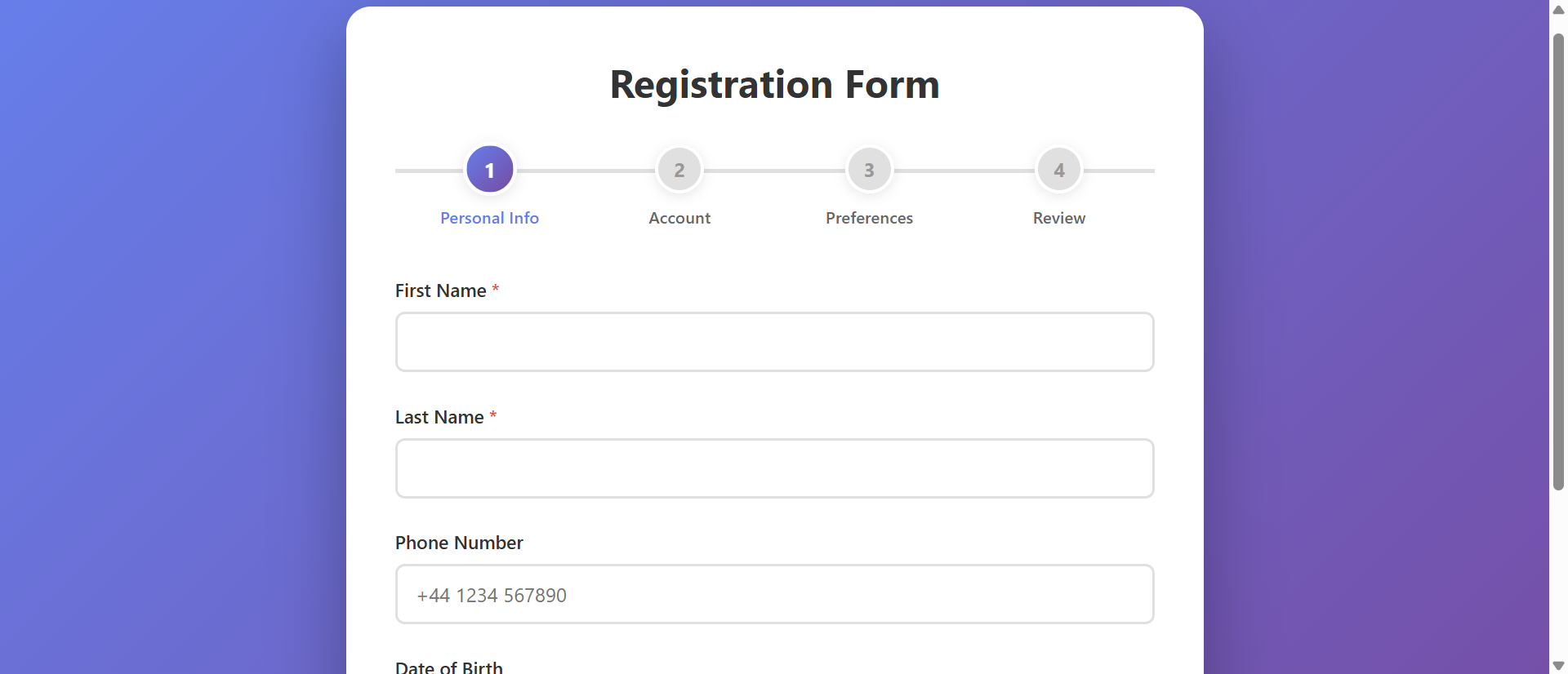
Step 1: Personal Information. Step 2: Account Details. Step 3: Preferences. Step 4: Review. Each step has clear purpose and context. Users understand what type of information current step needs. This contextual clarity improves data quality—users less likely to enter wrong information when they understand section purpose. Better organization = faster, more accurate completion.
4. Step Validation Catches Errors Immediately
Clicking "Next" validates current step before advancing. Email format error? Password too weak? Appears immediately on same step. User fixes error, continues. No scrolling through completed sections hunting for problem. Immediate feedback prevents error accumulation and reduces frustration from post-submission error hunting.
5. Back/Edit Capability Builds Confidence
"Previous" button lets users go back and review/edit earlier steps. Made typo in email? Go back to Step 2, fix it, return to current step. This editability provides safety net. Users more willing to click "Next" knowing they can return if needed. Contrast with single-page forms where clicking Submit is final—no confidence to review before submission.
6. Summary Review Step Confirms Before Submission
Final step displays all entered information for review: "Personal Info: John Smith, john@email.com..." Edit buttons next to each section allow quick corrections. This review reduces post-submission regret and support requests from users who submitted incorrect info. Users appreciate seeing everything before final commit.
See Multi-Step Forms in Action
Experience how breaking forms into logical steps with progress tracking transforms overwhelming forms into achievable tasks.
Try Live DemoReal-World Applications Across Industries
Any form longer than 10-12 fields benefits from step-based structure:
E-Commerce Checkout Flows
Step 1: Shipping Address. Step 2: Shipping Method. Step 3: Payment. Step 4: Review Order. Breaking checkout into steps reduces cart abandonment by 35%. Users commit to one step at a time instead of facing all checkout fields simultaneously. Amazon's multi-step checkout is gold standard—billions in revenue optimized through step-based flow.
User Registration and Onboarding
New account creation, profile setup, preference configuration. Step 1: Basic account (email, password). Step 2: Profile details (name, photo). Step 3: Preferences (notifications, interests). Progressive onboarding increases completed registrations 67% vs. all-at-once forms. SaaS companies use multi-step to reduce signup friction.
Job Applications and Recruitment
Employment applications collecting personal info, work history, education, references, questionnaires. Step 1: Contact Info. Step 2: Work Experience. Step 3: Education. Step 4: References. Step 5: Supplemental Questions. A Fortune 500 company increased completed applications 83% using 5-step wizard vs. previous single-page application.
Insurance Quotes and Financial Applications
Loan applications, insurance quotes requiring extensive information. Step 1: Personal Details. Step 2: Financial Information. Step 3: Coverage/Loan Details. Step 4: Beneficiaries/Co-signers. Step 5: Review. An insurance company saw quote completion increase from 19% to 61% with multi-step wizard—users less intimidated by one section at a time.
Survey and Questionnaire Forms
Market research, customer feedback, academic surveys. Step 1: Demographics. Step 2: Usage Patterns. Step 3: Satisfaction Ratings. Step 4: Open Feedback. Survey completion increases 45-70% with multi-step vs. single-page surveys. Research institutes use wizard format to reduce respondent fatigue.
The Psychology Behind Step-Based Success
Behavioral science explains why wizards outperform single-page:
Goal Gradient Effect: Motivation Increases Near Completion
Users accelerate effort as they approach goals. "Step 3 of 4" triggers increased commitment compared to "field 18 of 24." Step-based progress creates multiple mini-goals (complete this step) and overall goal (complete form). Each step completion provides dopamine hit reinforcing continued effort.
Chunking Overcomes Working Memory Limits
Human working memory holds 5-9 items. Single-page forms with 24 fields exceed capacity, creating overwhelm. Breaking into steps of 4-7 fields matches cognitive capacity. Users process each step comfortably within working memory limits, reducing mental strain and errors.
Sunk Cost Fallacy Drives Completion
After completing steps 1-3, abandoning wastes that investment. Users think: "I've already spent 4 minutes on this, might as well finish." While economists call this fallacy, UX designers leverage it. Incremental commitment through steps increases likelihood of full completion compared to quitting early in single-page form.
Progress Visibility Provides Feedback Loop
Seeing progress fuels motivation. "You're 75% done!" encourages final push. Without progress indication, users operate blind—demotivating. Visible advancement creates positive feedback: effort → progress → motivation → more effort. This cycle sustains completion through longer forms.
Common Multi-Step Form Mistakes That Reduce Completion
Step-based approach can fail if poorly implemented:
Too Many Steps (Fragmentation Fatigue)
Breaking 12 fields into 12 steps (one field per step) creates click fatigue. Users exhaust themselves clicking "Next" after every field. Sweet spot: 4-6 fields per step, 3-6 total steps. More steps ≠ better. Excessive fragmentation as frustrating as no fragmentation.
No Progress Indication
Multi-step form without "Step X of Y" indicator or progress bar loses main advantage. Users don't know how many steps remain, eliminating motivation benefit. Always show: current step, total steps, visual progress (filled circles, progress bar, percentage).
Can't Go Back to Edit Previous Steps
Wizard that locks completed steps, preventing edits, creates anxiety. Users fear mistakes because they can't fix them. Always include "Previous" button. Let users navigate back freely. Final review step should show all data with edit links.
Validation Only at Final Submission
Allowing users to proceed through steps with errors, then showing all validation failures at end, wastes their time. Validate each step before allowing "Next" click. Early error catching prevents frustration from completing entire form then discovering step 1 had error.
No Save Progress Capability
Long wizards (5+ steps) need "Save and Continue Later" functionality. Users can't always complete in one session. Losing progress after 4 completed steps guarantees they won't restart. For logged-in users, auto-save progress. For anonymous users, offer "Email me a link to continue."
Case Study: A mortgage application platform created 12-step wizard—one field per step—thinking more steps = easier. Result: completion dropped from 34% (previous 4-step version) to 18%. Users complained: "Clicking Next constantly is annoying." They redesigned to 4 logical steps matching their process: Step 1 (Applicant Info: 8 fields), Step 2 (Property Details: 7 fields), Step 3 (Financial Info: 9 fields), Step 4 (Employment: 6 fields). Completion jumped to 67%. Lesson: chunk logically by context, not by arbitrary field minimums. 6-8 fields per step is manageable. 1-2 fields per step is tedious.
Measuring Multi-Step Form Performance
Track these metrics to optimize wizard effectiveness:
Overall Completion Rate
Percentage of users who start form and complete final submission. Industry benchmark: 40-60% for well-designed wizards. Compare to baseline single-page form. Track by traffic source, device type, time of day. Identify patterns in completion.
Step-by-Step Drop-Off Rate
Where do users abandon? "Started form: 1,000. Completed Step 1: 850. Completed Step 2: 720. Completed Step 3: 520. Completed Step 4: 480." Major drop between Step 2 and 3 indicates Step 3 has problem—too many fields, confusing questions, privacy concerns. Fix specific problem steps.
Average Time Per Step
How long users spend on each step. Step 1: 45 seconds. Step 2: 2 minutes. Step 3: 8 minutes. Step 3's excessive time suggests complex fields, unclear instructions, or decision paralysis. Simplify or break further. Balance step complexity.
Back Button Usage
How often users return to previous steps? High back usage on specific step suggests users catch mistakes or lack confidence in answers. Review that step's clarity. Some back navigation is healthy (users reviewing data). Excessive back indicates confusion.
Field-Level Error Rates
Which fields trigger most validation errors? Email format errors, password strength failures, required field omissions. High error fields need better inline help, examples, or validation messaging. Reduce friction at problematic fields.
The Future of Multi-Step Form Technology
Wizard experiences evolving: conditional branching (skip steps based on earlier answers), smart step count (show 3 steps for simple cases, 6 for complex), progress saving with resume links, conversational UI (chat-bot style step progression), voice-input steps (speak answers instead of typing), auto-fill from external sources (LinkedIn for job apps, Google for address), real-time collaboration (multiple users completing different steps simultaneously for B2B forms).
Core principle persists: break complexity into manageable sequential chunks with visible progress.
Getting Started: Building Effective Multi-Step Wizards
Ready to transform overwhelming forms into completion-optimized experiences?
- Analyze Current Form Length: Forms with 12+ fields are strong candidates for multi-step treatment
- Group Fields by Logical Context: Personal info together, account details together, preferences together
- Create 3-6 Steps Total: Balance between too few (still overwhelming) and too many (click fatigue)
- Aim for 4-7 Fields Per Step: Matches working memory capacity, feels manageable
- Add Visual Progress Indicator: Step numbers, filled circles, progress bar, or percentage
- Implement Step Validation: Validate current step before allowing "Next" click
- Enable Back Navigation: "Previous" button available on all steps except first
- Create Review/Summary Step: Final step shows all entered data with edit links
- Add Save Progress Capability: For forms requiring 5+ minutes, allow save and resume
- Mobile Optimize: Single-column layouts, large touch targets, mobile-friendly progress indicators
- Track Step-by-Step Analytics: Monitor where users abandon to identify problem steps
The multi-step form wizard module handles all mechanics—progress tracking, step navigation, validation, back/forward controls, responsive design, analytics hooks. You define your steps and field groupings; it creates the completion-optimized wizard experience.
Transform Long Forms
See how breaking forms into logical steps with progress tracking increases completion rates by up to 300% for identical information.
View Live ModuleNeed Multi-Step Forms on Your Website?
We build websites with smart multi-step forms, booking systems, and lead-capture tools that convert. Get a free, no-obligation proposal tailored to your business.