A qualified prospect lands on your website ready to buy. They navigate to the pricing page. They see: "Contact us for a quote." Or worse: "Pricing available upon request." Or the dreaded: "Let's discuss your needs to create a custom solution." The prospect closes the tab. You've lost a customer not because your product wasn't right or your pricing wasn't competitive, but because you made them work for information they expected upfront.
This happens thousands of times daily across B2B and B2C websites. Businesses hide pricing behind contact forms, believing it creates sales opportunities. What it actually creates is distrust, friction, and abandoned journeys. Buyers in 2025 research independently. They compare options. They want transparency. Hidden pricing signals "we'll price gouge based on desperation" or "our pricing isn't competitive." Neither inspires confidence.
Why "Contact Us for Pricing" Destroys Conversions
Pricing transparency isn't just buyer preference—it's a conversion requirement. Hiding pricing creates barriers that most prospects won't cross:
1. It Signals Dishonesty and Variable Pricing
When you hide pricing, buyers assume you charge different customers different amounts based on negotiation skill, company size, or desperation. "If pricing was fair and consistent, they'd publish it" is the mental model. Hidden pricing suggests you'll extract maximum value rather than offer fair value. This breeds distrust from first contact.
2. It Forces Unqualified Sales Conversations
A prospect who can't afford your solution shouldn't waste their time or yours on a sales call. Public pricing enables self-qualification. "Our budget is $500/month, their pricing starts at $2,000/month—not a fit" saves everyone time. Hidden pricing creates frustrating discovery calls where budget mismatches get revealed 20 minutes in.
3. It Kills Comparison Shopping (Your Competitors Win)
Modern buyers open multiple tabs and compare options side-by-side. If Competitor A shows pricing tables and you show "Contact us," the prospect evaluates Competitor A's tiers, finds one that fits, and buys—without ever contacting you. You're not even in the consideration set because you made comparison impossible.
4. It Creates Massive Friction in the Buying Journey
Requiring prospects to fill out forms, wait for email responses, schedule calls, sit through sales pitches just to learn price is exhausting. Each friction point loses prospects. Research shows 87% of B2B buyers want self-service pricing information. When you require human interaction for pricing, 87% of your audience bounces.
5. It Alienates Low-Touch Buyers (The Majority)
Many buyers—especially younger decision-makers—prefer researching and purchasing independently. They don't want sales calls. They want information, evaluation time, and self-service signup. "Contact sales" feels like a time-consuming trap. They'd rather buy from a competitor with transparent pricing and online signup.
Real-World Results: A B2B SaaS company used "Request demo for pricing" on their website. 1,000 monthly visitors, 23 demo requests, 3 customers. Conversion: 0.3%. They added transparent pricing tables showing three tiers with clear monthly/annual costs. 1,000 monthly visitors, 127 signups (self-service), 41 customers. Conversion: 4.1%—a 1,267% increase. Same product, same pricing structure, dramatically different presentation. Transparency eliminated friction.
How Transparent Pricing Tables Build Trust and Drive Purchases
Well-designed pricing tables don't just present numbers—they guide decisions, communicate value, and remove barriers:
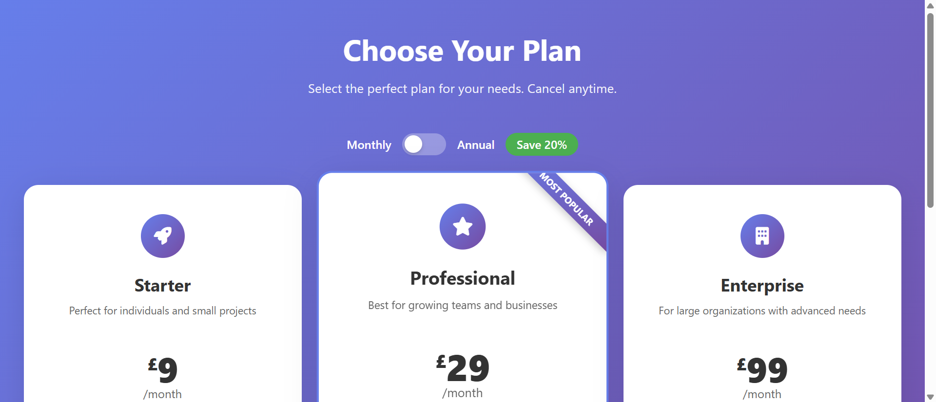
1. Side-by-Side Tier Comparison Enables Informed Decisions
Show 3-4 pricing tiers in columns: Starter, Professional, Enterprise. Each column displays price, billing frequency, included features, limitations. Prospects see at a glance: "Starter is too limited, Enterprise is overkill, Professional is perfect for my needs." This visual comparison matches how humans evaluate purchases.
The spatial arrangement creates natural contrast. Seeing "$29/month with 5 users" next to "$99/month with unlimited users" immediately communicates value difference. Prospects understand exactly what they're paying for at each tier.
2. Monthly vs. Annual Toggle Shows Savings and Flexibility
Include a toggle switch: "Monthly" / "Annual (Save 20%)." When toggled to annual, pricing updates dynamically and displays both the annual price and the monthly equivalent ("$79/month billed annually, save $228/year"). This transparency shows:
- You offer flexible billing aligned with different cash flow situations
- Annual commits offer meaningful savings (incentivizing longer-term relationships)
- You're confident prospects will stick around (not worried about monthly churn)
The toggle also increases average contract value—prospects see the annual savings and often upgrade from monthly intentions.
3. Feature-by-Feature Breakdown Justifies Price Differences
Under each price, list included features with checkmarks or X-marks. "API Access: ✓ / Advanced Reporting: ✓ / Priority Support: ✓" clearly shows what distinguishes higher tiers. This isn't just information—it's value justification. Prospects see: "Professional costs 3x more than Starter because it includes API access, advanced reporting, priority support, integrations..." The price difference feels earned, not arbitrary.
4. "Most Popular" Badges Guide Indecisive Buyers
Highlight your recommended tier (typically mid-tier, balancing features and affordability) with "Most Popular" or "Best Value" badges. This creates an anchor for uncertain buyers. Choice paralysis is real—too many options without guidance causes abandonment. Signaling "most customers choose this one" reduces anxiety and provides social proof.
This isn't manipulation if the badge accurately reflects customer distribution. It's helpful guidance.
5. Clear CTAs Enable Immediate Action
Each pricing column ends with a CTA button: "Start Free Trial," "Sign Up Now," or "Get Started." After comparing and deciding, prospects can act immediately without navigating elsewhere or contacting sales. This proximity of decision to action maximizes conversion. They've mentally committed; the button enables follow-through.
6. FAQ Section Below Tables Addresses Objections
Below pricing tables, include FAQ addressing common concerns: "Can I change plans later?" "What happens when I hit usage limits?" "Do you offer refunds?" "Is there a free trial?" Answering objections on the pricing page prevents them from becoming abandonment reasons. Transparency builds confidence.
See Transparent Pricing in Action
Experience how clear pricing tables with monthly/annual toggles transform hidden costs into trusted purchase decisions.
Try Live DemoReal-World Applications Across Business Models
Transparent pricing tables work across industries and pricing complexities:
SaaS Subscription Services
Display tiered plans based on features, user count, or usage limits. A project management tool showed Starter ($15/month, 10 projects), Professional ($49/month, unlimited projects + time tracking), Enterprise ($99/month, everything + API). Conversion rate increased 156% compared to previous "Schedule demo" approach. Self-service signups reduced sales team workload by 60%.
Membership and Online Course Platforms
Show access tiers clearly. A learning platform displayed Free (limited courses), Monthly ($29, full access), Annual ($249, full access + certifications + live workshops). Annual tier selection increased from 15% to 43% after adding pricing tables with clear savings calculations ("Save $99 vs. monthly").
Service Businesses with Package Tiers
Even service businesses benefit. A web design agency showed three packages: Basic ($2,500, 5-page site, 2 revisions, 3-week delivery), Standard ($5,000, 10-page site, 4 revisions, custom design, 4-week delivery), Premium ($10,000, unlimited pages, unlimited revisions, full branding, 6-week delivery). Lead quality improved dramatically—prospects self-selected appropriate tiers before inquiry calls.
E-Commerce Shipping and Product Variants
Display shipping tiers or product configurations. An electronics retailer showed laptop variants in pricing table format: storage size, RAM, processor, price. Customers quickly identified their performance/budget sweet spot. Decision time decreased 48%, add-to-cart rate increased 67%.
Consulting and Retainer Services
Even hourly or retainer services can show transparent ranges. A consulting firm displayed: 10 hours/month ($1,500), 20 hours/month ($2,800), 40 hours/month ($5,200). Clients could self-assess needs and budget before outreach. Initial conversations became more productive because expectations were pre-set.
The Psychology Behind Transparent Pricing
Understanding why transparent pricing outperforms hidden pricing reveals deeper trust dynamics:
Reciprocity and Trust Signals
Transparency creates reciprocity. "They showed me their pricing honestly, I'll engage honestly in return." Hiding pricing signals lack of trust in prospects. Showing pricing signals: "We trust you to evaluate fairly, we're confident our value is clear." This trust breeds trust—prospects are more likely to move forward when they feel respected.
Cognitive Closure and Reduced Anxiety
Humans dislike uncertainty. Unknown pricing creates anxiety: "Will this cost $100 or $10,000?" That anxiety becomes a barrier. Clear pricing provides cognitive closure—"I know exactly what this costs, I can make an informed decision." Reducing anxiety removes a major abandonment trigger.
Anchoring and Reference Points
Pricing tables create mental anchors. Seeing three tiers ($29, $99, $299) positions the mid-tier as the "reasonable" option—not too cheap, not too expensive. Without these reference points, a $99 price exists in isolation and might feel expensive. With context, it feels balanced.
Loss Aversion and Discount Psychology
Annual billing toggles leverage loss aversion. "Save $228/year" frames annual billing as avoiding loss rather than just spending more upfront. Humans are more motivated to avoid losses than achieve gains. Showing savings explicitly taps this psychological driver.
Common Mistakes That Undermine Pricing Effectiveness
Even transparent pricing can fail if implemented poorly:
Too Many Tiers (Decision Paralysis)
Offering 6+ pricing tiers overwhelms prospects. More choice isn't always better—it creates decision paralysis. Limit to 3-4 tiers maximum. If you need more granularity, offer add-ons or usage-based pricing within tiers rather than multiplying tier count.
Unclear What's Included in Each Tier
Listing features without clear indication of which tier includes what creates confusion. Use checkmarks (✓), X-marks (✗), or tier labels consistently. Every feature row should clearly show availability across all tiers. Ambiguity kills conversions.
No Guidance on Which Tier to Choose
Presenting equal-looking options without recommendation creates indecision. Highlight your recommended tier. Add "Best for: small teams" or "Best for: growing businesses" descriptions. Guide prospects toward appropriate tiers rather than making them guess.
Hidden Costs Beyond Listed Price
Transparent pricing means ALL costs. If you show $99/month but charge setup fees, overage charges, or required add-ons separately, you're not actually transparent. Include footnotes: "Plus $199 setup fee" or "Additional users $10/each." Surprise costs after signup destroy trust you built with transparent pricing.
Poor Mobile Experience
Pricing tables with 4 columns break on mobile. Implement responsive design: stack tiers vertically, use swipeable cards, or simplify to 2 columns on small screens. 60%+ of traffic is mobile—if pricing tables don't work on phones, you've lost most prospects.
Case Study: An online course platform initially offered 5 pricing tiers ranging from $19 to $299/month with unclear feature differentiation. Conversion rate: 2.1%. They simplified to 3 tiers with clear feature lists, added "Most Popular" badge to mid-tier ($79/month), included monthly/annual toggle showing 20% savings, and added FAQ section addressing refunds and plan changes. Conversion rate jumped to 7.8%—a 271% increase. Simplification and clarity outperformed variety and complexity.
Measuring Pricing Table Performance
How do you know if your pricing tables are effective?
Conversion Rate from Pricing Page
What percentage of pricing page visitors convert to trial signups or purchases? Industry benchmarks: 2-5% for B2B SaaS, 5-12% for consumer subscriptions. Lower rates suggest friction—confusing tiers, unclear value, or pricing misalignment with market expectations.
Tier Distribution (Which Plans Sell)
Track which tiers get selected. Healthy distribution might be 20% lowest tier, 60% mid-tier, 20% highest tier. If 95% choose cheapest, you're not communicating higher-tier value. If distribution is even across all tiers, pricing might be too confusing—no clear recommendation.
Monthly vs. Annual Selection Rate
What percentage choose annual over monthly billing? Target 30-50% annual if you offer meaningful discounts (15-25% savings). Lower rates suggest insufficient savings incentive or prospects uncertain about long-term commitment (might indicate product trust issues).
Time on Pricing Page
How long do visitors spend on pricing page? Too short (under 15 seconds) suggests they're not engaging—might be sticker shock or lack of interest. Too long (over 5 minutes) suggests confusion or uncertainty. Sweet spot: 45-120 seconds—enough to compare tiers and make informed decisions.
Exit Rate and Drop-off Points
Where do visitors leave? High exit from pricing page (without clicking CTA) suggests pricing is turning prospects away—either too expensive, unclear value, or confusing presentation. A/B test pricing structure, feature communication, and CTA placement.
The Future of Pricing Transparency
Modern pricing tables are becoming increasingly sophisticated: dynamic pricing based on usage estimates ("Based on 50 users, your cost would be $147/month"), personalized tier recommendations ("Companies like yours typically choose Professional"), calculator tools ("Estimate your costs"), and chat integration ("Questions about pricing? Ask us").
But the fundamental principle endures: transparency builds trust, trust enables transactions. The more openly you communicate pricing—costs, value, options—the more confidence prospects have to purchase.
Getting Started: Building High-Converting Pricing Tables
Ready to transform hidden pricing into transparent conversion drivers?
- Define 3-4 Clear Tiers: Starter/Basic, Professional/Standard, Enterprise/Premium—distinct value levels
- Price Each Tier Transparently: Show exact monthly and annual costs, calculate and display savings
- List Features Explicitly: What's included in each tier—use checkmarks for included, X-marks for excluded
- Add Monthly/Annual Toggle: Let prospects switch between billing frequencies and see savings
- Highlight Recommended Tier: "Most Popular" or "Best Value" badge on mid-tier (or wherever appropriate)
- Include Feature Descriptions: Brief explanations of what features mean—tooltips or expandable details
- Show Clear CTAs: "Start Free Trial" or "Sign Up Now" buttons in each tier
- Add FAQ Section: Address common objections—refunds, plan changes, trials, support
- Disclose All Costs: Setup fees, overages, add-ons—no surprises after signup
- Design for Mobile: Responsive layout that works on small screens—stack tiers or use swipeable cards
- A/B Test Variations: Test tier names, price points, feature lists, CTA copy
The pricing comparison tables module handles all presentation—responsive grid, billing toggles, feature lists, highlighting, animations. You provide the tiers and features; it creates the transparent, conversion-optimized pricing experience.
Build Trust Through Transparency
See how modern pricing tables turn "Contact us for pricing" friction into confident, immediate purchase decisions.
View Live Module