A shopper browses your product grid on their phone. They see something interesting: "Wireless Bluetooth Headphones." They tap the product card. Loading screen. Two seconds pass. Full product page loads with reviews, specifications, shipping info, related products. They scroll down looking for the price. More scrolling. Found it: $149. Not what they expected. They hit back button. Loading screen again. Product grid reloads, but scroll position is lost—they're back at the top. Frustration builds. They close the tab.
This interaction cost you a potential sale. Not because your product was wrong or your price was bad, but because checking basic product information required too much friction. Every page load is an abandonment opportunity. Every lost scroll position is a frustration point. Mobile shoppers are impatient. They want instant information access. Forcing full page loads for quick product checks kills conversion.
Why Traditional Product Pages Destroy Mobile Shopping Flow
Product pages optimized for desktop research sessions fail mobile browsing behavior:
1. Page Load Delays Break Shopping Momentum
Each product page visit requires: leaving current view, waiting for page load (1-4 seconds on mobile networks), consuming new page content, then navigating back and waiting for grid to reload. These delays compound. Checking 5 products means 10 page loads (5 forward, 5 back) taking 20-40 seconds total—just to gather basic info available in under 5 seconds with quick view.
Research shows every 1-second delay reduces mobile conversions by 7%. Multi-second delays for simple information checks destroy conversion rates.
2. Lost Context and Scroll Position Creates Disorientation
Browser back button often resets scroll position to top of page. Shoppers who were browsing row 4 of product grid find themselves back at row 1 after checking a product. Re-scrolling to find where they were is tedious. Many give up rather than re-navigating. The disorientation breaks shopping flow and mental product comparison.
3. Overwhelming Detail for Simple Decision (Information Overload)
Full product pages contain: detailed specifications, customer reviews, sizing charts, shipping information, related products, FAQ sections, warranty details. This comprehensive detail helps committed buyers but overwhelms casual browsers. Someone just checking if a product exists in blue or what it costs doesn't need 2,000 words of detail. Information overload slows decision-making and increases cognitive load.
4. Impossible to Compare Multiple Products Efficiently
Comparing three products requires: open product A, scan details, back button, open product B, scan details, try to remember product A details, back button, open product C, scan details, try to remember both previous products. This mental juggling is exhausting. Shoppers can't hold detailed product information in working memory across multiple page loads. Comparison requires side-by-side viewing—impossible with traditional full-page navigation.
5. Small Screens Make Full Pages Harder to Navigate
Mobile screens show maybe 20% of what desktop shows simultaneously. Full product pages on mobile require extensive scrolling to find key information. Price might be screen 2. Add to cart button might be screen 4. Shoppers don't want to scroll through entire pages just to check basic facts. Every scroll is friction.
Real-World Results: A fashion e-commerce site had traditional full product pages. Mobile bounce rate: 67%. Average products viewed per session: 2.3. Mobile conversion rate: 1.1%. They implemented quick view modals: click any product card to see modal with image gallery, price, size/color options, description, and "Add to Cart" or "View Full Details" buttons. Bounce rate dropped to 38%. Average products viewed increased to 7.8. Mobile conversion rate jumped to 3.1%—a 182% increase. Reducing friction enabled exploration that led to purchases.
How Quick View Modals Enable Effortless Product Exploration
Quick view isn't just convenience—it's designed around mobile shopping psychology:
1. Instant Product Preview Without Navigation Penalty
Click or tap product card → modal overlays current page with product details. No page load. No navigation. No context loss. Check price, see colors available, read brief description, view images—all in under 5 seconds. Close modal → you're exactly where you were, ready to browse next product. This zero-penalty exploration encourages checking multiple products.
The instant display (no loading delay) maintains shopping momentum. Shoppers can satisfy curiosity about 10+ products per minute versus 2-3 with full page loads.
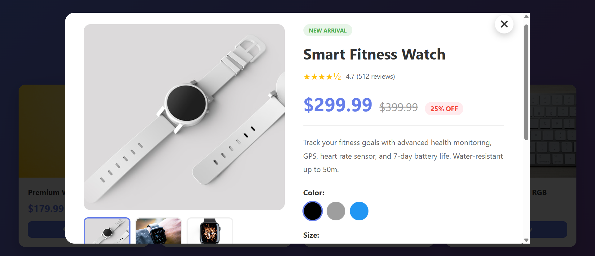
2. Essential Information Only (Progressive Disclosure)
Quick view shows: product images (gallery with thumbnails), name, price, rating, color/size options, brief description, stock availability, "Add to Cart" button, and "View Full Details" link. This curated information set answers 90% of initial questions. If shoppers want comprehensive details, they click through to full page. But most don't need that depth initially.
Progressive disclosure reduces cognitive load. Show essentials first, details on demand.
3. Image Gallery for Visual Product Assessment
Quick view includes thumbnail navigation showing product from multiple angles, lifestyle shots, detail close-ups. Shoppers click thumbnails to change main image. Visual assessment is critical for fashion, furniture, electronics—seeing product from all angles builds confidence. Full product pages have this too, but quick view makes it accessible without navigation cost.
4. Instant Add to Cart Without Leaving Browse Context
If shopper likes product, they can select size/color and add to cart directly from quick view modal. No need to visit full product page. Cart badge updates, quick view closes, they're back browsing. This streamlined path from discovery to cart reduces funnel steps. Fewer steps = higher conversion.
5. Maintains Grid Context for Easy Comparison
Because quick view overlays rather than navigates away, shoppers can quickly check multiple products while staying in grid context. Check blue dress → close → check black dress → compare mentally → choose. The retained context enables rapid comparison impossible with full page navigation.
6. "View Full Details" Escape Hatch for Interested Buyers
Quick view includes prominent "View Full Details" or "See More" button leading to traditional product page. Shoppers who want reviews, specifications, shipping info can access it. But casual browsers aren't forced through unnecessary detail. The option exists without being mandatory.
See Quick View in Action
Experience how instant product previews eliminate friction and transform mobile browsing into buying.
Try Live DemoReal-World Applications Beyond Traditional E-Commerce
Quick view patterns work anywhere users browse collections:
Fashion and Apparel Retail
Fashion shoppers browse extensively, checking dozens of items. Quick view showing outfit images, available sizes/colors, price, and styling tips enables rapid exploration. A clothing brand added quick view and saw mobile session length increase 156% (shoppers stayed longer, viewed more) and mobile add-to-cart rate increase 89%.
Electronics and Tech Products
Tech shoppers compare specifications. Quick view showing key specs (processor, RAM, storage, screen size), price, and comparison checkboxes enables efficient comparison. An electronics retailer saw comparison shopping increase 203% and informed purchase decisions increase (fewer returns) by 34%.
Furniture and Home Decor
Visual assessment is critical. Quick view with room scene photos, dimensions, materials, and color options lets shoppers evaluate fit quickly. A furniture store saw mobile engagement increase 127% and showroom visit requests (for products viewed via quick view) increase 67%—quick view drove qualified showroom traffic.
Real Estate Property Listings
Property quick view showing photo gallery, price, bedrooms/bathrooms, square footage, and location map enables rapid property screening. A real estate portal saw inquiry form submissions increase 98% because shoppers could efficiently narrow to properties worth contacting about.
Job Listings and Recruitment
Job quick view showing: company, location, salary range, key requirements, and benefits overview lets candidates screen opportunities quickly. A job board saw application starts increase 73% and application completion rate improve (candidates self-selected better fits) by 41%.
The Psychology Behind Quick View Effectiveness
Understanding cognitive and behavioral science reveals why quick view outperforms traditional navigation:
Reduced Cognitive Load Through Chunking
Quick view presents information in digestible chunks: images, price, key details. This matches working memory limits (5-7 items). Full product pages present 50+ information elements simultaneously—overwhelming. Chunking makes processing easier, decisions faster, and satisfaction higher.
Preservation of Mental Models
Shoppers build mental models: "I'm browsing blue dresses under $100." Full page navigation breaks that model—suddenly they're in a different context (individual product deep-dive). Quick view preserves browse context. The shopper remains in "browsing blue dresses" mindset while temporarily examining one item. Context preservation reduces cognitive switching cost.
Exploration Without Commitment (Lower Psychological Barrier)
Clicking a product card to visit full page feels like commitment: "I'm seriously considering this product." Quick view feels exploratory: "Let me peek at this." The lower psychological barrier encourages checking more products. More exploration = higher likelihood of finding something they love = more purchases.
Immediate Gratification and Reduced Friction
Humans prefer immediate rewards over delayed ones. Quick view provides instant information access (immediate gratification). Full page loads create delay (punishment). The instant feedback loop—click, see details, decide—is more satisfying than click, wait, load, scroll, find info, decide. Satisfaction drives continued engagement.
Common Quick View Mistakes That Reduce Effectiveness
Poorly implemented quick view can frustrate rather than help:
Too Little Information (Forces Full Page Visit Anyway)
If quick view shows only product image and name but not price or size availability, shoppers must visit full page for basic decision factors. You've added a step (open modal) without providing value. Quick view must answer the 3-4 most critical questions: What does it look like? How much? Available in my size/color? What's it for? Anything less forces unnecessary full page visits.
Slow Modal Loading (Defeats the Purpose)
If quick view modal takes 2+ seconds to load product images and details, you've recreated the page load problem. Quick view should feel instant—under 0.5 seconds to display. Preload product data, optimize images, use lazy loading for off-screen content. Perceived performance is critical.
Difficult to Close or Navigate Away
No close button, tiny X in corner, or unclear how to dismiss modal frustrates users. Include: large visible close button, click outside modal to close, ESC key support. Make exiting as easy as entering. Trapped users become angry users.
Poor Mobile Implementation
Desktop-sized modals that don't fit mobile screens, tiny product images, unreadable text, or add-to-cart buttons below the fold ruin mobile experience. Design mobile-first: full-screen modal on phones, larger tap targets, readable typography, critical info above fold. Test on actual devices, not just browser resize.
No Clear Path to Full Product Page
Interested shoppers who want more detail need obvious "View Full Details" or "Learn More" link. Burying this in small text or omitting entirely traps shoppers who want deeper information. Always provide escape hatch to comprehensive product page.
Case Study: A home goods retailer implemented quick view showing only product image and name—no price, no dimensions, no add-to-cart. Usage was high (curiosity), but 94% of quick view users then visited full product page anyway. Quick view added friction without value. They redesigned to include: image gallery, price, dimensions, materials, color options, add-to-cart, and "See More Details" link. Full page visit rate dropped to 31%—69% of shoppers got answers and added to cart directly from quick view. Mobile conversion increased 143%.
Measuring Quick View Impact on Conversion
How do you know if quick view is actually helping?
Quick View Usage Rate
What percentage of product grid visitors use quick view? Healthy adoption: 50-70% on mobile, 30-50% on desktop. Low usage suggests quick view isn't discoverable (poor trigger button design) or shoppers don't see value. Track which products get quick viewed most—indicates shopper interest patterns.
Add to Cart From Quick View vs. Full Page
What percentage of cart additions happen directly from quick view modal vs. after visiting full product page? Target: 40-60% from quick view. If under 20%, quick view doesn't provide enough information to support purchase decisions—add more detail. If over 80%, question whether you need full product pages at all.
Products Viewed Per Session
Compare sessions with quick view vs. without. Expect 150-300% increase in products viewed when quick view is used. More exploration indicates reduced friction. If products viewed doesn't increase, quick view isn't reducing navigation cost as intended.
Mobile Bounce Rate and Session Duration
Track before/after quick view implementation. Expect bounce rate reduction of 20-40% and session duration increase of 80-150% on mobile. These metrics indicate shoppers are staying engaged longer because exploration is easier.
Conversion Rate Lift (Overall and Mobile-Specific)
Ultimate measure: does quick view increase conversions? Expect 30-100% lift on mobile, 15-40% on desktop. Mobile should see larger impact because friction reduction matters more on constrained devices. A/B test: 50% of traffic sees quick view, 50% doesn't—measure conversion difference.
The Future of Product Quick View
Modern quick view implementations are evolving: AR try-on integration (see product on yourself in modal), video previews (product demo videos in quick view), AI-powered recommendations ("Customers who viewed this also liked..."), size prediction ("Based on your previous purchases, we recommend size M"), and real-time inventory by location ("Available at your nearby store").
But core principles persist: reduce friction, preserve context, provide essential information instantly, enable effortless exploration.
Getting Started: Implementing High-Converting Quick View
Ready to eliminate mobile friction and boost exploration?
- Add Quick View Triggers to Product Cards: "Quick View" button or icon on product cards—make it obvious and clickable
- Include Image Gallery: Main product image + thumbnail navigation showing multiple angles
- Display Critical Information: Product name, price, rating, brief description, stock status
- Show Size/Color Options: Variant selectors if applicable—let shoppers choose before adding to cart
- Add Prominent "Add to Cart": Primary action button—enable purchase directly from quick view
- Include "View Full Details" Link: Secondary button/link to full product page for interested shoppers
- Optimize for Mobile First: Full-screen modal on phones, readable text, large tap targets
- Ensure Fast Loading: Preload product data, optimize images—modal should appear instantly
- Make Closing Easy: Large X button, click outside to close, ESC key support
- Track User Interactions: Monitor usage rates, add-to-cart rates, products viewed per session
- A/B Test Layouts: Test information density, image sizes, button placement for optimal conversion
The product quick view module handles all functionality—modal overlay, image gallery, variant selection, add to cart integration, mobile optimization, smooth animations. You configure your product data; it creates the frictionless exploration experience that converts browsers into buyers.
Eliminate Mobile Friction
See how instant product previews transform tedious page loads into effortless exploration that drives mobile conversions.
View Live Module